
How to make your own visuals or pictures for your academic or scientific presentation
Have you ever wanted to make your own picture or visual for your presentation?
You’re in the right place: That’s exactly what we’re going to talk about in today’s article.
In this article, you’re going to learn:
Who should make their own presentation visuals?
Why should you make your own presentation visuals?
When should you make your own presentation visuals?
How to make your own presentation pictures (tips to get started).
What software or app should you use to make your own visuals?
Where can you develop the skills to make your own presentation pictures?
BONUS: Other ways making your own visuals can help
Hi! 👋 I’m Dr. Echo Rivera and I help academics, scientists, and educators create engaging presentations. That includes using visuals that already exist online or in PowerPoint, but also includes going the extra mile and creating your own visuals.
One thing we should discuss before we get started is what I mean by visual in this context.
When I refer to a visual or picture in this blog post, I’m referring to:
Shapes and/or icons that you put together to create a unique visual
Something you draw using any type of medium or app (on paper or digital)
Vector illustrations you create using something like Affinity Designer or Adobe Illustrator
Anything similar to the above
I just wanted to be clear that this blog post applies even if you’re using things like PowerPoint shapes and icons to create your own visuals.
Before we dive into this comprehensive guide about how to create visuals for your presentations, I also want to make sure you know about my FREE presentation training:
1. Who should make their own presentation visuals?
The first question you might have is whether or not YOU should make your own presentation visuals or pictures.
So let’s get this out of the way: Who should make their own visuals?
Everyone.
Well, that was easy :)
Or are you not convinced.
Let me guess:
You’re convinced you’re “not an artist” or that you’re “not creative” enough to make your own visuals for your slideshow?
Nonsense.
You don’t need to paint like Frida Kahlo to create your own visuals for your research, teaching, or evaluation work.
Being creative just means that you apply creative thinking to solve problems.
If you do research, science, or scholarship then you are creative!
Creativity is not only the ability to come up with new ideas, but also narrowing down those new ideas to focus on one that can be elaborated.
Think about a time when you were struggling or frustrated, but then had an “Aha!” moment?
Maybe it was with a survey question, or finding a way to explain something in your manuscript.
Whatever it was, the moment when an idea pops into your head about how to solve a problem isn’t magic.
It’s the result of creativity.
Once again, Barry Bickmore has some words of wisdom about this:
Creative people in any field come up with new ways of looking at the world – they are constantly asking, "What if...?" But it doesn't stop there. After a creative person asks "What if...?" they then go on to logically think through the consequences.
Scientists, researchers, and educators are excellent at solving problems and generating new/ or useful ideas and that means they’re creative!
The scientific method is a process, and approaching tasks in that way provides an excellent foundation for creativity.
So you absolutely can create your own visuals, and you absolutely should. And, yes, you are creative enough to do it.
2. Why should you make your own presentation visuals?
Here are 6 reasons you should consider making your own visuals for your presentations.
Reason #1: Your presentation will be more engaging
If you want to have an engaging presentation, you need to use visuals.
There is no way around that.
And some the most eye-catching and memorable visuals you can use are ones you made yourself.
Reason #2: It might be the only way to get the type of representation you want in your presentation
About 10 years ago, you basically had two options when it came to stock photos:
White guy in a suit, giving a cheesy smile to the camera
White guy in a casual outfit, giving a cheesy smile to the camera
That’s a slight exaggeration of course, but we’ve definitely come a long way in terms of the diversity available across stock photos (especially free ones).
However, we still have a long way to go.
At the time I’m writing this post, it can still be hard to find stock photos of people from all races and ethnicities, people with disabilities, and people who are not cis gendered.
Sometimes, if you want diversity and representation, you might have to make it yourself.
Reason #3: It can sometimes be the fastest way to add a visual to your presentation
Yes, there are a lot of stock photos you can find online for free.
If you don’t use Google Images, and if you use my system instead, this process can even go pretty fast.
But still.
When you’re presenting on a very niche or specialized topic, it can be challenging to find a photo that will work on your slide.
This is particularly true for common scientific/theoretical models.
For example, in my field a lot of people use Bronfenbrenner’s Ecological Systems Theory.
But a google search of this model pulls up a lot of images that have specific examples not relevant to my topic.
I’ve personally wasted a lot of time searching and searching for the perfect model to fit my topic, only to have nothing in the end.

I found that it was significantly faster to just create this visual in PowerPoint using shapes and text boxes.
And it wasn’t even just faster, the model I made in PowerPoint looked a lot better than the ones I found online.
I could make sure the font sizes were large enough to be seen in a presentation.
Plus, I could set up some changes to the colors of each layer and walk the audience through each layer, one at a time.

Faster + Looks Better = Win-Win!
Reason #4: You don’t need to worry about violating copyright law
Did you know that copyright law still applies to you, even if you’re using visuals found online for non-profit purposes?
And did you know that visuals found online do NOT meet the requirement the requirements for fair use?
And finally, did you know that choosing the “creative commons license” option in Google Images does not actually guarantee you’re finding creative commons photos (or using them correctly)?
If any of those three surprised you, then you’re not alone.
These are only someone of the reasons you should stop using Google Images to find visuals for your presentation.
(The other reason is that you’re only seeing the worst visuals available, and missing out on all the best pictures).
There is a right way to find free stock photos online, but copyright law is complicated and one way to simplify your life is to create more of your own visuals.
Reason #5: Your presentation design will be more consistent
Going back to the Ecological Systems Model example…
99% of the models shown in that screenshot above are outdated and ugly.
I’m talking 2002 type of outdated.
Using those will instantly make my entire presentation or conference poster look outdated.
Okay but let’s say we somehow stumbled upon the magic trifecta of finding a visual that is:
a perfect representation of the content I need to talk about,
legal to use, and
well-designed.
Even then, we have a problem: you can’t adjust the colors to match the style theme of my overall presentation.
That introduces inconsistency in the design of your slide deck, which instantly makes it look unprofessional or amateurish.
When you create your own visuals using professional design software, you can ensure that it’s designed well, and that the design matches the rest of your presentation.
Reason #6: It could save you money
Instead of paying for a whole icon pack because you wanted one of the icons or paying someone to make simple graphics for you, you could learn how to make some yourself.
When you DIY your design it’s going to be a cheaper option compared to having someone design it for you.
There’s no question that being able to whip up your own visual in an hour would save you money compared to hiring a designer to do the same.
3. When should you make your own presentation visuals?
The easiest, most straightforward answer to this question is: whenever you want to.
I don’t have a rubric or set of criteria I use before deciding to make my own presentation visuals.
I just do it when it feels right.
But for someone who has never done this before, it can be helpful to have some ideas for when it makes sense to create a visual.
It makes sense to create your own presentation visuals when:
You’re presenting a scientific theory or theoretical model
You’ve already tried to find good stock photos, but can’t seem to find enough
You know you can put together a few shapes together faster than it will take you to find the visual you need
You really, really want to impress your audience
For example, one of the concepts I teach is how to create a presentation storyboard.
I knew that finding the right visual to represent that would either be impossible or take a long time.
So, I put together some shapes and icons in PowerPoint, and made this:

Another concept I teach is about how slide clutter can be really distracting.
I wanted a way to make my point by showing the audience how distracting it is, rather than just telling them.
While I knew it was going to be possible to find stock photos that represented clutter really well, I was hit with a little inspiration to make this topic more fun.
I drew “Mr. Clutter” using professional design software, turned him into a gif, and added him to slides to help me better make my point.

(c) Echo Rivera / do not use
That’s way more memorable than if I just had a photo of a crowded room, don’t you think?
(Seriously, my training sessions are a lot of fun! Make sure you check them out!)
So there are no rules regarding when you should or should not create visuals for your presentation.
Just do it.
Here is my challenge to you: in your very next presentation create at least one visual.
It can be shapes and icons, it doesn’t need to be a hand drawing or illustration.
Even if it feels really hard at first, just keep trying.
I want you to do this, because the more you create your own visuals, the easier it becomes.
4. How to make your own presentation pictures (tips to get started).
You DO NOT need to be "a creative" or a graphic designer to create visual presentations.
I promise.
It's a skill that you can learn with training and practice.
One of the easiest ways to create a more engaging presentation is to just draw it.
Suck at drawing?
Even better, because bad stick figures are all you need to do.
But here’s even better news than that: You could also just use shapes and icons to create your own visuals!
So here are my best tips for getting started with making your own visuals:
Use PowerPoint’s shapes + special tools to edit those shapes
Add speech bubbles to a photo to make it a fun comic-style visual
Create your own vector illustrations (see next section about Affinity Designer)
5. What software or app should you use to make your own visuals?
There are a lot of apps you can use to make your own visuals, so it can be hard to know where to start.
The most popular and relevant to academic, scientific, and educational presentations are:
PowerPoint (Yes, really!)
Adobe Illustrator
Gimp
BioRender
Canva
I only use two of these: PowerPoint and Affinity Designer.
Let’s do a very quick rundown of each:
BioRender is great, though you have to pay for high quality images and to be able to have unlimited images.
Plus, most of their images are for science labs, DNA, cells, chemical compounds, and that type of thing.
Social scientists will find BioRender less helpful.
Gimp is free, but has an incredibly difficult learning curve.
I found Gimp to be one of the most frustrating apps I’ve ever used in my life (and I use a LOT of apps).
I love using the free version of apps whenever possible. In this case, though, free wasn’t even worth it.
Canva is mediocre. It’s fine. I guess.
I find the user experience of Canva to be worse than PowerPoint and Affinity Designer, and you have to pay for the best features anyway.
Adobe Illustrator is relatively easy to use and learn, and I used it for years.
However, I stopped using Adobe Illustrator they switched to a monthly cloud subscription service because it was just way too expensive for how little I used it.
I imagine if you’re reading this blog post and need tips on how to create visuals for your presentations, you also don’t want to pay a lot of money every single month for something you might use only once a month or so.
That’s why I learned how to use PowerPoint to create visuals.
I already pay for it so it was, in a sense, free.
And, you can do a lot with PowerPoint because it’s actually a really robust app.
But, PowerPoint has some limitations.
So, I did need professional software for more advanced design work.
That’s why I switched from Adobe Illustrator to Affinity Designer. 😍

Credit: An example of icons made in Designer, provided by Serif Europe (the creators of Affinity Designer)
If your organization or university has a subscription to Adobe Illustrator, then by all means—use it. It’s a great app.
But if you’re like me and paying for this out of pocket? Affinity Designer is way to go.
6. Where can you develop the skills to make your own presentation pictures?
In full disclosure, I’m self-taught. 🤷♀️
So, I don’t think you need training to do this.
I started by messing around in Apple Keynote, PowerPoint, and Adobe Illustrator.
The easiest place to start is by using a bunch of shapes, and to have an outlet.
Your presentations are the perfect outlet to test our your skills, which is why I challenged you to create a visual for your next presentation.
I used the visuals I created in my presentations, but I also used to have a blog about bicycling.
That’s where I really stretched my creativity and skills.
Check out this cartoon I made using Apple Keynote. 😂
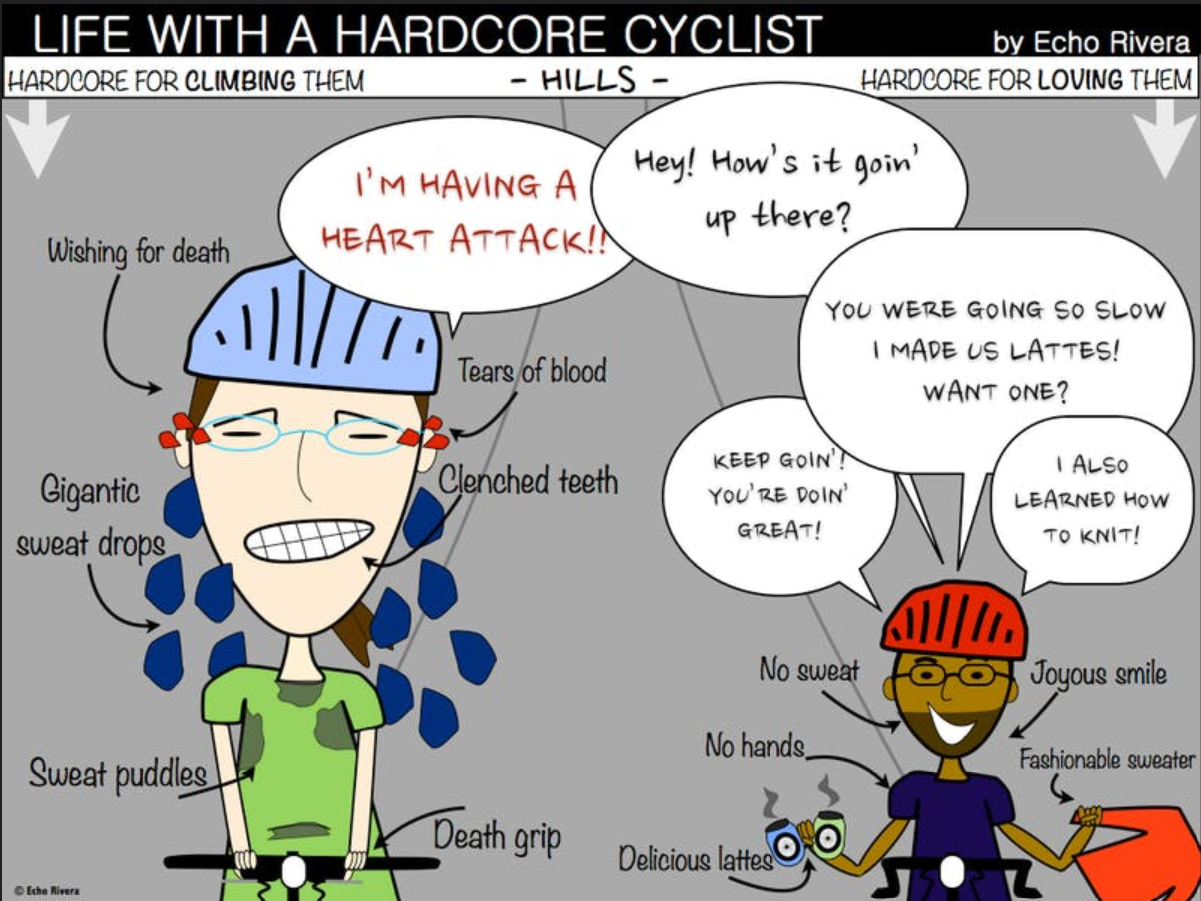
That’s just the shapes feature in Keynote with some text boxes.
That’s it!
So you absolutely do NOT need training, and you do NOT need to use specialized software to create visuals that your audience will enjoy.
But, if you want to take training, then I do have something to help.
In our online presentation program, we have an entire module dedicated to using different types of visuals in your presentations.
This module includes training on:
How to use shapes and icons to create your own visuals
How to create simple hand-drawn illustrations (and animate them)
Plus, there is a whole mini-course on how to use Affinity Designer to create your own presentation visuals.
Check out this case study for an example of some icons a member made for their physics presentation.
As far as I know, ours is the only online course that teaches academics, scientists, and educators such comprehensive skills for creating their own visuals in the context of presentation design.
7. BONUS: Other ways making your own visuals can help
You might be wondering if this seems like an unnecessary and excessive skill to develop just for presentations.
I actually think that’s a really fair point.
So I’d like to end this article by sharing some examples of how I’ve used these skills in ways that go beyond presentation slide design.
When you make your own visuals in professional software like Affinity Designer, you can then use the same visuals in multiple ways, such as:
Infographics,
visual abstracts,
website graphics,
presentation slides,
reports,
social media graphics,
videos,
and more!
Case Study 1: Icons and Infographics
When I hosted @iamscicomm, I wanted to make some visuals to use during my takeover week.
We first made these icons in Affinity Designer:
Then, we used them to create an infographic in Affinity Designer:

Case Study 2: A science comic about hearing
We don’t offer this as a typical service here, but we did use Affinity Designer to make a science comic for Dr. Allison Coffin.

Case Study 3: A Theoretical Model
One client needed to merge two models together for their research work.
One component was a Venn diagram with a context border and the other component was a list of items.
PowerPoint does not provide the level of control over the design to do this well, plus it would most likely look blurry when added to a report.
Case Study 4: Mixed Methods Design Diagram
Another client needed a model demonstrating their mixed method design.
Qualitative and mixed methods researchers will be really familiar with this mode (I’ve even used this same process before!).
Their version included specific details from their project, but here is an anonymized version to protect their confidentiality.

Case Study 5: Stickers and Swag
Thanks to Affinity Designer it’s easy to make high resolution images and send them along to be turned into stickers and swag.
I used to use Sticker Mule for this, but it has since come to light that the co-founder Anthony Constantino supports Tr*mp (via their own unhinged newsletter sent July 2024, that encourages customers to buy stickers in support of Trump).
I’ve been using them for almost 3 years and have never been disappointed.
One year they had a few special events and I … uh … well, I kinda went wild.
Look at all the different types of stickers I have 🤣

Those are just 5 examples of how having the skills to create my own visuals have benefited me beyond just presentation slides.
To me, it’s just the cherry on top for something that I already think is worth it: creating highly visual engaging presentations.
If you found this article helpful, then you’ll LOVE my free training!
with joy,
Echo Rivera, PhD
Links mentioned in this article & additional reading >>