
6 Reasons You Need Good Presentation Visuals

Why are presentation visuals so important?
Maybe you already know that you should be using visual aids in your presentation, but you don’t really know why. Or, maybe you’ve been hearing about the importance of using visual aids in your presentation and you’re doing some research to find out of it’s true.
Either way, welcome to my blog post where I explain the overall value of using visuals in an academic, scientific, educational, or professional presentation. This blog post applies to any type of presentation software you use, whether it’s PowerPoint, Google Slides, or Keynote.
The core reasons it’s so important to use images in a presentation is because using visuals:
Saves you time when creating your presentation, and
Makes your presentation more effective and engaging, and
Helps your career (by gaining a reputation as an effective communicator)
Just in case you’re new to my blog, then you should know how I define an “effective presentation.” An effective presentation is one that increases the likelihood your audience will:
Pay attention to you
Understand what you say
Remember what you said
Use was you said
I say that now so you know I’m not talking about throwing pictures on a slide just for visual interest. My focus is on helping you design presentations that effectively teach your audience.
Now that we’ve got the basics out of the way, keep reading to find out how using the right types of visuals can achieve those goals.
Before I get into that, though, I want to make sure you know about my free training video about effective presentations. Be sure to check that out if you’re interested in making better presentations than the status quo.
Okay. Let’s get back to the blog post now. We’re going to start with how using visuals saves you time, because very few people talk about visuals in this way.
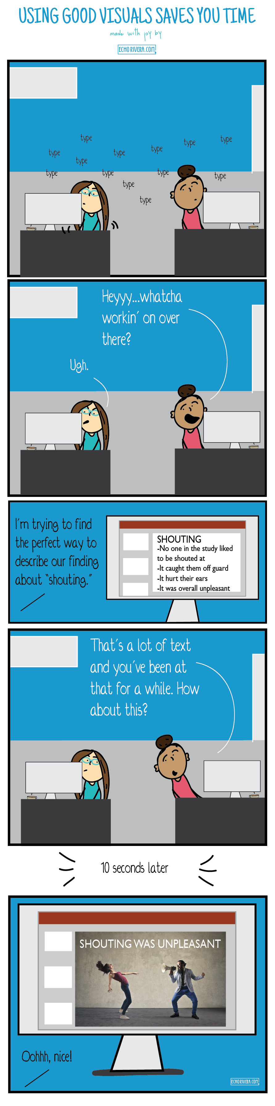
1. Using great presentation visuals saves you time when creating your slides
I know you've heard it before: A picture speaks 1,000 words.
Most of the time people say it to remind us that pictures help other people understand something quickly, at-a-glance. And, that's true (and is the basis for reasons 2-4).
But let's flip that around and think about what that means for the presentation creator (i.e., us). Which sounds more time intensive: Dragging/dropping a picture -OR- typing out 1,000 words?
Even compared to typing out 50 or 100 words, it's easy to imagine how adding a picture saves you time compared to writing out a bunch of text.
Wait. What’s that?
I know what you’re thinking right now.
You’re thinking, “But it takes me forever to find a good visual. It doesn’t save ME time!”
It can take forever to find visuals if you don’t have an efficient system for finding visuals.
For example - do you use Google Images to find visuals? If so, that’s the slowest and hardest way to find good visuals.
As another example - do you search for visuals when you’re working on your slides? Yup, that’s also the time-consuming and difficult way.
Now you’re probably thinking, “What other option is there?”
So glad you asked that, because I have a whole blog/video about a better system for finding visuals that will save you time.
Once I created this system for finding visuals, I've been able to take all the text/bullets from my presentation and turn it into to stunning visuals in minutes.
Yes. Minutes.
Plus, my system increases the likelihood the visuals I find will last a long time. That means I can reuse my great images and don’t have to keep starting from scratch with each presentation.
If you're feeling like you already spend a lot of time on your presentations and you don't believe that it could take less time, then make sure you learn more about my visual database system.
2. Using great presentation visuals helps you catch your audience’s attention
I probably don’t have to tell you that it’s hard to get people's attention these days.
Just about everyone has a computer in their pocket. With this escape at their fingertips, the second they're bored, they're going to do something else.
And the quickest way to make your audience bored? Throw a wall of text/bullet points up on the screen (i.e., #DeathByPowerpoint).
It’s super tempting to blame technology, social media, or the youngins for this. That’s why so many professors and instructors consider things like laptop bans. Don’t do that, though, because the problem is most likely not their laptops.
The problem is more likely to be a lack of effective visuals in your presentation (among other common presentation mistakes).
And it’s important to care about this step.
If your PowerPoint, Keynote, or Google Slides have so much text that your audience doesn’t even want to pay attention to your slides, how will they understand or remember the material?
They probably wont. So we need to get their attention, and walls of text just don’t do it.
Let’s look at this together. Which slide is more likely to catch people’s attention. This wall of text?

Or this highly visual slide?

Obviously, it’s the presentation slide with the great visual (and minimal text).
Now, it’s also easy to dismiss the idea of putting effort into your slide design because you think your audience should “meet you halfway.”
That’s honestly a fair point. Your audience does need to meet you halfway.
But you need to meet your audience halfway, too. And that wall of text up there? That’s not halfway.
And here’s the hard truth: Our human brains prefer visuals over text.
That’s just the way it is.
When you have too much text on your slides, you’re encouraging people to ignore your slides.
In contrast, if you use high quality visual aids in your presentation (and format them properly), you’ll significantly increase the chances of your audience paying attention to you instead of their device.
3. Images in your slides help your audience understand the presentation material
We already know that our brains process visuals much quicker than text.
One reason is because of working memory and cognitive load.
Our working memory is that space where we're processing, thinking, and trying to fit that new bit of info into its new "home" in our brains.
It's really easy for us to get overwhelmed during this process—especially if there are distractions, we're tired, or get confused.
The quickest way to make your audience overwhelmed? Speaking while you have a lot of text on your slides.

The best way to make sure your audience makes it through that working memory stage? Less text and more pictures on your slides.

Yes, even for academics. Yes, even for scientists. Yes, even for data nerds. We all have limits on our working memory and we all benefit when speakers take that into account when designing their slides.
Plus, some people struggle more than others. Have you wondered how to make your presentations more accessible?
Walls of text and too many bullet points on your PowerPoint slides are highly exclusive and go against universal design strategies. Using great visual aids is one way to enhance the accessibility of your presentation slides.
For example, have you heard of Aphantasia?
It’s a condition where someone cannot picture images inside their head. For example, if I told you to picture a red star. Do you actually see a star in your mind’s eye? Or is it pretty much just darkness?
If you’re like most people, you actually saw that red star in your mind. If you have Aphantasia, you probably saw darkness (I’m oversimplifying this of course, but here’s a test).
That’s just one example of many instances where visuals help make your presentation more accessible to a broad audience.
4. Presentation visuals help audiences remember the material
Building on the last point, if people don’t understand the information you share, it’s going to be hard for them to store it in long term memory.
Or, worse, it stores into long-term memory, but is actually incorrect because they couldn’t follow along with your presentation.
Research shows that the combination of a great visual + a little bit of text increases the chances of information making it to long-term memory.
Again, just like with all the other examples I’ve mentioned, slides with too much text and too many bullet points are terrible at this task.
5. Good presentation visuals resonate with audiences and inspire people to act
The ultimate goal of your presentation is to get your audience to DO SOMETHING with the information, right?
Maybe you want your undergrads to do well on their exam.
Maybe you want policymakers to approve Medicare for All and cancel all student debt.
Whatever it is, you’re giving a presentation to change your audience in some way.
So let me ask you this: how will your presentation inspire people to act if they:
didn't even pay attention?
were confused by what you said?
never resonated with what you said?
misunderstood what you said?
forget the info a week later?
didn't enjoy the experience and were bored and uninspired?
We’ve already talked about how using great visuals will help your audience pay attention, understand, and remember the material.
But there’s an advantage of visuals we haven’t talked about yet: resonating with your audience.
If you want that to happen then you need to make your audience feel emotions. You need to connect with your audience on an emotional level.
A lot of academics and scientists are trained to avoid emotions at all costs, and that’s a critical mistake to make when you’re creating a presentation.
Here’s a helpful little rhyme to help you:
If you want them to do something with the info you share, you need to make them care.
For example, let’s say you’re trying to help your audience improve their habits. Maybe you want to help them have better data management systems. Or maybe you want to help them develop healthier eating habits.
How effective do you think this will be at resonating with them?

The answer is: it won’t be. No one — literally no one — resonates with a wall of text in a presentation.
But what if we used a slide like this, instead:

The answer is: it will resonate.
Why? Because it’s a hilarious photo that comes across as non-judgmental. Plus is has minimal text and I’ve applied several best practices for slide design in this slide.
Don’t worry. I’m not saying you should only care about emotions. This isn’t a marketing pitch you’re creating.
I’m saying you need to balance all your facts with some emotions. Storytelling is one way to achieve this, but that can be difficult and is what I consider to be a more advanced presentation skill.
There’s a much easier way to start that isn’t as risky to do: use great visuals!
6. Using presentation visuals can directly and indirectly be good for your career
This is a benefit of using visuals in presentations that almost no reader sees coming.
The easiest example of this is that it can actually help improve your job talk or teaching demo.
Yes, your job talk or teaching demo should have visuals! That’s probably the most important presentation of your career, and it’s important to use visuals and avoid giving a #DeathByPowerpoint presentation.
You must do better than the status quo to make a good impression, and nothing screams status quo like a presentation that looks like this:

But using visuals in presentations can help your career in more indirect ways, too. Mainly this is because using great visuals is part of presenting effectively, period.
And when you present effectively then you will develop a solid reputation as someone who can communicate complex information in digestible and accessible ways.
Trust me. That’s a big deal and people will want to keep you around just for that reason.
You’ll also be more memorable when you deliver conference presentations, which further enhances your reputation and professional network.
So... Should you use presentation visuals?
The answer is Yes.
There are no exceptions for your audience or topic. Every single audience and every single topic benefits when you prioritize using more visuals in your presentations.
It’s important to note, however, that it’s not just about having a picture in your presentation. You must use visuals effectively, which means:
Choosing the right type of visual for your content and audience
Reducing the text on the slide, so there is room for the visual
Formatting the visual so it resonates with your audience
Before you go… if you thought this post was helpful, then you’ll LOVE my free training! Don’t leave without clicking that button below to learn more about it!