
Presentation Skills Professional Development Program
For researchers, academics & other professionals who want undivided attention from their audience, proof their presentations are actually making a difference, and confidence in themselves as a speaker.

Does this sound like what you want when you give a presentation?
UNDIVIDED ATTENTION from an engaged audience (any audience).
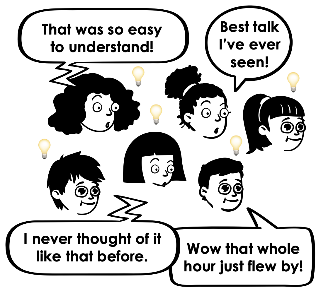
PROOF OF IMPACT & confirmation that all your efforts were worth it.
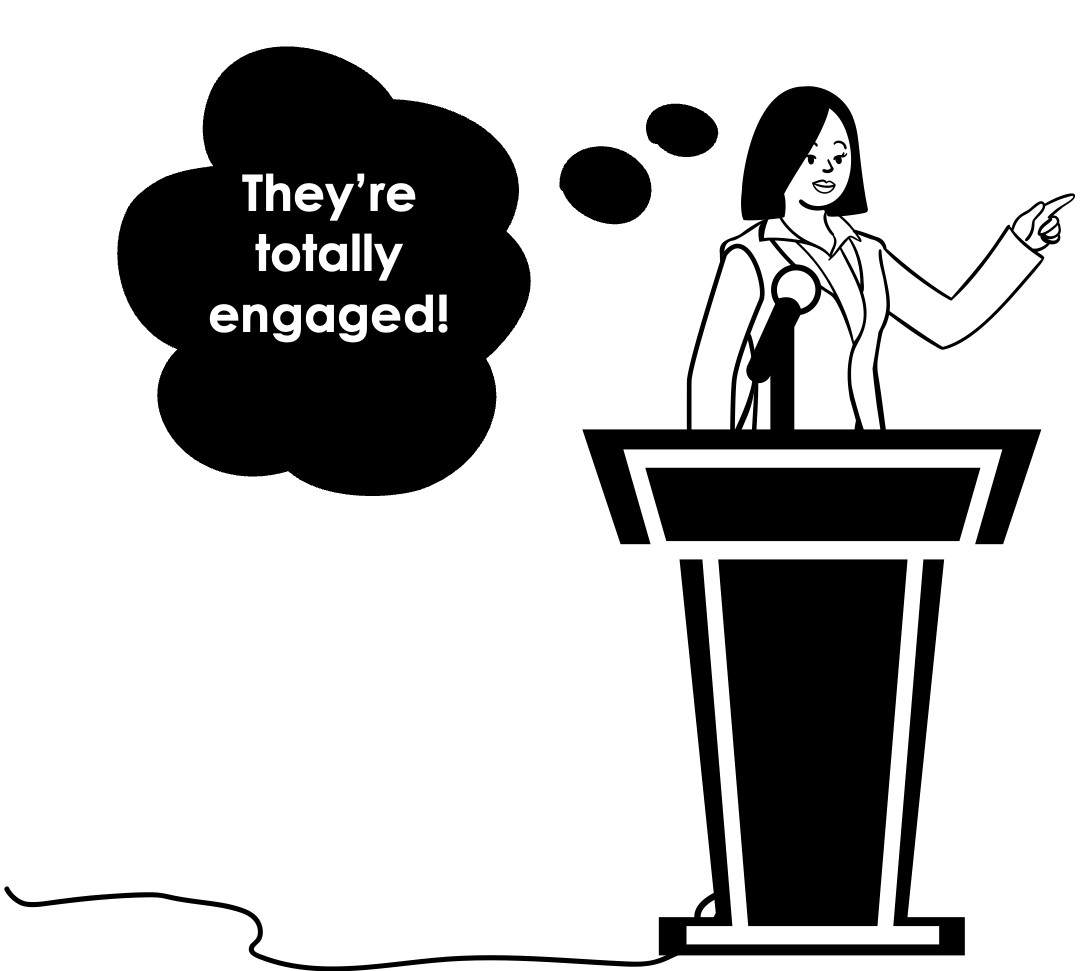
CONFIDENCE in yourself as a speaker. AKA finally having that feeling of “I nailed it!”
…But, when working on your presentation, you don’t want to…

SPEND AGES UPON AGES on every single presentation you make. (You’re way too busy).

STRESS OUT that you’ll forget what you’re going to say because you’re using more visual slides.
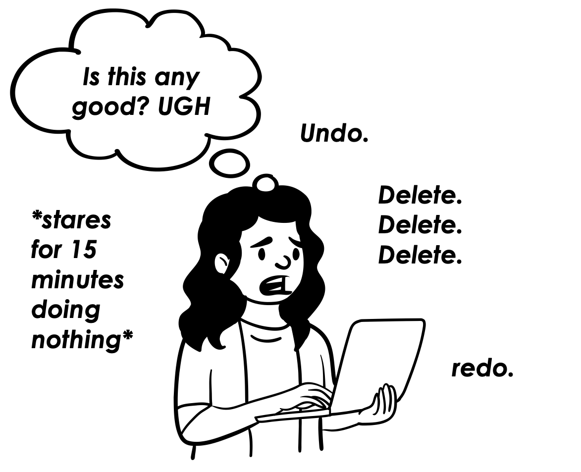
WORRY that you’re making the wrong slide design or presentation script choices.
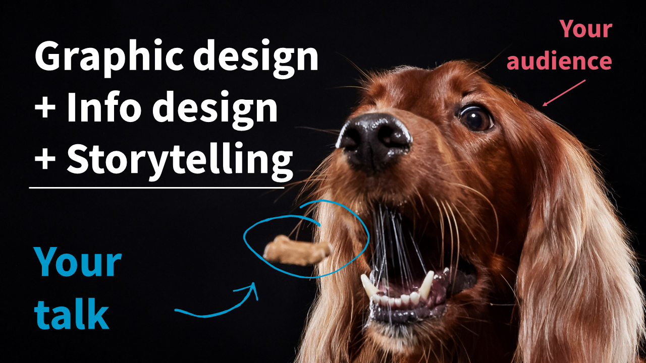
Join my visual presentation skills course and become a pro at making ANY info interesting & engaging (without it taking forever)
In my program, you’ll learn how to apply an information design framework that lets you quickly whip together engaging, easy-to-follow, visual presentations that will keep your audience engaged enough to actually learn the thing.

Master new visual slide design + presentation script writing skills with 4 focused modules…
…And have an easier time applying it all with handy implementation tools.


#1. Slide layouts you’ll learn
Text only slides (to replace the “Title & Content” layouts)
Core content slides with text ^ a photo (3 layouts)
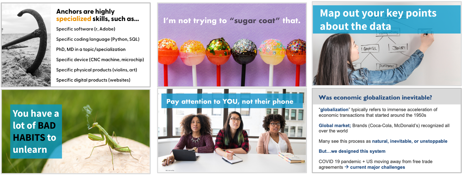
#2. Slide layouts you’ll learn
Multiple photos
Key point/summary slides
Text & icon layouts
Section (agenda) slides
Title slides
Custom visuals like timelines, process, venn Diagrams, models, etc
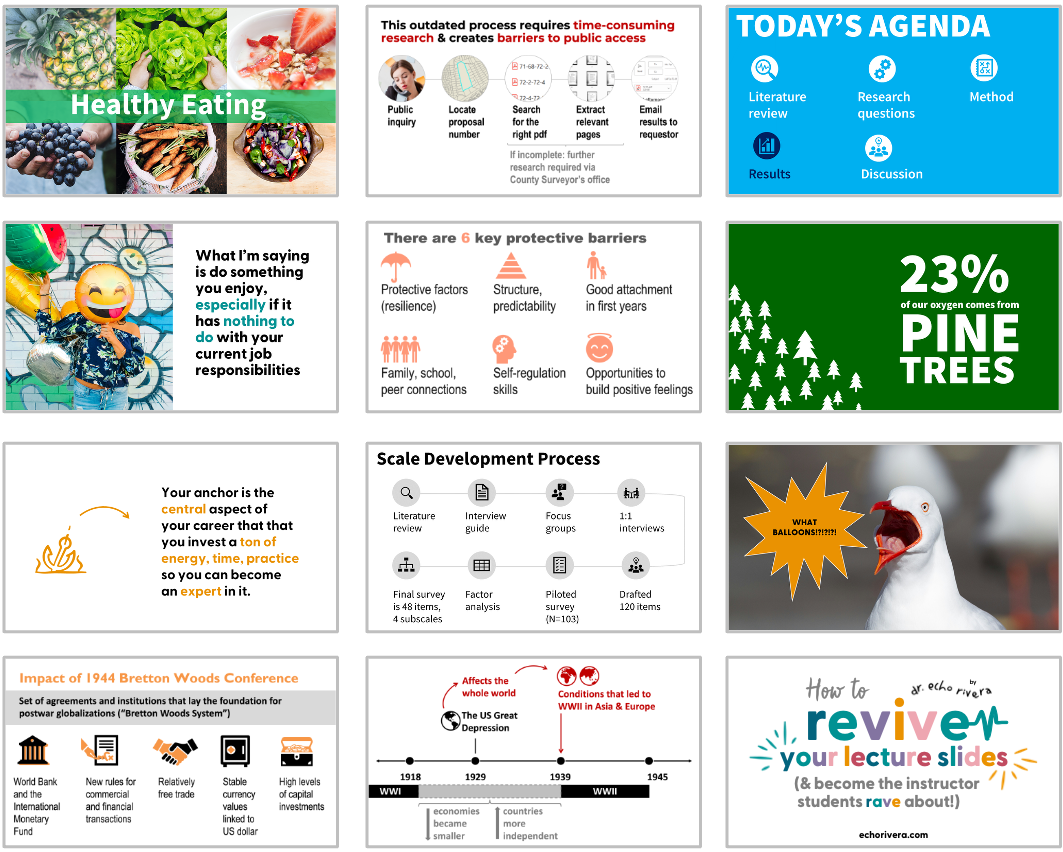
#3. Slide layouts you’ll learn
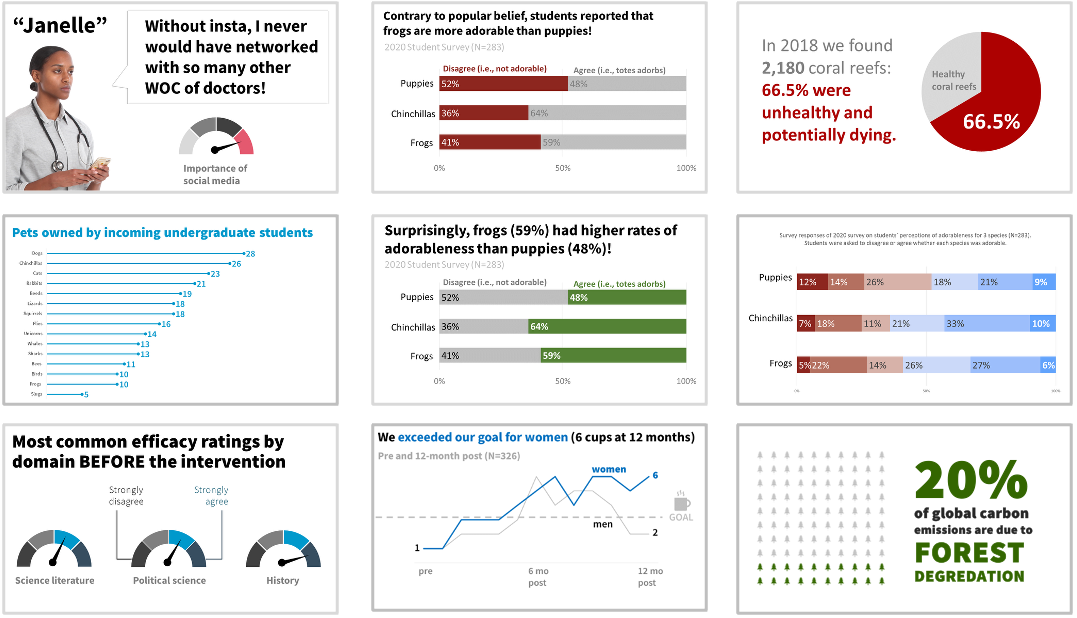
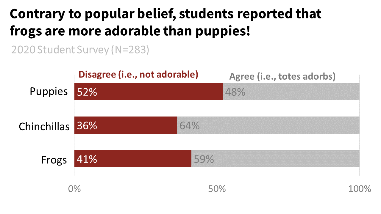
Tables (incl. for qual themes/codes)
Bar charts (horizontal & vertical)
Stacked bar charts
Line graphs (incl. slope charts)
Pie charts, waffle charts, icon arrays
Lollipop graphs
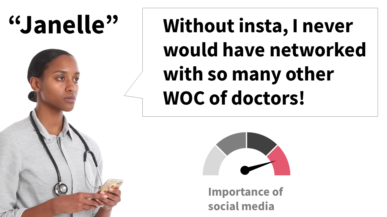
Qual quotes
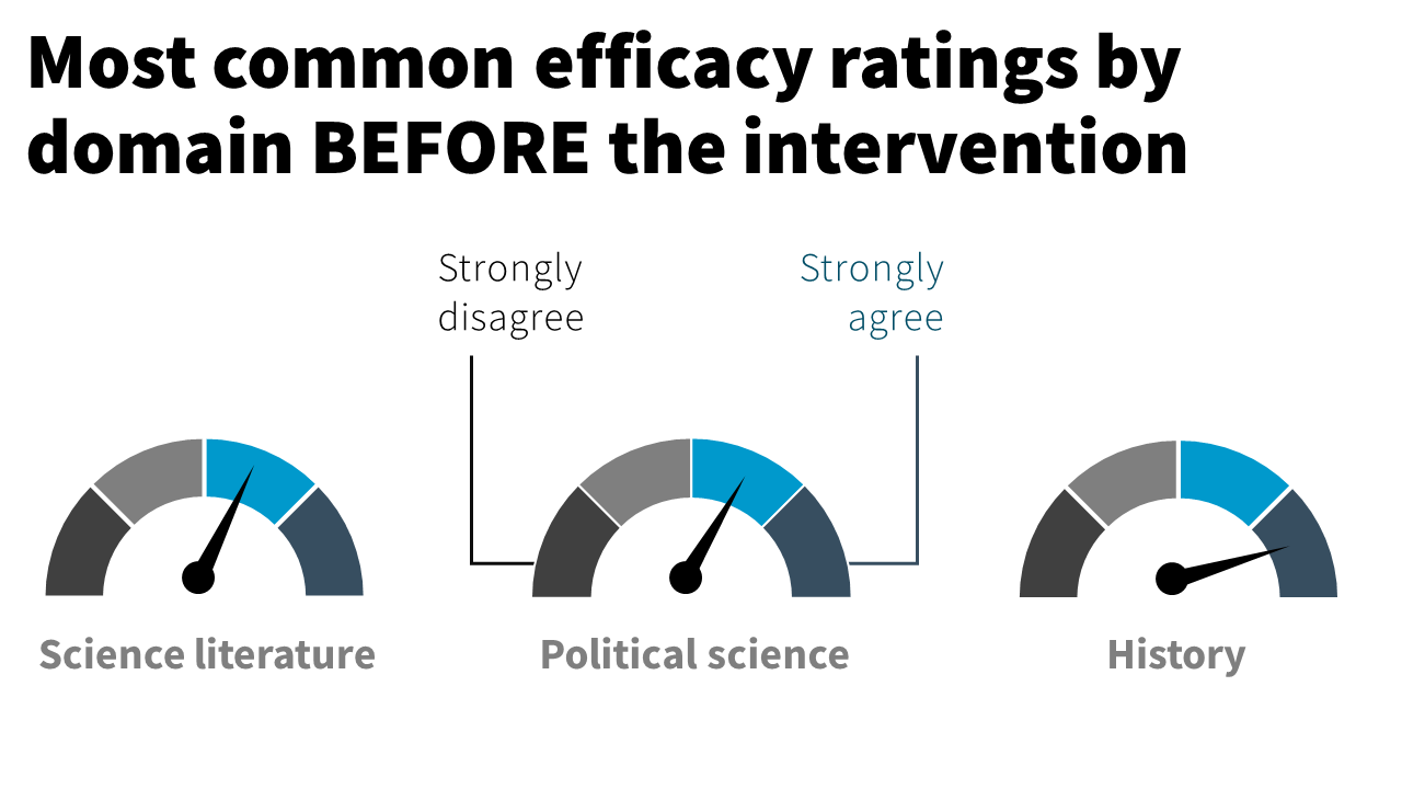
Gauge charts (speedometers)

#4. Slide x scripting x storyboarding you’ll learn
Opening hooks (go beyond “ learning objective” slides)
Strong closings (no more “thank you” slides)
Visual themes or models that change or update as you go
Special slides that help you give the audience a mental break (i.e., prevent cognitive overload!)
Audience interaction ideas (+ slides to encourage participation)
Tailoring to your audience
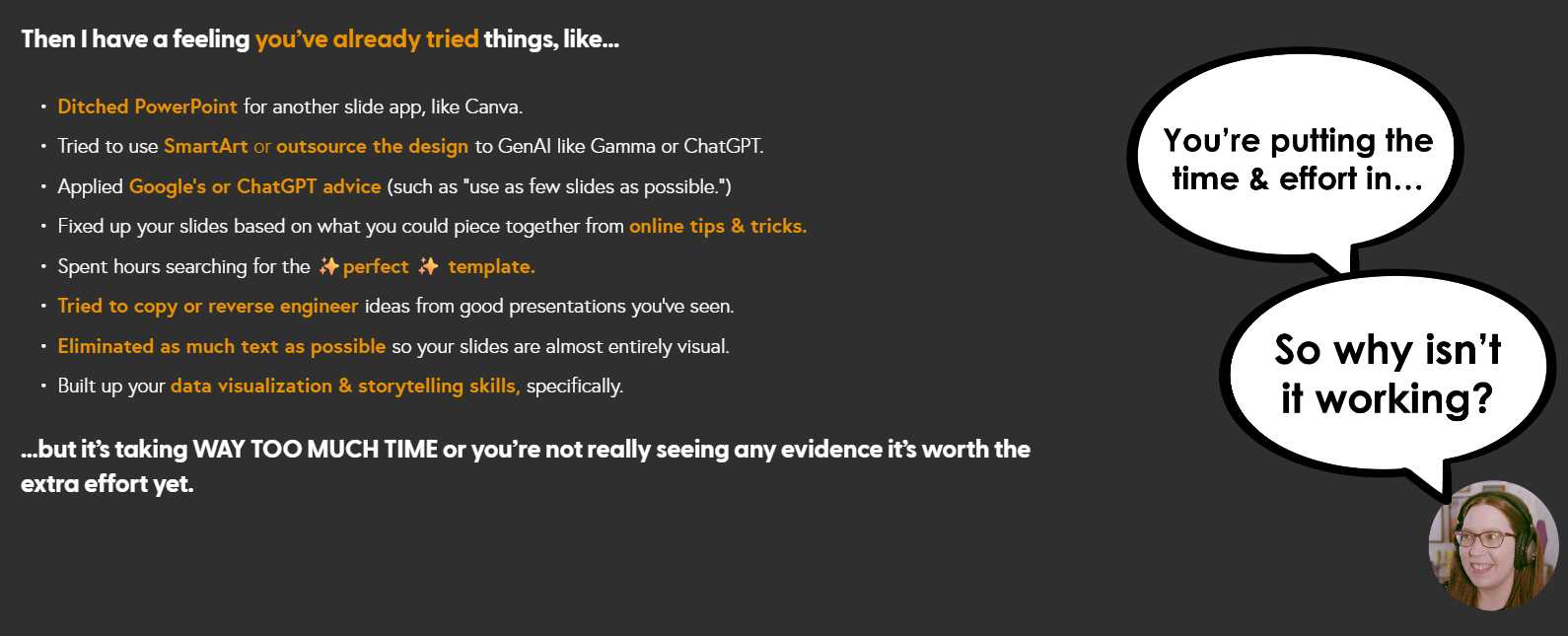
I have a feeling you’ve already tried things, like…
Ditched PowerPointfor another slide app, like Canva.
Spent hours searching for the ✨perfect ✨ template.
Tried to make SmartArt or DesignIdeaswork.
Tried to have GenAI like Gamma or ChatGPT do the design or create your visuals.
Usingas few slidesas possible.
Tried to copy or “reverse engineer”ideasfrom good presentations you’ve seen.
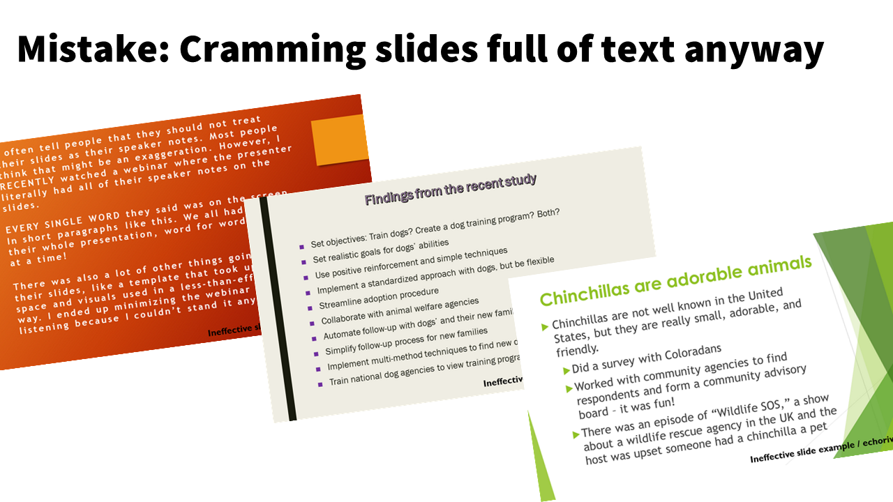
Eliminated as much text as possible,so your slides are almost entirely visual.
Built up your data visualization & storytelling skillsspecifically.
If so, that’s a sign you’re dedicated to making better presentations. Nice. Let’s align your efforts with actual impact.
Here’s what’s going on ~

You’re stuck on a hamster wheel of effort without impact.
If you’re trying all the tips and tricks to make better presentations, but it:
takes too long
still doesn’t seem to look sleek and professional
still isn’t landing right with the audience (or even gets pushback from them!)
Then it’s really easy to get discouraged and you might be tempted to:
give up and just go back to the old way…
worry that you can’t do it…
think that the audience wants text-heavy, standard presentations
But the problem isn’t you (or your audience).. It doesn’t have to take forever, it can be fun, and both you and the audience will benefit.
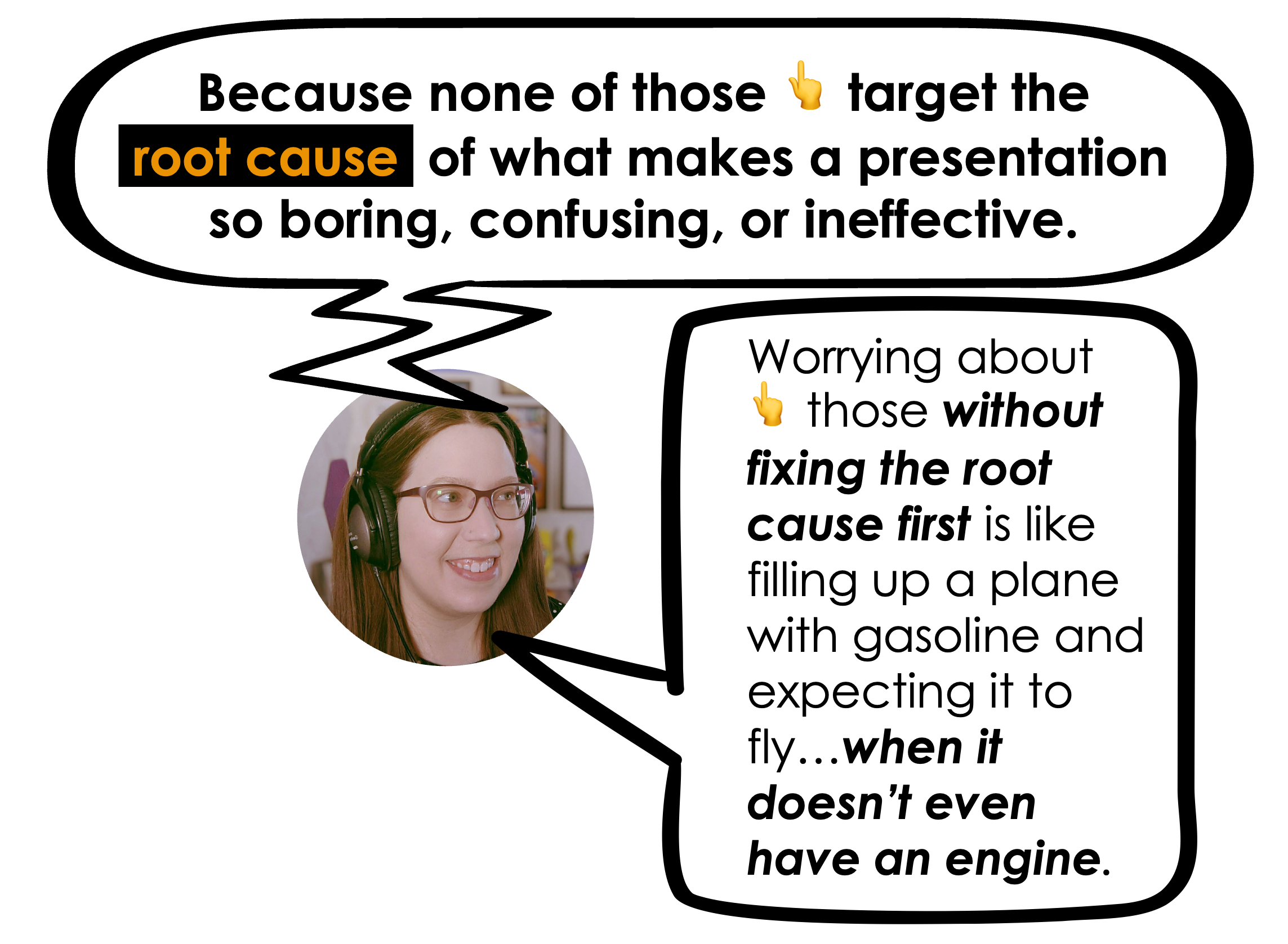
The reason it’s not working is because none of those above strategies target the root cause of what makes a presentation so boring, confusing, or ineffective.
(or why it feels so time consuming to make 😮💨)
You need to address this root cause, because otherwise it’s like filling up a plane with gasoline and expecting it to fly…when it doesn’t even have an engine yet.
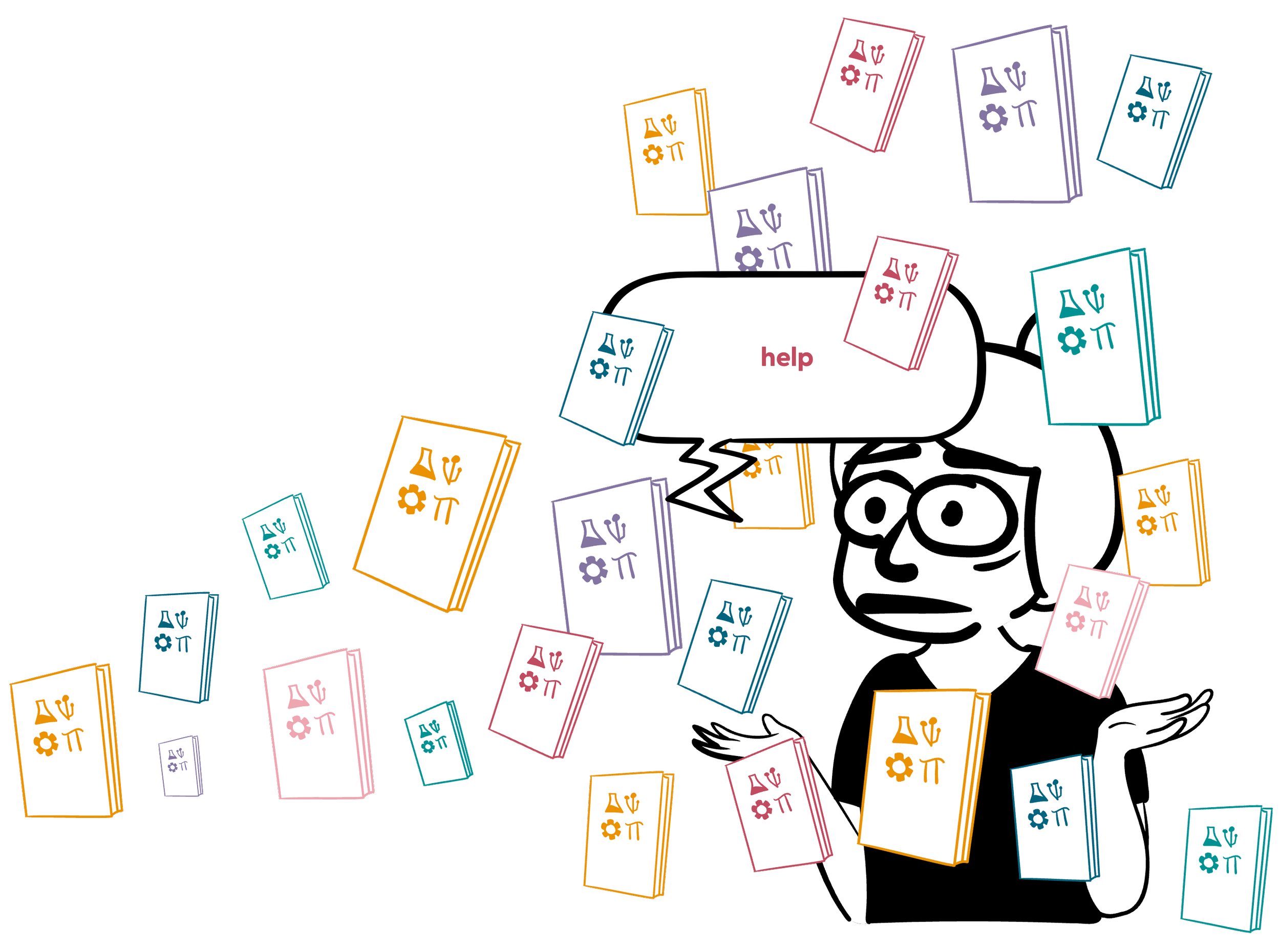
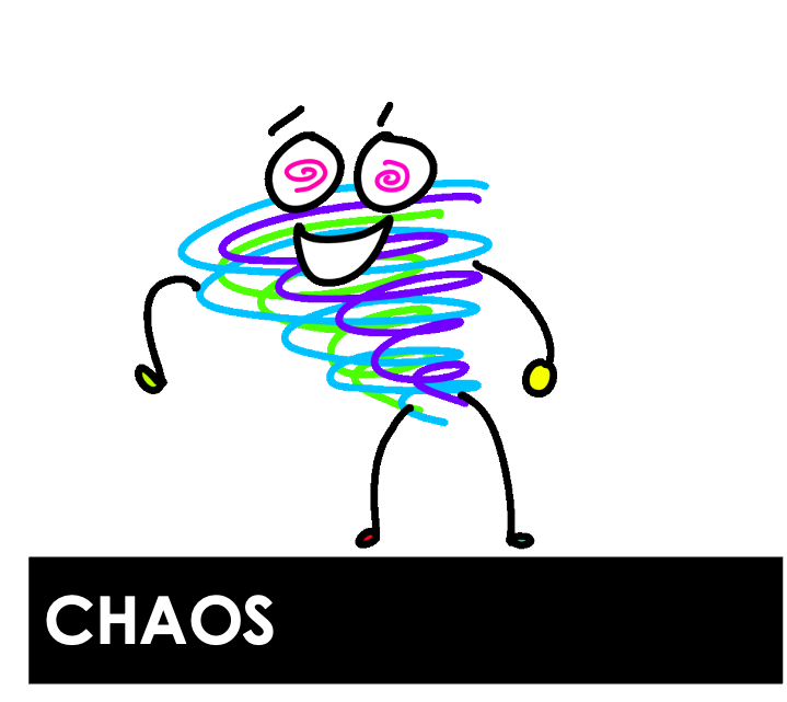
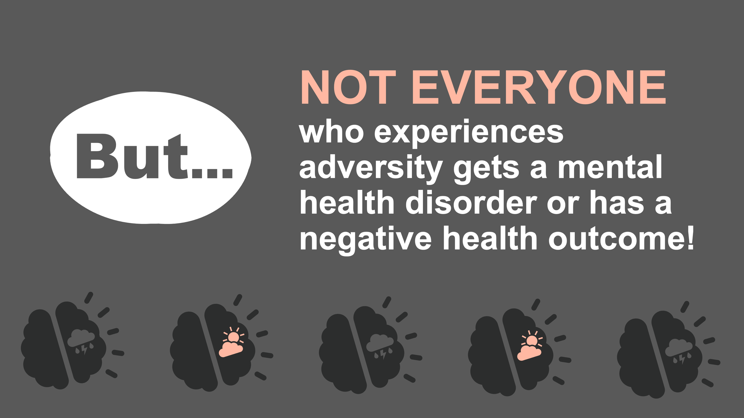
So what’s the root cause 👇 of bad presentations in every industry, across the world? Cognitive overload.
COGNITIVE OVERLOAD
is when your audience member’s brain gets “overheated” & involuntarily shuts down and disengages. It’s the #1 reason your audience will disengage from a presentation.
But, it just so happens to be the most preventable…
(IF you intentionally design for it).

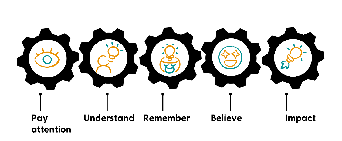
Why should you care about cognitive overload?
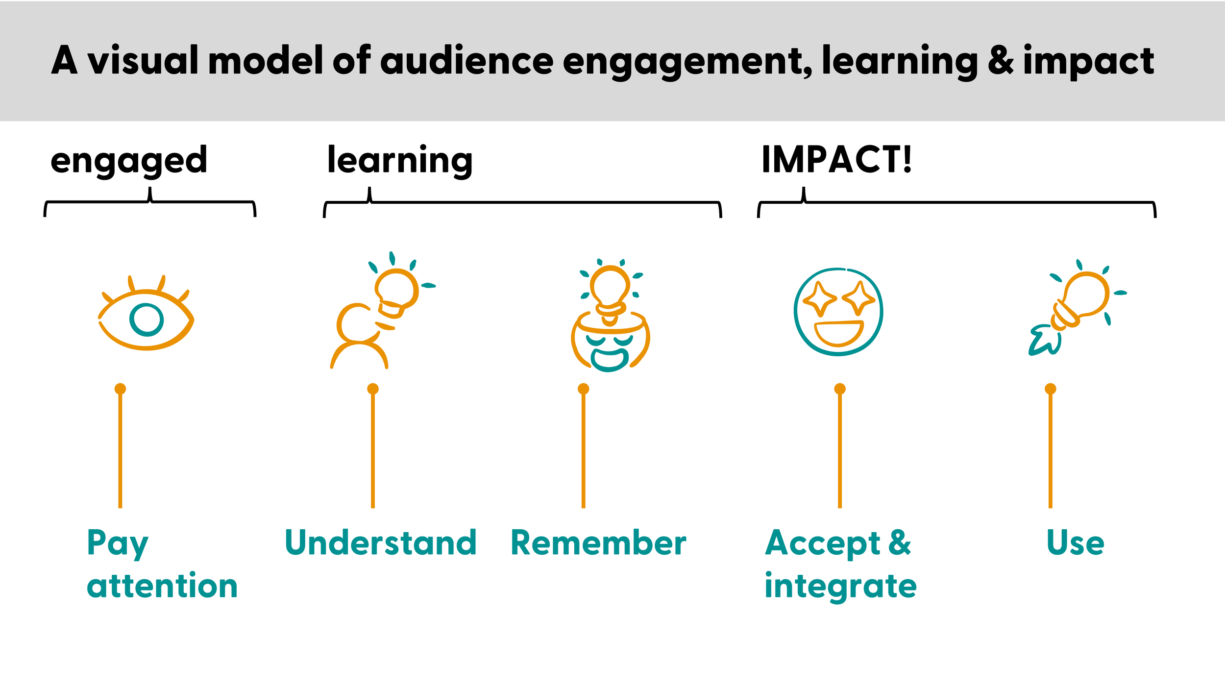
If you give presentations and want your audience to:
Be fully engaged with undivided attention
Actually understand what you’re saying
Remember the key points you presented
Trust and believe what you’re saying
Be impacted in some way by your talk, lecture, or training
then…the #1 thing stopping you from achieving these outcomes is when your audience’s brain gets overheated. What’s happening behind those blank eyes is that their brain can’t keep up with you. How do I know? In part, due to my PhD in psychology (but more on that later 😉)
Yes, it feels like your audience has the attention span of a goldfish right now. There’s no denying there’s been a shift in this over the past decade.
That was always a problem, but life is a lot more complicated for people, which means they’re going to brick from cognitive overload faster than ever.
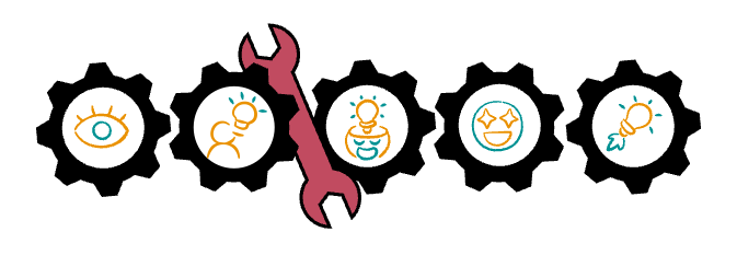
Cognitive overload is like a wrench that grinds this whole process to a halt…
…And when the gears stop, we see blank stares & distracted faces.
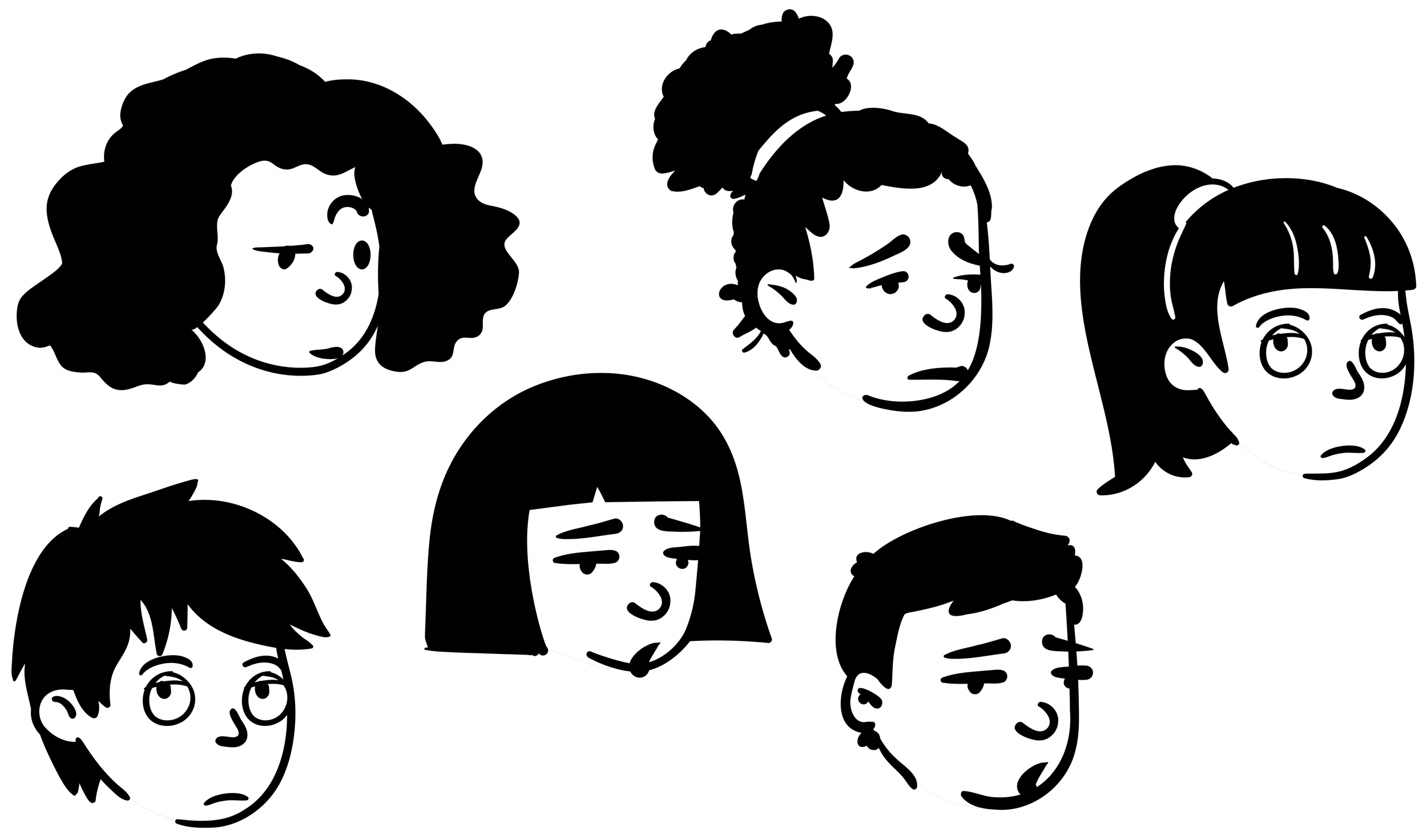
Who bricks from cognitive overload pretty quickly?
(especially compared to 10 years ago)
It becomes harder to stay focused when we are stressed, worried, sad, in pain, hungry, or tired.
…and that alone probably describes 👏 your 👏 entire 👏 audience 👏
Smart, busy professionals who have competing demands? High achievers who have a lot of things they need to get done? Students taking multiple classes? People worried about their business?
Yeah, they’re going to check at least one of those boxes.
And staying focused on a presentation is even harder when you combine those with things like:
learning disabilities
ADHD
physical disabilities
chronic pain/illness
any type of mental health struggles
(Because just existing with these increases the likelihood, frequency, and intensity of things like stress, anxiety, depression, pain, fatigue, etc)
So if you’re one of the few people who presents in such an engaging way that even busy, stressed out, hungry people can focus on? You’re going to shine.

Cognitive overload is like a wrench that grinds the whole attention & learning process to a halt.
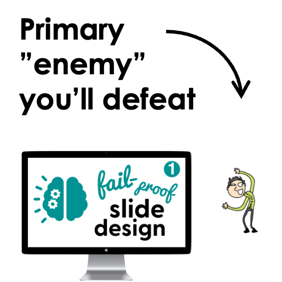
But don’t worry, I make this easy to fix. You’re going to stop it for good by “defeating” the 3 things that cause cognitive overload >>>
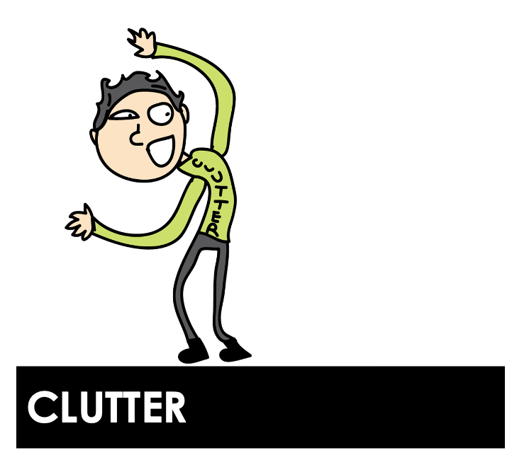
Anything in your presentation (script or slides) that doesn’t need to be there.
AKA form over function
Anything in your presentation (script or slides) that is messy, scattered, or disorganized.
AKA neither function nor form
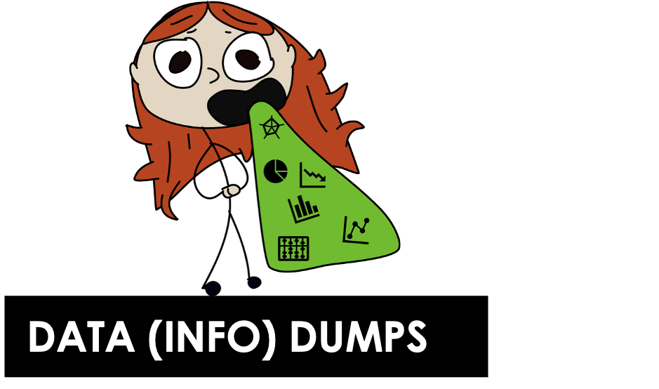
A presentation that fails to give the audience the mental breaks they need to stay engaged…or a presentation packed with content that just falls flat.
AKA function over form
You’re not going to “dumb it down.” You’re not going to turn into some clown entertainer.
You’re just going to use some different strategies to make the type of professional, modern presentations you’re already trying to make.
Presentations that are…
Clear & concise

Easy to follow along with and understand

Captivating, interesting, and memorable

AKA function x form
AKA information design


✔️ graphic design
✔️ PowerPoint (tech) skills
✔️ psychology & cognitive science
✔️ storytelling
✔️ pedagogy
✔️ user experience & user design
✔️ visual hierarchy
✔️ vector & photo design
✔️ developing an eye for design
✔️ data visualization
✔️ effective communication
✔️ universal/accessible design

You’ll learn all of it
(without being overwhelmed)

This is the professional development program that teaches you how to leverage psychology and other skills to design visually-engaging, digestible presentations

About the framework you’ll learn
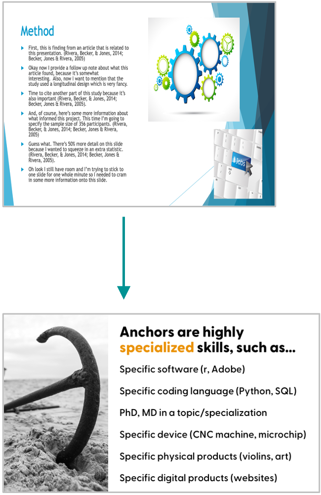
#1. Clear the clutter + Create an accessible “minimum viable” base design
The first step is to clear up some space for better design by removing clutter.
You’ll create a “minimum viable” base design, which are slides that:
Are more accessible
Look great as is (and can enough for one-time presentations)
Can be “upleveled” quickly and easily over time
You’ll get used to slides with less text, more visuals, and better pacing.

#2. Calm the chaos + Up-level slides with your own custom, creative visuals
The second step is to up-level those base designs. This is where you learn how to visualize any content you have, no matter how dry or technical it is.
You’ll learn a menu of design options:
ranging from low effort, medium effort, and high effort;
using using basic features like text boxes, shapes, animations, and icons.
You’ll also fix common issues that make the presentation too chaotic for your audience to follow. We’ll use simple structures and improve the balance between what you show with what you say. You’ll see a big difference in how much easier it is for your audience to follow along.
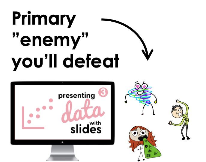
#3. Present quantitative & qualitative data effectively
Like course 2, this is an “upleveling” stage, but with quantitative and qualitative data as the focus. This is where you start telling data stories (without losing site of the data).
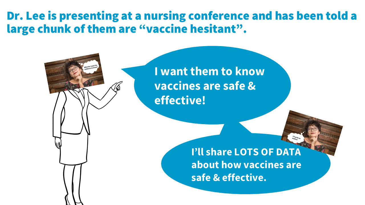
Never again slap a table or chart on a slide and stumble through your explanation. You’ll learn how to walk people through data on presentation slides so they understand and remember your key points.
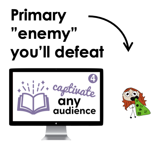
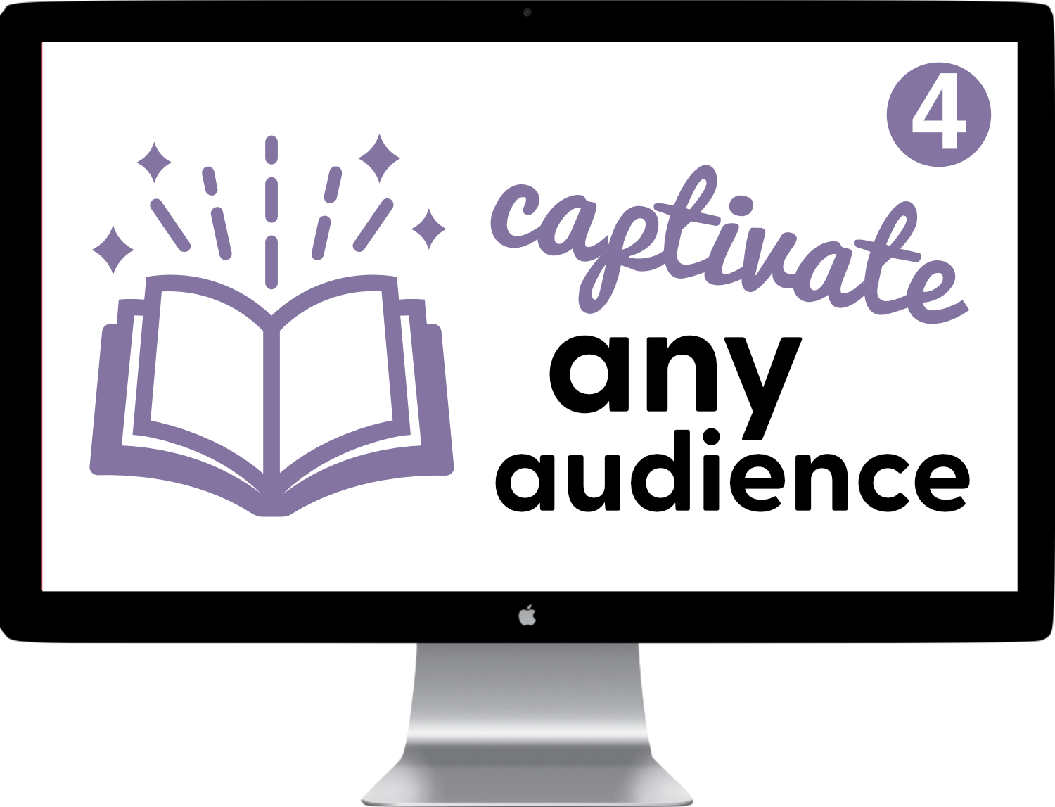
#4. Storyboarding the ”wow” factor: How to captivate any audience, with any topic
The final step is to focus on the script/content (the storyboard).
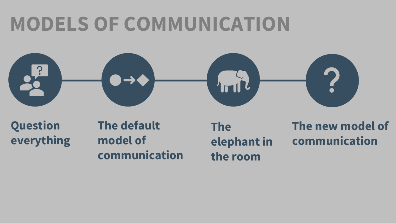
This is when you learn how to ditch the information deficit model of communication, and gain the ability make any material more interesting and impactful (no matter how technical, dry, or complicated).
We’ll even cover how to tailor material to the audience, and cover public speaking tips for a solid, confident delivery.

In all, it’s about 32 hours in length
(that’s like being able to to take 4 professional development workshops, but at home & at your own pace!)
About the
slide layouts you’ll learn

#1. Slide layouts you’ll learn
Text only slides (to replace the “Title & Content” layouts)
Core content slides with text ^ a photo (3 layouts)


#2. Slide layouts you’ll learn
Multiple photos
Key point/summary slides
Text & icon layouts
Section (agenda) slides
Title slides
Custom visuals like timelines, process, venn Diagrams, models, etc


#3. Slide layouts you’ll learn
Tables (incl. for qual themes/codes)
Bar charts (horizontal & vertical)
Stacked bar charts
Line graphs (incl. slope charts)
Pie charts, waffle charts, icon arrays
Lollipop graphs
Qual quotes
Gauge charts (speedometers)

#4. Slide x scripting x storyboarding you’ll learn
Opening hooks (go beyond “ learning objective” slides)
Strong closings (no more “thank you” slides)
Visual themes or models that change or update as you go
Special slides that help you give the audience a mental break (i.e., prevent cognitive overload!)
Audience interaction ideas (+ slides to encourage participation)
Tailoring to your audience

Plus you get
implementation resources!
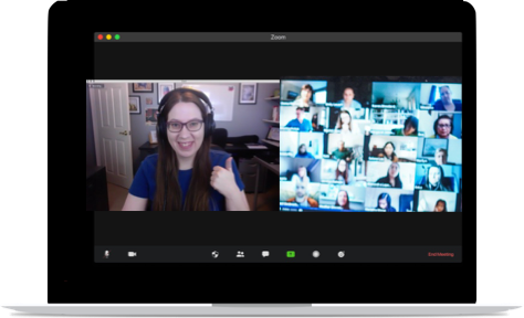
Quarterly member office hours (group zoom calls)
Get feedback on your presentation slide designs & scripts/storyboards
Get your questions answered
See examples from other members
Get support with struggles or challenges
Celebrate successes & wins
Feel comfortable sharing—these are not recorded.
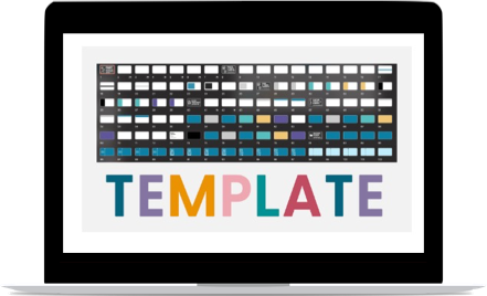
PowerPoint template made by me — with 100+ layouts (including data visualization templates & assets)
100+ layouts, includes data visualization templates & assets.
I took me 60+ hours to put this together because I wanted this to be something YOU could use for any presentation.
Includes training videos on how to use and edit the template to perfectly fit your content, brand, style, and needs.
The program itself is mainly software neutral, but I do recommend PowerPoint, so this PPT template + bonus training is included as a bonus.

Curated photo library of 1,200+ FREE stock photos you can download + mini-course on finding/using visuals
No need to spend hours searching for free stock photos. I’ve curated 1,200+ of them for you! (saves you 20+ hours)
It took 20+ hours to put together, plus I update them regularly. And, you get to keep access even after you’re done with the program.
Where to find free stock photos? Icons? What about copyright? I answer all those questions (and share links to my fav sites) in the mini-course.
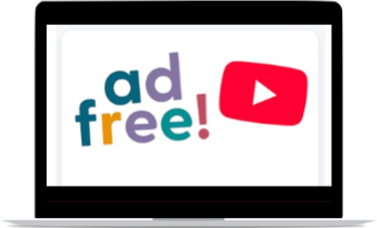
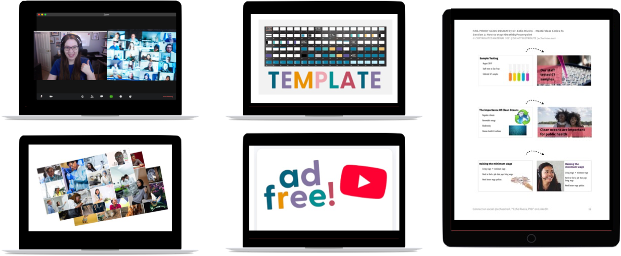
Complementary tech training & supplemental videos
PowerPoint tutorials, full-length webinar style talks, and other supplementary videos are available on my YouTube channel, More Than Powerpoint!
Course members get access to a private portal of these YouTube videos, so you can watch them without every having to leave the course (ad-free).
Plus, this private portal includes bonus content, such as answers to questions people posted in the comments.
Worksheets, handouts, PPT slide deck files, and checklists
Every lesson comes with a downloadable handout that you can keep forever, and reference whenever needed.
Throughout the course, you will also have additional downloadable materials such as worksheets, checklists, presentation files, and more!


Join the presentation skills masterclass today!
Choose 6 months of access or save $200 and get a full year of access. A payment plan option for each is available. Prices are in USD do not include sales tax or VAT. Sales tax/VAT will be added where applicable.

6-month access
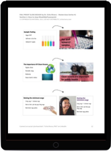
Course #1: Fail-Proof Slide Design
Course #2: Visual Slide Design
Course #3: Presenting Data with Slides
Course #4: Captivate Any Audience
Quarterly office hours (with me, Dr. Echo Rivera)
60+ supplemental videos with bonus content
Photo Library + mini-course (saves you 20+ hours)
Custom PowerPoint Template (saves you 60+ hours)
Downloadable PDFs, checklists, and files
1 year access (save $200!)
Course #1: Fail-Proof Slide Design
Course #2: Visual Slide Design
Course #3: Presenting Data with Slides
Course #4: Captivate Any Audience
Quarterly office hours (with me, Dr. Echo Rivera)
60+ supplemental videos with bonus content
Photo Library + mini-course (saves you 20+ hours)
Custom PowerPoint Template (saves you 60+ hours)
Downloadable PDFs, checklists, and files


Millions of hours are not required
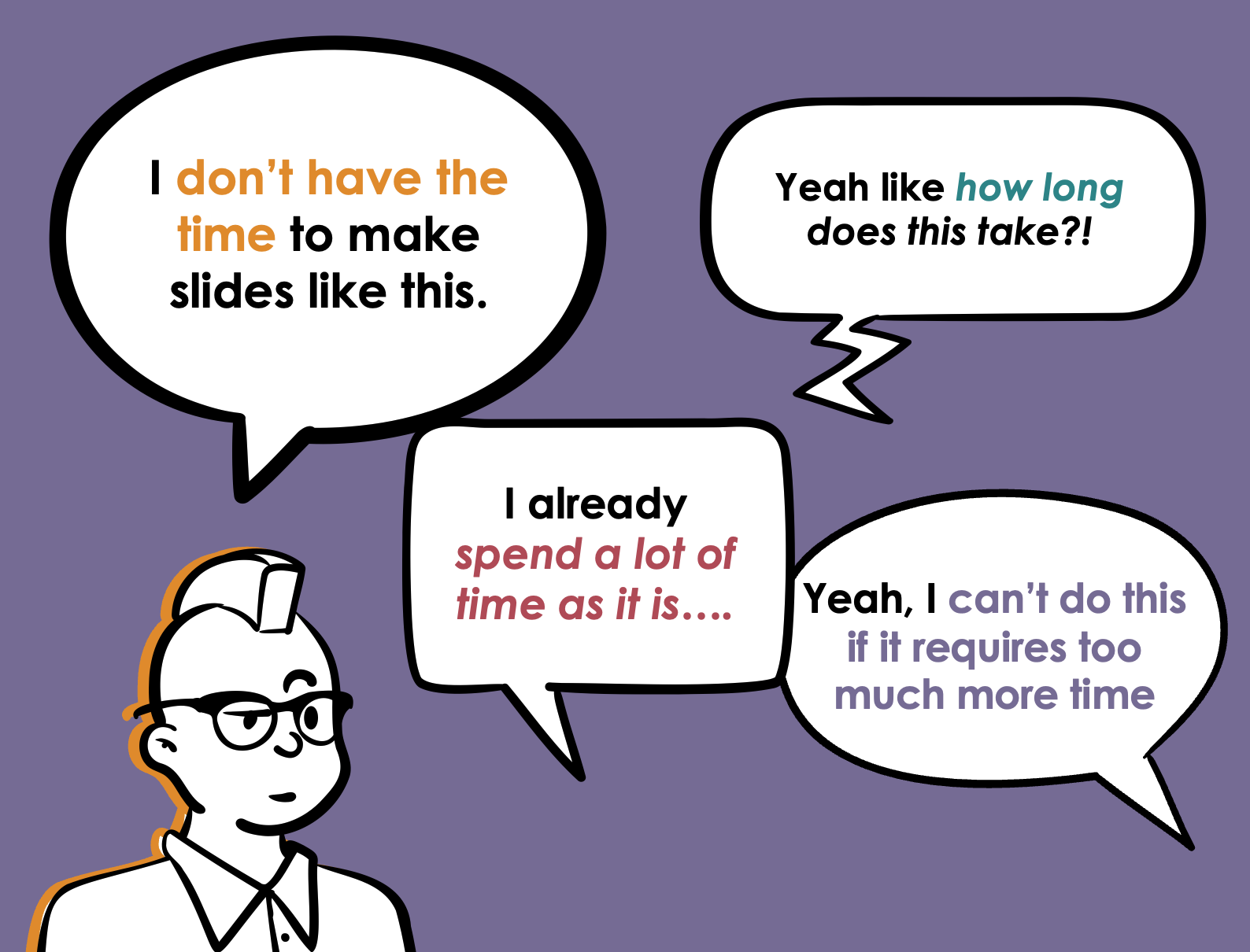
“How long does it take to make slides like this?” You choose.
I don’t know how much time you’re spending right now, but members report that they can make better slides, in LESS time then they were spending before the program.
The whole framework begins with “minimum viable” slides for a reason—so you can whip together slides in as little time as possible, while also making them LOOK like you spent more time on them than you did.
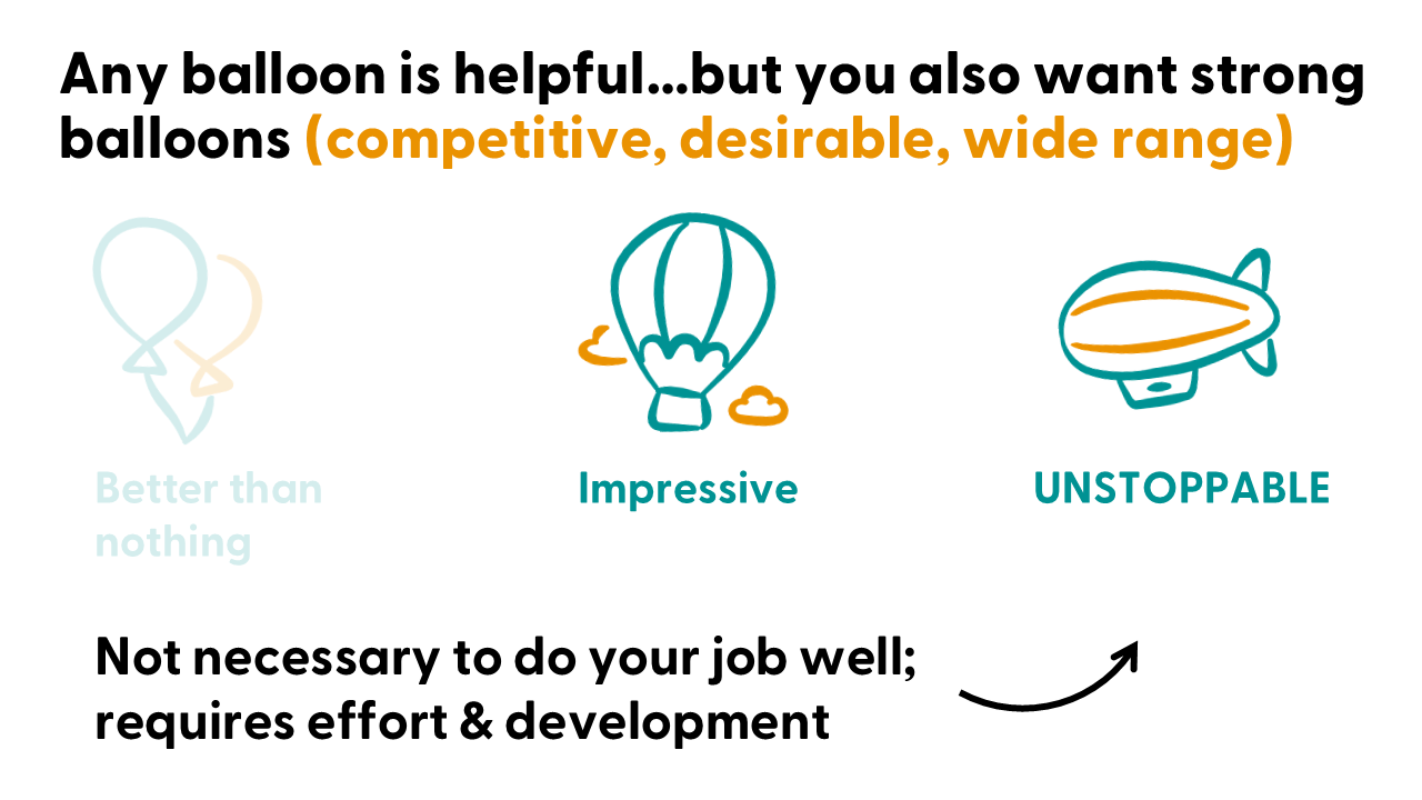
But, for high stakes presentations like keynotes, TED talks or TEDx talks, job talks, teaching demos, sales webinars, or book tour talks…the framework also shows you how to impress your audience.
So, you’ll choose how much time and effort you put in based on the ROI you’ll get from a specific presentation.
Regardless of your choice, at the very least, you’ll be making significantly more impressive slides in the same time you’re spending right now.
How is that possible?
You’re going to swap the things you’re currently wasting time with for smarter, better options.
YOU, NOW
Going back and forth on your designs
YOU, AFTER THE MASTERCLASS

Quick & confident decisions

Spending hours looking for new visuals every new slide deck

Find visuals faster and repurpose them across decks
Superficial, low-impact time wasters (that don’t prevent cognitive overload)
Fast & easy, high-impact strategies (that do prevent cognitive overload)

Reinventing the wheel for slide designs in every presentation
Start with “minimum viable” design & uplevel over time
AKA days of your time wasted on tasks that don’t actually improve your presentation.
AKA better presentations in LESS TIME + every minute you spend is step towards a clear, compelling, memorable presentation


Everyone wants to enjoy watching talks, lectures & trainings
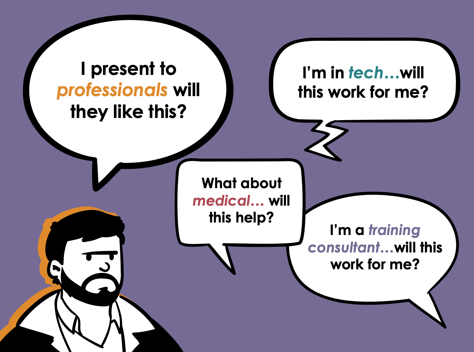
The strategies you learn in this program will help you effectively communicate to an audience in the following fields:
STEM
Legal
Medical
Non-profit sector
Government sector
Higher education (incl. class lectures for students!)
p.s. This includes professional development or TTA providers (consultants, trainers, entrepreneurs).
The common thread?
You want your audience to learn something (knowledge or skill) dense, technical, complex, or difficult.
But your audience gets bored or overwhelmed (i.e., experiences cognitive overload).
So, you need strategies for improved focus & content retention among your audience.
2 types of people say their audience wants a text-heavy presentation (IME):
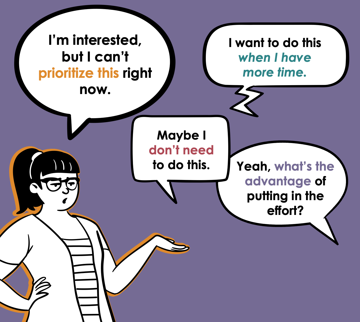
Those who don’t want to put the effort into making their presentations better, but don’t want to feel bad about it (not you).
Those who have tried to make their presentations better, but the audience didn’t care or actively grumbled about it (maybe you?).
If a supervisor/colleague is telling you to present in a text-heavy way there’s a strong likelihood they fall into #1. But peeps like that wouldn’t even be reading this page.
If it’s #2 for you, then I think I know what happened. The changes never fully fixed cognitive overload, or might have made it worse. For example, using no text in a presentation or as few slides as possible increases cognitive overload.

When you effectively use information design to prevent cognitive overload, EVERY audience in EVERY industry is going to appreciate it.

Join the presentation skills masterclass today!
Choose 6 months of access or save $200 and get a full year of access. A payment plan option for each is available. Prices are in USD do not include sales tax or VAT. Sales tax/VAT will be added where applicable.
6-month access
1 year access (save $200!)
Course #1: Fail-Proof Slide Design
Course #2: Visual Slide Design
Course #3: Presenting Data with Slides
Course #4: Captivate Any Audience
Quarterly office hours (with me, Dr. Echo Rivera)
60+ supplemental videos with bonus content
Photo Library + mini-course (saves you 20+ hours)
Custom PowerPoint Template (saves you 60+ hours)
Downloadable PDFs, checklists, and files
No creativity required

This is a step by step training—You only need the ability to follow directions.
Participant gallery of before & after slide designs

Natural speaking ability NOT required.
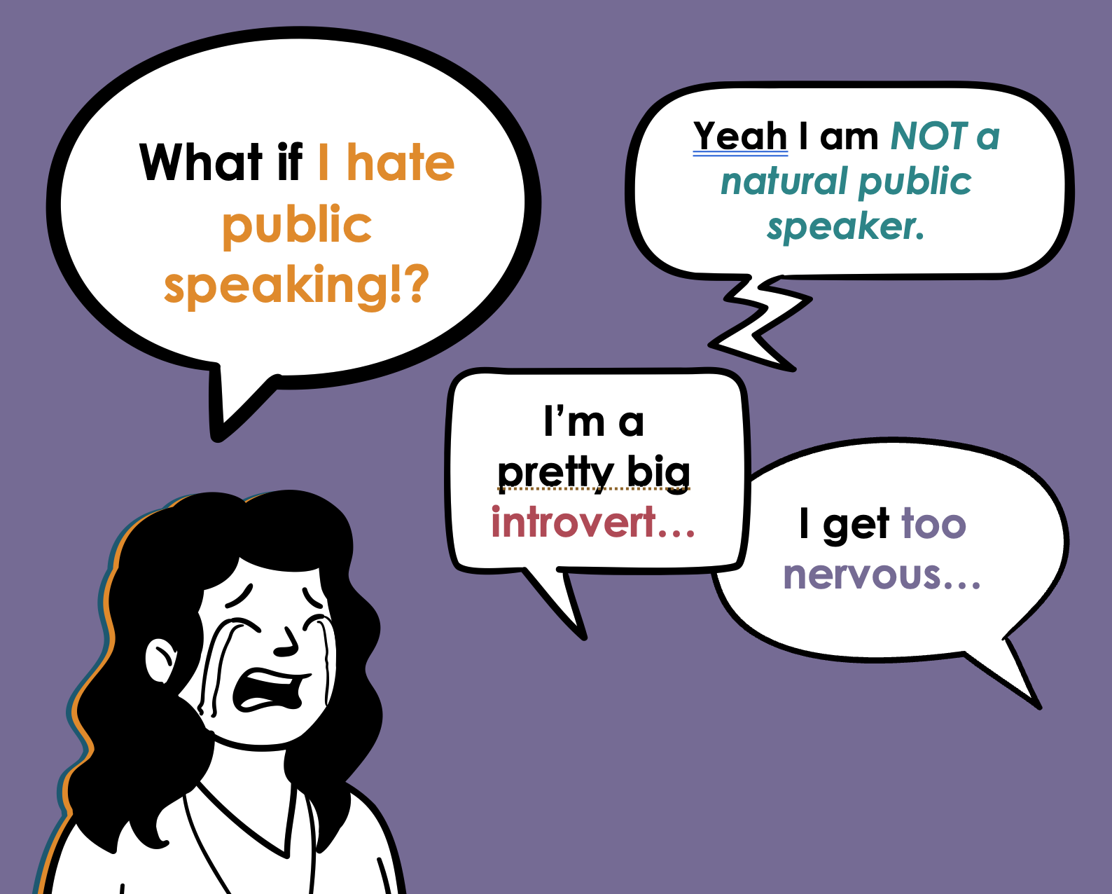
No, people don’t fear public speaking more than death, but it’s certainly one of the most anxiety-producing things we need to do as a professional.
I used to be terrified of public speaking, and my bar was set to “just don’t embarrass yourself, Echo”
I’d lose sleep for weeks leading up to a presentation. I’d throw up in the bathroom right before. My hands would shake and my voice would quiver while giving the talk.
And I’m just talking about a 5 min undergrad class lecture! 🥲
But now, if you watch me present, you’d have no idea I ever felt that way. So how did I get here?
At first, I followed all the public speaking advice I could find, and still failed. Miserably.
But then I started over with a blank slate and tried it my way. And it worked.
This is a zero-gimmick way to get over your fear or dread of public speaking.
Question for you: Have you ever seen a great presentation and thought, “WOW! they’re such a natural!”?
That could be feeding into your public speaking anxiety without you realizing it. Same if you believe any of the following:
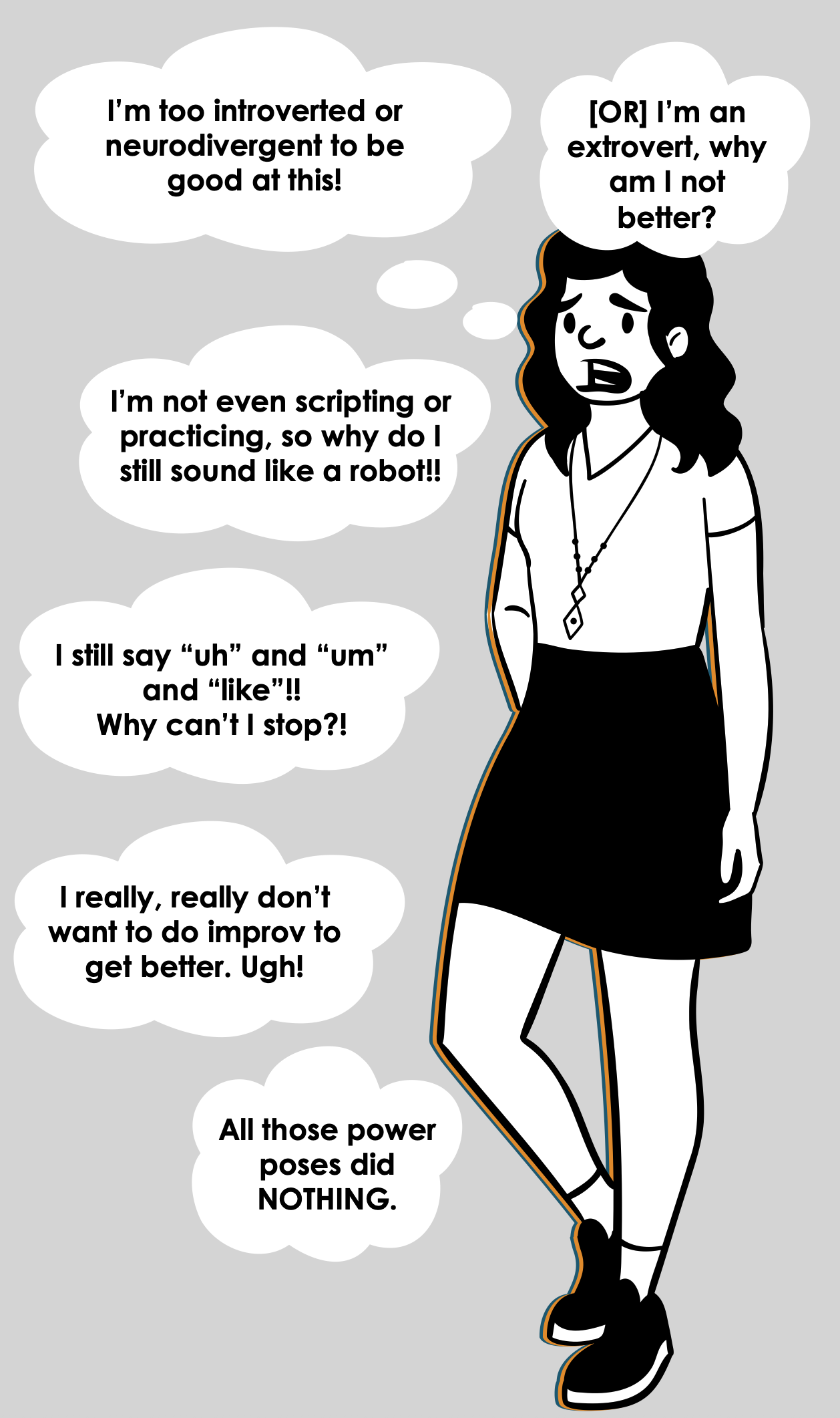
Extroverts/neurotypicals have the advantage when it comes to public speaking
It’s rare for introverts/neurodivergent peeps to excel at public speaking
Scripting and practicing makes you sound like a robot—don’t script/practice too much
Eliminating the “uhs” and “ums” and “likes” is critically important for a smooth, professional delivery
Doing improv is the most effective way to increase your public speaking confidence
Nervous system hacks like “power poses” are an important part of reducing your anxiety.
I used to believe all of the above, so as a neurodivergent level 10 introvert, I used to think I was doomed to suck at public speaking forever.

But I had dreams of becoming a researcher/professor! I needed to be able to do this. So when that advice failed to help me, I had to reset and try things a different way.
I stopped caring about my “ums” and “uhs” and never did anything like toastmasters.
Instead, I started to leverage my own strengths for storytelling and empathy (now called user experience) while working more on my scripts and slide designs. I also just, like, practiced more.
And finally. After years of struggling and feeling like a failure, I started to hear things like “wow! that was such a good presentation! You’re a natural!” from my peers & supervisors 😅
That’s when I learned:
Everyone has speaking strengths regardless of whether they’re introverted, extroverted, neurotypical, or neurodivergent.
Scripting and practicing is actually the big secret no one admits to that makes you sound like a natural.
Eliminating the “uhs” and “ums” and “likes” is usually not worth your time.
Working on improv skills is fine if you want to do it, but it’s not the best (or most direct) path towards more confidence as a speaker.
Deep down your brain knows that things like power poses are superficial and don’t make you a better speaker, so they’re not really effective
BUT… I absolutely was not a natural. While I was happy for the compliments, they were wrong. It made no sense to me at first, until the ✨💡 final insight💡✨ ignited in my brain.
If they were wrong…then that means I used to be wrong, too!
What I ultimately realized is that NO ONE is a “natural” public speaker.
It’s not a thing that exists.
Those people we all thought were “natural speakers” just…like…made an engaging presentation 🤣.
That’s it. 🫠
All this time, it was just that their presentation:
had a compelling script
had well-designed slides
was delivered smoothly because of practice
No genetic advantage. No special charisma. No sudden superpower.
Just like anything else, it’s all just a skill.
A skill that anyone can learn.
And I realized that we can’t always trick our brains into being confident.
❌ Increased confidence does NOT lead to better public speaking.
You can deliver a terrible presentation with 100% confidence (I know, I’ve seen it happen…and you prob have too 😬).
✔️ Increased confidence naturally comes after you’re giving effective presentations.
You can deliver a stellar presentation with zero confidence. (I know, I’ve done it).
And what happens is that after you deliver a powerful talk, engaging lecture, or fun training…your audience is going to tell you that.
And THAT is the long-lasting way to fix the root of your anxiety and dread— proof from your audience that you were effective.
When your audience goes out of their way to tell you how much they enjoyed your presentation…that’s the evidence your brain needs make you feel confident.
Information design is a valuable skill that never goes out of style.
…because presentation skills feed 2 birds with one scone 🍪✨🐤🐧
When you present more effectively using information design to prevent cognitive overload, it’s pretty obvious that there are advantages to your audience. They’re going to learn more, retain more, and enjoy the experience. Because, at the core of information design is user experience.
But you’re busy, overwhelmed. Maybe even overworked and underpaid. Probably burned out, too.
You have to prioritize your tasks, and just about everyone around you gives the impression that presentation skills (“soft skills”) should not make the cut.
Fight the urge to keep this on the backburner, because this skillset has these 2 hidden advantages for you…👇
#1) Presentation skills make you both easier to hire and harder to fire
There are time-tested ways to increase your chances of being the one who gets hired, or the one who gets to keep your job.
Be able to do the tasks required for the job.
Be competitive or irreplaceable.
#1 is pretty easy, and everyone tells you to focus on it. But how do you become a competitive candidate? How do you become irreplaceable once you’re there?
The answer is not to get even better at the tasks already required for the job. Everyone else is focusing on that same idea. It’s just the bare minimum to get or keep your job.
#1 is the minimum. It’s not what makes you competitive. #2 makes you the must-hire-cant-fire.
And you get there with something unique. A bonus, valuable skill that few people in your specific field probably don’t have.
Well…in every field, just about every single person is told to deprioritize presentation skills 😅
Yet, strong presentation skills equate to:
shining as an applicant, especially if you have to do a sample presentation or product.
easy networking at events like conferences, because other people will approach you already impressed.
being someone your students/supervisors/etc will enjoy listening to.
developing a reputation for this unique skillset, and becoming the go-to person for all things design.
Plus, because you learn an interdisciplinary design & storytelling (plain language) skillset, you’ll even be in a position to excel at adjacent products, like:
infographics, including visual executive summaries
visual reports
workbook, handout, and worksheet design
social media graphics
website design/website graphics
Someone who can do the job well AND is one of the few who can also communicate it effectively is a solid path towards being the must-hire-can’t-fire.


#2) Presentations can help with burnout by being your creative outlet that brings joy and fulfillment.
Right now, working on your presentations is probably a drain on your energy.
Even if you don’t dread them, you just don’t enjoy it. So time drags and you have to fight yourself to stay focused on put the energy in.
The more time you spend on things you don’t enjoy only increases your risk of burnout and feeling unfulfilled.
One of the outcomes of my training program—and the corresponding boost in your presentation skills—is that working on them actually becomes fun and enjoyable. Time will fly by and you’ll wonder where the time went. Please don’t dismiss the importance of prioritizing ways to enjoy more of your time. That’s legit important.

Here’s what happens when you develop these highly valuable presentation skills:

Get other people excited about or interested in your topic.

Create presentations with less stress and more efficiency!

Get undivided attention from your audience, from start to finish!

Have more fun at your job, impress your boss, and become an invaluable powerhouse at work!

Move hearts, change minds, and inspire people take action.

Have confidence in your slides, your info, and most importantly—confidence in yourself.
Join the presentation skills masterclass today!
Choose 6 months of access or save $200 and get a full year of access. A payment plan option for each is available. Prices are in USD do not include sales tax or VAT. Sales tax/VAT will be added where applicable.
6-month access
1 year access (save $200!)
Course #1: Fail-Proof Slide Design
Course #2: Visual Slide Design
Course #3: Presenting Data with Slides
Course #4: Captivate Any Audience
Quarterly office hours (with me, Dr. Echo Rivera)
60+ supplemental videos with bonus content
Photo Library + mini-course (saves you 20+ hours)
Custom PowerPoint Template (saves you 60+ hours)
Downloadable PDFs, checklists, and files

Course #1: Fail-Proof Slide Design
Course #2: Visual Slide Design
Course #3: Presenting Data with Slides
Course #4: Captivate Any Audience
Quarterly office hours (with me, Dr. Echo Rivera)
60+ supplemental videos with bonus content
Photo Library + mini-course (saves you 20+ hours)
Custom PowerPoint Template (saves you 60+ hours)
Downloadable PDFs, checklists, and files
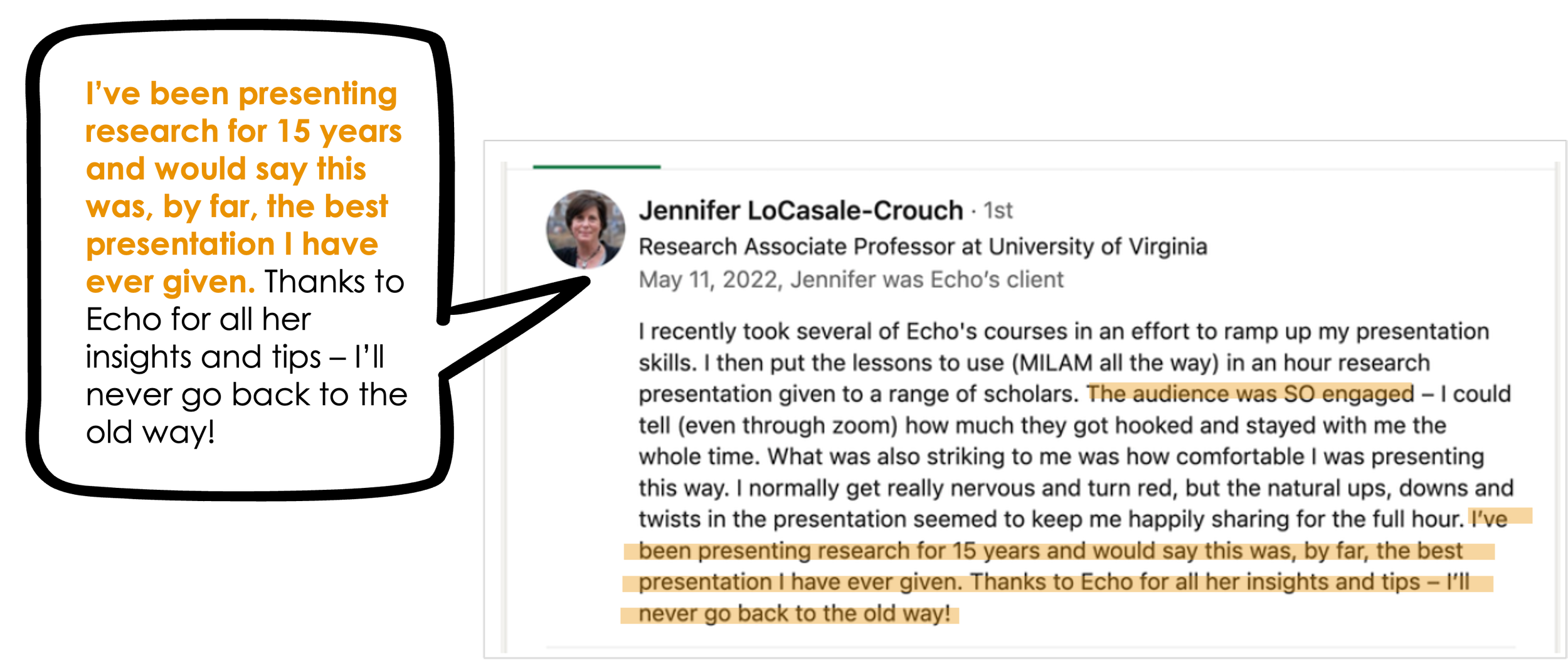
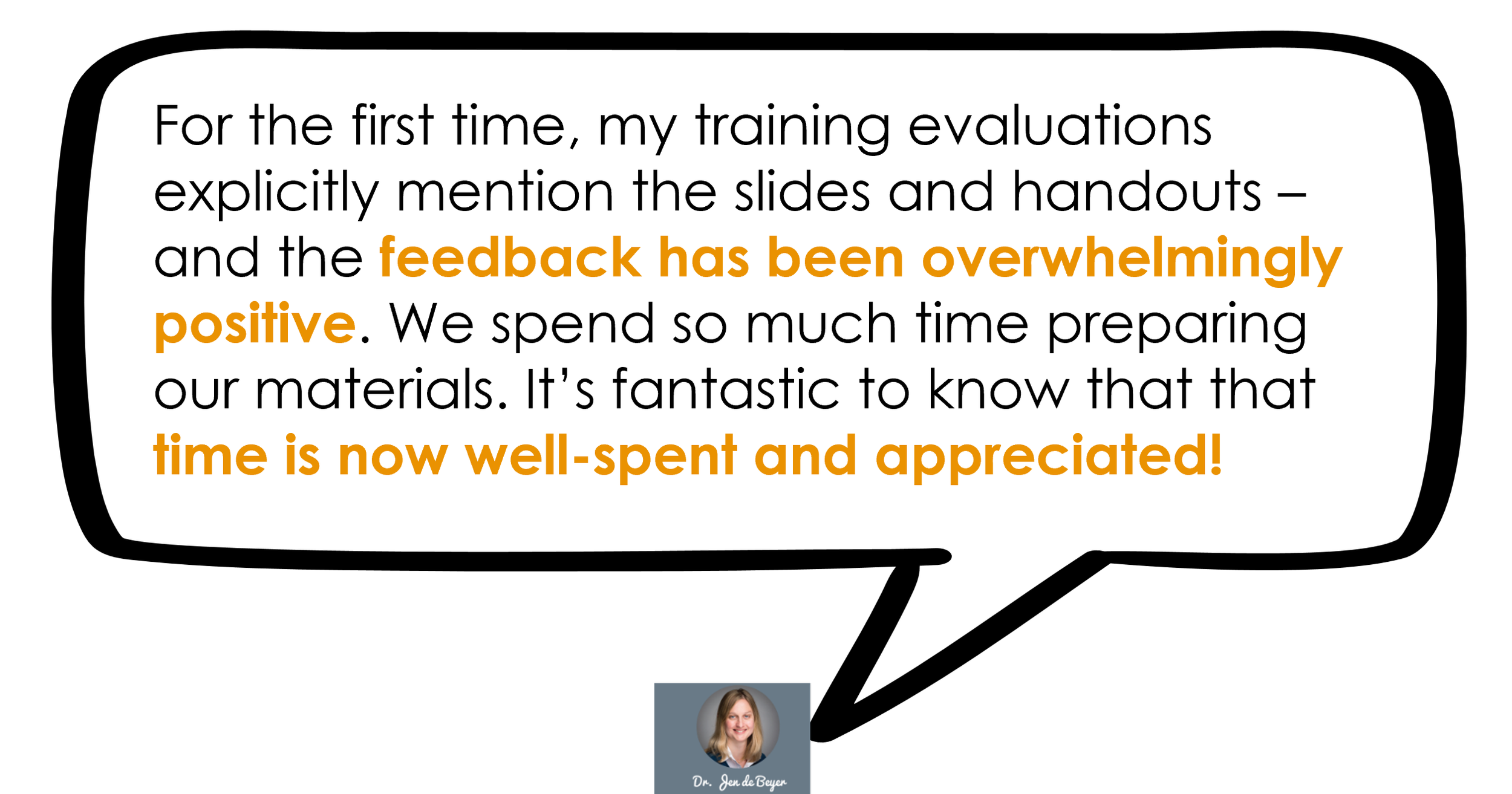
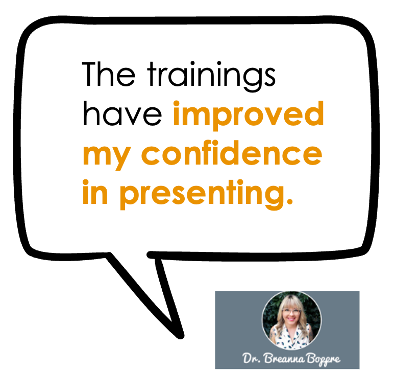
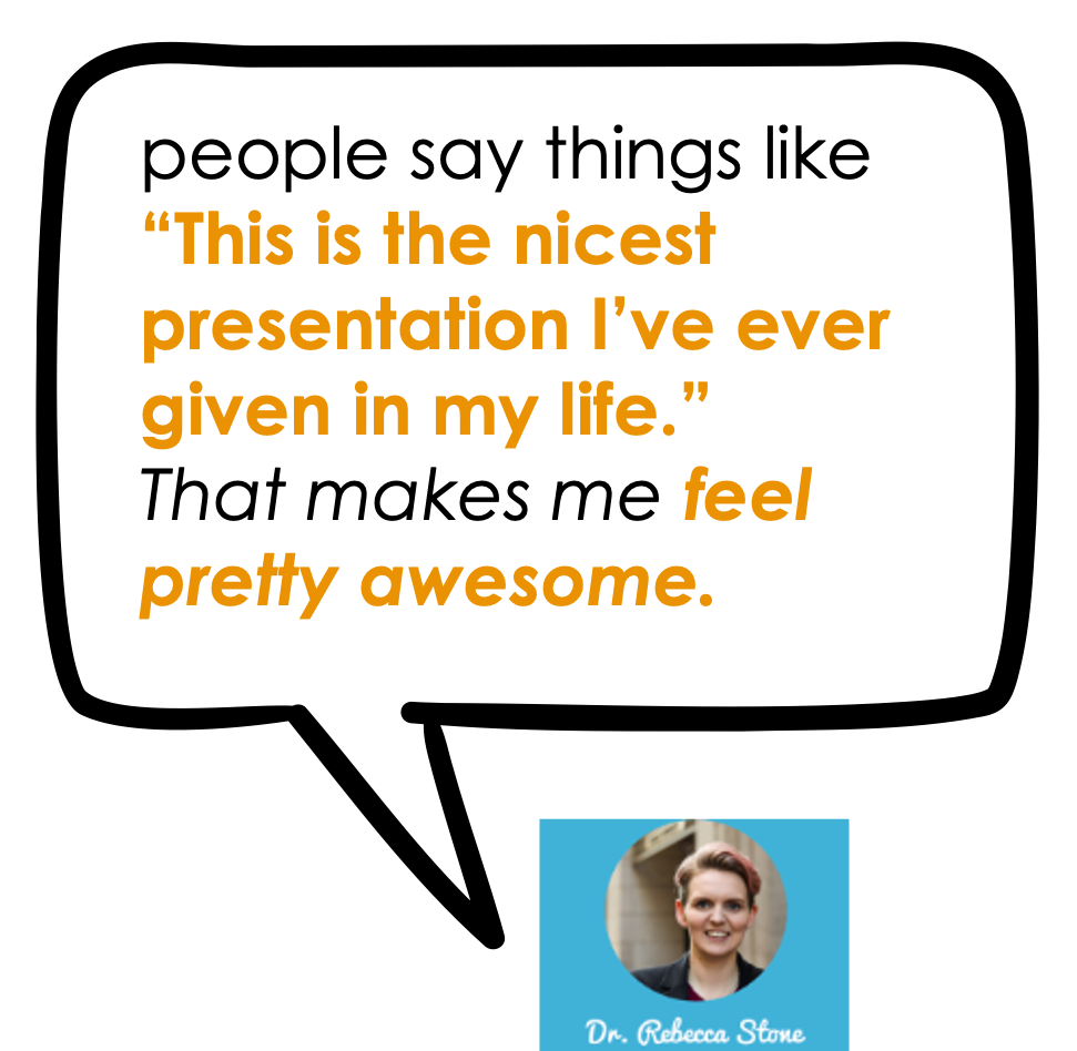
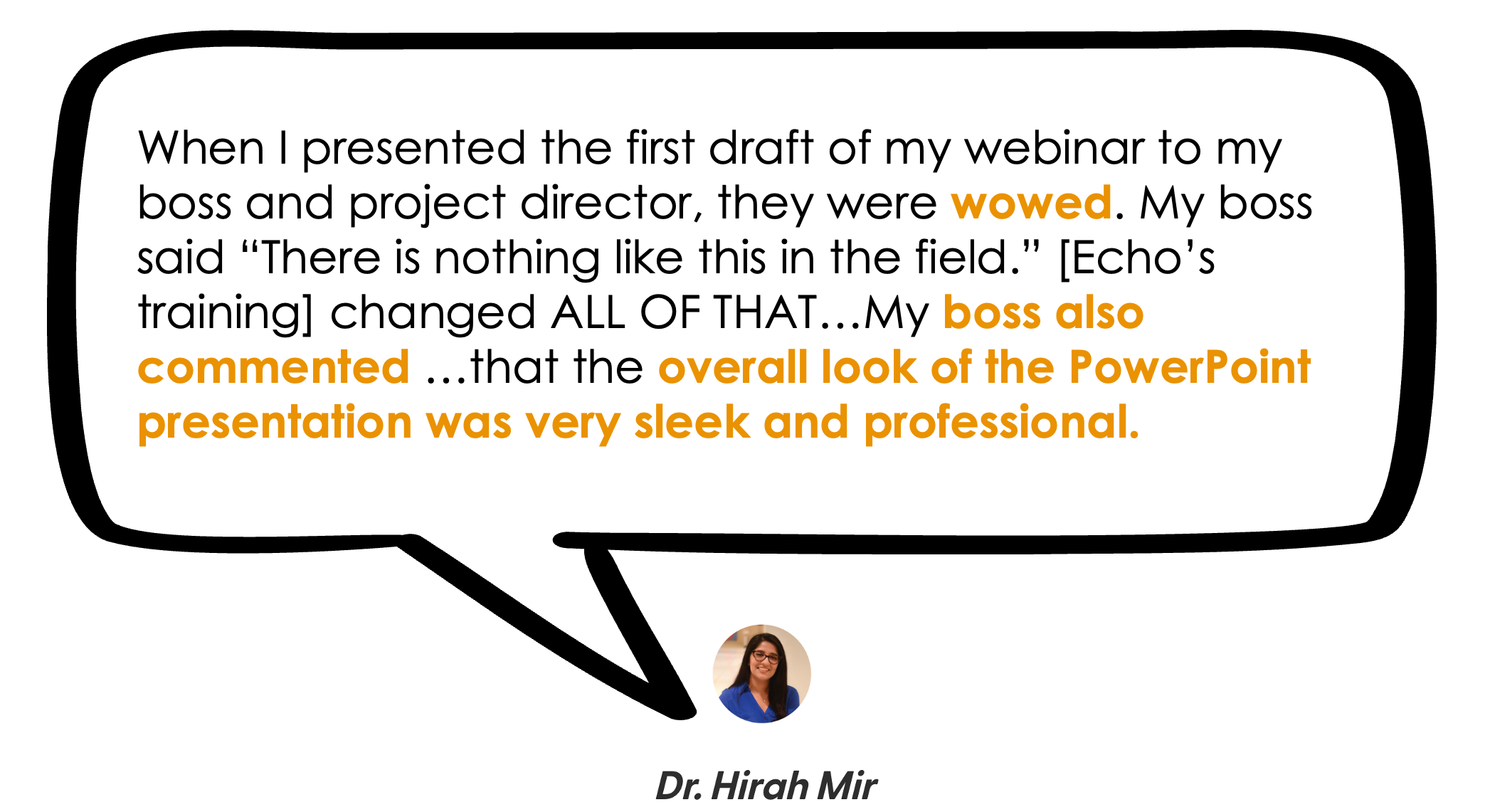
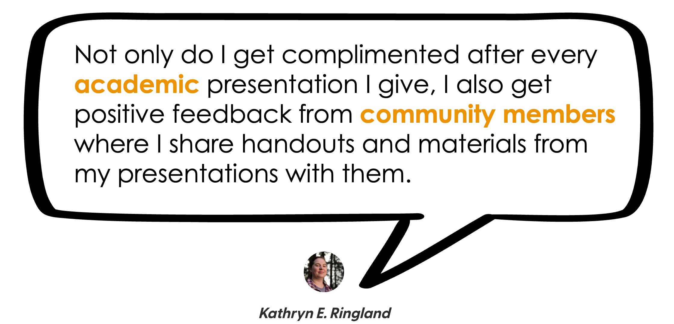
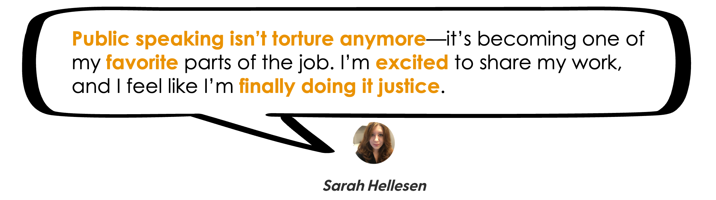
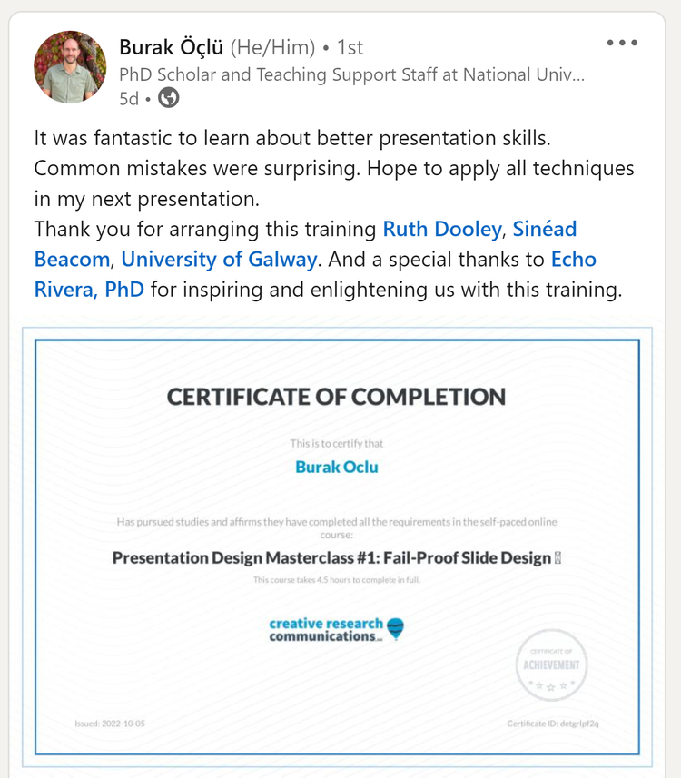
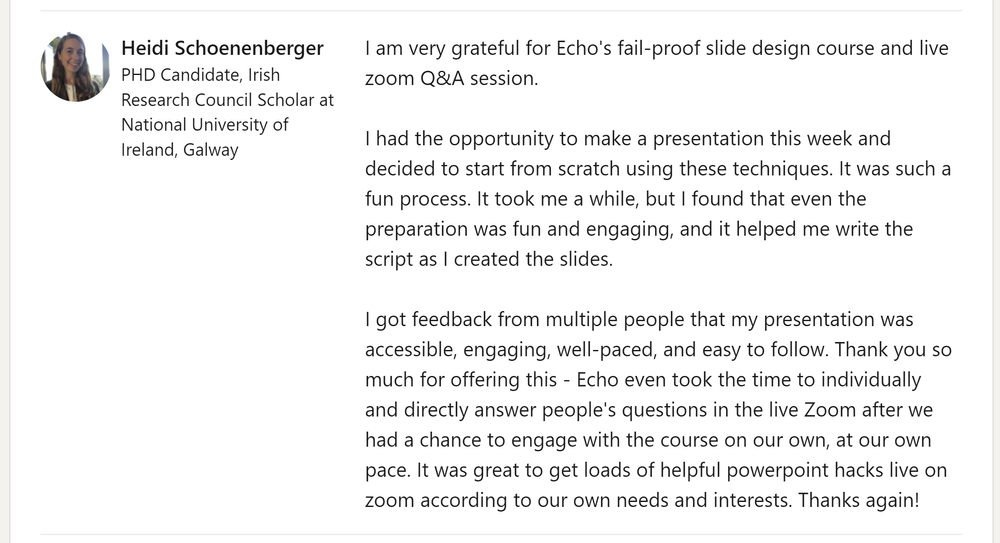
What our alumni say about the Presentation Skills Masterclass program


Frequently Asked Questions about the Presentation Skills Masterclass
-
The presentation skills masterclass program is ideal for those in the following areas:
STEM
Medical
Legal
Non-profit sector
Government sector
Higher education
This includes anyone who provides professional development or TTA to the above.
The common thread?
You want your audience to learn something (knowledge or skill) dense, technical, complex, or difficult.
But your audience gets bored or overwhelmed (i.e., experiences cognitive overload).
So, you need strategies for improved focus & content retention among your audience.
-
No natural speaking ability is required, because no one is born a natural public speaker.
I used to be terrified of public speaking, and my bar was set to “just don’t embarrass yourself, Echo”
I’d lose sleep for weeks leading up to a presentation. I’d throw up in the bathroom right before. My hands would shake and my voice would quiver while giving the talk.
And I’m just talking about a 5 min undergrad class lecture! 🥲
After years of trial and error, I finally learned that the way to overcome my fear of public speaking was to improve my presentation skills, so that my presentations were actually better.
Once I did that, every time I gave a presentation someone (even supervisors and professors) would come up to tell me that it was the best presentation they’ve ever seen.
And that’s how I’ll help you. We’re going to build up your skillset so you have REAL SKILLS. And then, your audience is going to give you proof that it worked, and confidence will naturally increase.
-
You will have 6 or 12 months to access the program and implementation resources.
You will have permanent access to:
My personal visual database links (make sure you bookmark them while you still have access to the program).
The downloadable materials from the course (make sure you download them while you still have access to the program), which include custom-designed workbooks and reference handouts.
The timeframe begins on the date of purchase.
-
This masterclass program was made for busy people, because my clients tend to be high performing busy professionals (academics, researchers, evaluators, etc).
The time to complete all 4 courses is about 32 hours, or the length of 4 full-day workshops.
But most videos within the courses are 5-15 minutes. Some videos are longer (about 25-30 minutes). That makes it easier to fit into your day.
Plus, the whole point of the course is to speed up your presentation design process. So, you’ll be able to whip together presentations much more quickly once you finish!
-
Due to the nature of the training we share in this course, all sales are final.
It’s just that knowledge is not a returnable product. It’s one of those things that once you have it, you can't give it back.
Once you watch even just the first few videos in the course, you will have already learned a new way of thinking about and approaching your presentations that will make them better and more accessible.
If you aren’t sure an online course is for you (or, you aren’t sure my strategies will help), then here are some options:
-
This is not a PowerPoint training program. The course lessons are 90-95% software neutral so you can use whatever slide software you want.
Most tech videos about PPT are on my YouTube channel, so the course can stay focused on information design and cognitive overload—concepts that apply regardless of your software of choice.
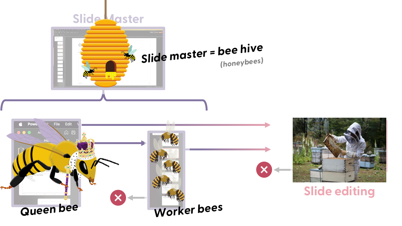
I personally use PowerPoint and it is what I recommend. Mainly because it has such a great slide master feature, which is why the template I create is made in PowerPoint.
-
As a member, you can submit a question or even some presentation slides for review.
I run the sessions, and will do live makeovers on your slides and send them back to you after the session.
Even if you don’t have something to submit, these sessions are great to see how the presentation skills framework can be applied to different topics and audiences. It’s incredibly useful to see a variety of examples like this!
These sessions are not recorded, so that everyone can feel more comfortable participating.
(we’ve also found that it helps keep the course easy to go through — no one has time to watch 50+ replays of 60-minute zoom calls 😅 )
-
Absolutely!
Email us at hello@echorivera.com and we’ll send you a way to pay for the program separately, and you’ll have up to 6 months before you need to activate the license.
-
Absolutely! We offer a 30% discount if you want to purchase 6 or more licenses. They can be enrolled together as a cohort, or we can offer the option to have each person choose their own start date.
Please email us at hello@echorivera.com to get the process started.
-
That’s a pretty common thought, which is why you’ll be able to leverage this new skillset in ways your coworkers, employers, clients won’t see coming
(and how you’ll be the must-hire-cant-fire).
There are time-tested ways to increase your chances of being the one who gets hired, or the one who gets to keep your job.
Be able to do the tasks required for the job.
Be competitive or irreplaceable.
#1 is pretty easy, and everyone tells you to focus on it. But how do you become a competitive candidate? How do you become irreplaceable once you’re there?
The answer is not to get even better at the tasks already required for the job. Everyone else is focusing on that same idea. It’s just the bare minimum to get or keep your job.
#1 is the minimum. It’s not what makes you competitive. #2 makes you the must-hire-cant-fire.
And you get there with something unique. A bonus, valuable skill that few people in your specific field probably don’t have.
Well…in every field, just about every single person is told to deprioritize presentation skills 😅
Yet, strong presentation skills equate to:
shining as an applicant, especially if you have to do a sample presentation or product.
easy networking at events like conferences, because other people will approach you already impressed.
being someone your students/supervisors/etc will enjoy listening to.
developing a reputation for this unique skillset, and becoming the go-to person for all things design.
Plus, because you learn an interdisciplinary design & storytelling (plain language) skillset, you’ll even be in a position to excel at adjacent products, like:
infographics, including visual executive summaries
visual reports
workbook, handout, and worksheet design
social media graphics
website design/website graphics
Someone who can do the job well AND is one of the few who can also communicate it effectively is a solid path towards being the must-hire-can’t-fire.
-
4 presentation skills courses + 5 implementation resources
Course #1: Fail-Proof Slide Design
Course #2: Visual Slide Design
Course #3: Presenting Data with Slides
Course #4: Captivate Any Audience
Quarterly office hours (with me, Dr. Echo Rivera)
60+ supplemental videos with bonus content
Photo Library + mini-course (saves you 20+ hours)
Custom PowerPoint Template (saves you 60+ hours)
Downloadable PDFs, checklists, and files
Still got a question? Get in touch!
Join the presentation skills masterclass today!
Choose 6 months of access or save $200 and get a full year of access. A payment plan option for each is available. Prices are in USD do not include sales tax or VAT. Sales tax/VAT will be added where applicable.
6-month access
1 year access (save $200!)
Course #1: Fail-Proof Slide Design
Course #2: Visual Slide Design
Course #3: Presenting Data with Slides
Course #4: Captivate Any Audience
Quarterly office hours (with me, Dr. Echo Rivera)
60+ supplemental videos with bonus content
Photo Library + mini-course (saves you 20+ hours)
Custom PowerPoint Template (saves you 60+ hours)
Downloadable PDFs, checklists, and files

Course #1: Fail-Proof Slide Design
Course #2: Visual Slide Design
Course #3: Presenting Data with Slides
Course #4: Captivate Any Audience
Quarterly office hours (with me, Dr. Echo Rivera)
60+ supplemental videos with bonus content
Photo Library + mini-course (saves you 20+ hours)
Custom PowerPoint Template (saves you 60+ hours)
Downloadable PDFs, checklists, and files
This is truly a win-win situation where you feel proud of your presentations and your audience is glad they took the time to be there.
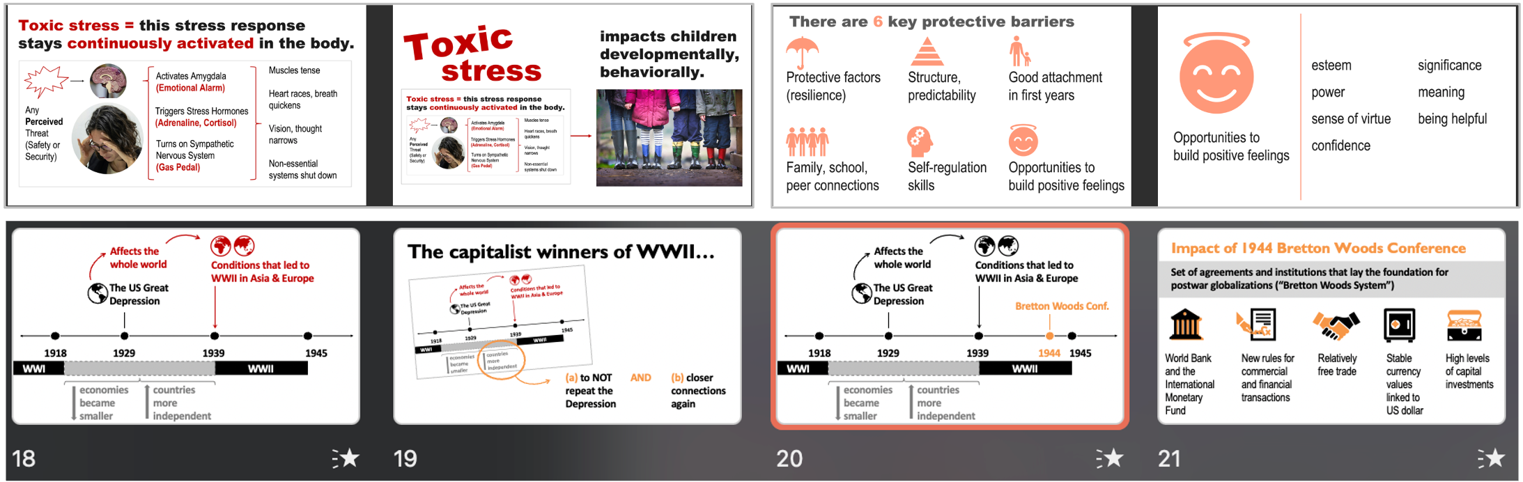
Engaging slides are accessible slides. Beautiful slides are professional slides. These are not in any type of conflict. When you make better presentations, they are better because they’re easier to look at, understand, and remember. Slides like these prevent cognitive overload, and are much easier to make than you probably think! (p.s. these are all PowerPoint slides) 👇


Hey there 👋🏻! I’m Dr. Echo Rivera.
This whole thing started for me because I used to be terrified of public speaking. I’d lose sleep for weeks leading up to a presentation. I’d throw up in the bathroom right before the talk. My hands would shake and my voice would quiver while giving it.
I tried all the “tips and tricks” for public speaking confidence but ultimately became convinced they weren’t working because I was too introverted. I wasn’t a “natural” and therefore I was doomed.
But I had dreams of becoming a researcher/professor! I needed to be able to do this. So when that advice failed to help me, I had to reset and try things a different way.
Instead of confidence hacks or superficial “just stop saying um” rules, I leaned in on 2 things: Better slide designs/scripting and a better experience for my audience (a field now known as user experience).
Once I did that, the change was instant. After years of trial, failure, repeat…I finally heard the magic words: “That was the best presentation ever! You’re such a natural!!”
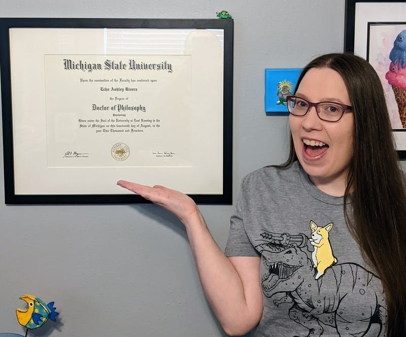
That was the confidence boost I needed to keep going. I ultimately did earn my PhD (in psychology) which only solidified my skillset in better user (audience) experiences. I also had a personal interest in creative/design activities like graphic and web design that I used to supplement these strategies.
It wasn’t long before I got rave reviews after every presentation from a wide range of audiences:
professors, researchers, scientists (STEM, higher education)
non-profits, service providers
state and federal department staff
consultants, TTA, and professional development providers
But as I looked around, I saw that there was a deep need for professionals in these areas to make more accessible, digestible presentations. I didn’t want to be the rare case anymore. I wanted EVERY presenter to hear “your presentation was fantastic!”—not just me.
So, 3 years into my post-PhD research associate position (at a non-profit research/evaluation center), I quit and formed this company. I now share all my best secrets in my professional development program, and I hope to see you inside today!
I can’t wait to help you become a powerful speaker! 🙌
with joy,
Echo Rivera, PhD


Join the presentation skills masterclass today!
Choose 6 months of access or save $200 and get a full year of access. A payment plan option for each is available. Prices are in USD do not include sales tax or VAT. Sales tax/VAT will be added where applicable.
6-month access
1 year access (save $200!)
Course #1: Fail-Proof Slide Design
Course #2: Visual Slide Design
Course #3: Presenting Data with Slides
Course #4: Captivate Any Audience
Quarterly office hours (with me, Dr. Echo Rivera)
60+ supplemental videos with bonus content
Photo Library + mini-course (saves you 20+ hours)
Custom PowerPoint Template (saves you 60+ hours)
Downloadable PDFs, checklists, and files

Course #1: Fail-Proof Slide Design
Course #2: Visual Slide Design
Course #3: Presenting Data with Slides
Course #4: Captivate Any Audience
Quarterly office hours (with me, Dr. Echo Rivera)
60+ supplemental videos with bonus content
Photo Library + mini-course (saves you 20+ hours)
Custom PowerPoint Template (saves you 60+ hours)
Downloadable PDFs, checklists, and files