
Please stop using PowerPoint’s SmartArt. Here are 2 SmartArt alternatives that are better.

You’re short on time and want to add some visuals to your slide, but you don’t know how.
What do you do?
If you’re like most academics, scientists, and educators…you start with PowerPoint SmartArt.

My goal is that after this blog post, you never do that again.
😬
Whoa.
I know.
That’s probably not what you expected to hear, so let me explain.
Why you should stop using PowerPoint SmartArt
First, let me say how happy I am that you want to use visuals in your presentation.
The fact that you even want to use SmartArt and have visuals in your presentation tells me you care about creating a presentation that your audience enjoys and will be effective.
How is “effective presentation” defined?
An effective presentation is one that increases the likelihood your audience will:
Pay attention to you
Understand what you’re saying
Remember what you said
Use the information you shared at a later time
When you use good visuals, it’s going to be a lot easier to create an effective presentation.
Emphasis on good visuals.
There is an actual negative consequence if you use bad visuals.
When you use bad visuals, then you increase the likelihood your audience will:
Disengage and stop paying attention
Get confused, overwhelmed, or bored with your presentation
Remember very little (or nothing)
Not use the information later (or use it in the wrong ways)
Yikes!
Why don’t they teach us this in graduate school?
I don’t know, but the important thing is you’re here now.
And you need to know that SmartArt tends to count as a bad visuals.
To be clear, I’m not judging or shaming you. If you have SmartArt all over your presentations, I understand.
In fact, my old presentations used to be slathered in SmartArt.
I’m not coming from a place of judgment here. I just want you to avoid the same mistakes I made.
Why PowerPoint SmartArt counts as a bad visual
The team at PowerPoint are trying their best. They’re trying to help you create better presentations, and to stop everyone from saying #DeathByPowerpoint.
And they have made improvements to SmartArt over the years, offering more customizations and icons.
So, they’re not trying to sabotage your efforts to create an engaging presentation.
But, sadly, that’s exactly what happens when you use SmartArt.
SmartArt designs usually have:
Font sizes that are way too small and too hard to read
Bad contrast of colors that make the info hard to see
Outdated design elements that make your slides look unprofessional
The wrong type of text alignment, which makes it annoying to read your text
Unnecessary visual elements that don’t need to be there, which clutters up the slide
Those, alone, are reasons to not use SmartArt. And, it’s why SmartArt made my list of features in PowerPoint I ignore.
But there are more insidious reasons to avoid it.
One of the more damaging aspects of using SmartArt is that it puts you into the mindset of “it’s better than no visual.”
That’s actually not true, though.
SmartArt designs are usually worse than having a slide that is just really well-designed text.
And the most damaging aspect of using SmartArt is that it keeps you used to using templates.
And templates, my friend, are the some of the worst things you can use in your presentation if you want it to be effective and engaging.

I know. I know.
I’m being such a bubble burster today!
I hate that I have to do this. But this is what happens when graduate schools don’t train us on something we do almost every day, like giving presentations.
The very first thing everyone learns from my presentation design training is that they need to stop using templates.
And the longer you use SmartArt, the harder that’s going to be to internalize.
And the longer you use SmartArt, the longer you’ll be stuck creating #DeathByPowerpoint slides.
It’s time to break free of all that and learn how to create engaging presentations the right way: from a blank slide.
SmartArt Design Makeover #1: The Timeline Arrow or Process Arrow
You have a step-by-step process or timeline that you need to share.
Here’s a common starting point:

You already know that this slide is ineffective because it has too much text and no visual elements at all.
So let’s say you turn to SmartArt for help.
This is one of the options that makes sense for this information.

Thanks to SmartArt, we now have a slide with too much text that is now even smaller and harder to read than before.
(Wait. That’s not a good thing!)
And now we also have a… giant, goofy arrow shape?
You’re smart, and you’re probably thinking that this will be better if we just reduce the text on the slide.
I like where you’re going with this because it’s always a good thing to remove excess text from your slide.
So let’s give that a try.

Technically it’s better, because the text is larger and easier to see.
But there are still too many problems with this slide:
The text is still too small
The text alignment choice makes it annoying to read
The color contrast between the text and arrow is too low
There is an excessive amount of strong, distracting colors here
The arrow is actually unnecessary and feels more like clutter than a visual
The arrow is unnecessary because people already assume if you arrange text from left to right in this way, that it’s a linear process.
The arrow isn’t needed here.
SmartArt didn’t help at all in this case. It just made us spend time so we feel better about our text-heavy slide, without making significant improvements in how we share this information.
That means it’s a bad slide, with a bad visual.
I want you to feel better about your slides while also making sure your slides are actually better.
So let’s go “back to the drawing board” and start with a blank slide.
Now we can use our presentation design skills to create an engaging slide.
This is what I did:

The animations are moving automatically because it’s a gif, but if this were a real presentation I would actually control the pace and explain each step, one by one.
Did you notice that this slide has the EXACT same text as the last one?
🤯 Most people don’t.
Because it feels like there is less text.
Go ahead — compare them!
Same text.
But this one is so much better because I (a) dropped the slide template and (b) used several presentation design strategies to create this slide.
The secret is that when you have foundational presentation skills, you know how to design your slides for your content. In the UX/UI world, that’s called content-specific design.
I never would have been able to make a slide like this if I started with SmartArt. No amount of customizing the SmartArt template would have gotten me to this point.
The reason this slide is better than the one with SmartArt is because:
The text is easy to read
There is no clutter on the slide
The visuals add meaning to the slide
The animations allow me to walk the audience through each point
Plus, now that I took the extra step to use nice icons, I could re-use them in future slides. That will save me time in future slide design, while still using visuals!
Here are 4 design ideas for including the icon in the corresponding slides.


What do you think?
That’s just one idea for how to design this type of information when starting from a blank slide instead of using PowerPoint SmartArt.
Want another idea?
How about this:

I just love how cute the icons are at the bottom, not gonna lie 😂
This might work better when it’s a timeline instead of a process. But still, way better than SmartArt, amirite?
Wish you knew how to make slides like this?
I can train you on these skills, and you can get started for FREE with this training:
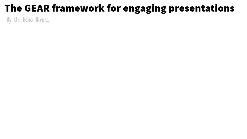
PowerPoint SmartArt Design Makeover #2: Systems and Gears
I’ve been working on a new way to explain my presentation design training approach.
Because effective presentation skills involve a lot more than just knowing how to design slides, I teach much more than “tips and tricks to make pretty slides.”
I’m about helping you become an effective presenter, from start to finish. Really, to me, it’s a whole system.
The 6 components of this system include:
Know the cause (of both good and bad presentations)
Replace your bad habits with good habits
Unlearn harmful myths
Improve storyboarding and engagement strategies
Learn slide design and data visualization design strategies
Consider the entire package (e.g., handouts, good audio for webinars)
I like the idea of using gears because if you aren’t “moving the gear” on each component of the system, then you’re going to struggle.
If all gears aren’t moving, then none of them are. Then, your presentations wont be as good as they could be, or it will take you longer to create them.
So, I could have started with SmartArt gears:

This is very “meh” — at best — in terms of the design.
It was annoying for me as the user because I had to use 2 of them, because they only allow 3 gears at a time. And every time I tried to click on a gear, that annoying “place text here” box popped up and got in the way.
But the worst part is, there are 6 extra pieces of clutter that don’t need to be there.
Do you see what it is?
It’s the arrows.
The arrows are there because this is a simple template that requires you to fit your information into it. That’s the most practical way for them to create a template that explains systems.
The arrows tell your audience “imagine that this individual gear is moving.”
It’s better to show, not tell.
It’d be better for each individual gear to move on its own.
Except, because it’s SmartArt, I had only one option when trying to animate this:

🤣🤣🤣
That is terrible!
And it’s definitely not what I was going for.
I need the individual gears to spin, not the entire thing.
I don’t want my audience to puke, I want them to follow along with me without getting confused or overwhelmed.
And maybe there is a way to do it in PowerPoint, but who cares. I tried for a few seconds and stopped because no matter what I do with this SmartArt, it’s not going to be great.
Besides, if I did find a way to animate one gear at a time, then I’d have to deal with deleting the arrows, and I was ready to move on.
So, again, back to my goal: I want them to do less work to understand my information, so I need to use animations in a much more strategic way.
So here’s what I did.
Once again, I started with a blank slide and created this:
Sadly you’re just seeing a gif and you don’t have the benefit of my narration.
Basically, I’d walk you through each gear, and they turn blue as I talk about them.
And I keep making the point that unless all gears are moving, there’s going to be friction. Hence, the gear wiggle.
And the final reveal is when that last gear (“full package”) is activated, and then the entire system spins easily.
No dizziness, just a memorable moment that perfectly makes my point.
How did I do it?
It’s a combination of icons, text boxes, and animations. This was 100% made in PowerPoint and no, it wasn’t that hard.
Copy and paste is my BFF, which speeds everything up 😉
This is why I want you to stop using SmartArt!
I want you to make slides like this.
Slides that are memorable and help your audience learn the material.
SmartArt is NOT better than nothing. It’s holding you back from starting with blank slides so you can create your own visually engaging elements.
Here’s an example of that when presenting Venn diagrams.
Are PowerPoint’s Design Ideas any better?
No.
It’s essentially the same thing as SmartArt.
Design Ideas add clutter to your slides, or take your great visuals and reduce their impact by cutting them up or making them small.
It’s time to let go of the idea of using a pre-determined template on your unique content. Your presentations should use content-specific design, which is a skill you learn with presentation design training.
Remember: the purpose of slides is to guide people through your material and data in a clear, coherent, organized, and visual way.
Templates do not know how to do that!
The purpose of a presentation is not to throw colors and shapes in their face to distract them.
That’s what templates do!
If you loved SmartArt before reading this post, it’s not your fault. It really was the best feature you knew about at the time.
However, you can’t unsee this post 🙈. Now you know the truth about SmartArt and design templates, and that it’s time to learn how to design your slides in engaging and effective ways.
If you found these SmartArt alternatives eye opening, then wait until you see this FREE training!
I have so much more to share with you. Don’t forget to learn more about my free training before you leave!
with joy,
Echo Rivera, PHD
Links mentioned in this post >>