
Blast From the Past: My Old Slides

Want to see some of my old slides and how I’ve transformed them over the years?
So let's dig into my past, shall we? Let's take a look-see at my presentation portfolio that's the equivalent of my middle school ID photos.
Sadly, I can only go back as far as 2010 because that's all I could find. We're going to start with my Masters Defense presentation.
Ready to review some Blasts From the Past (BFTP)?
Before we get started, you should know I have FREE training! Be sure to check it out and sign up if you’re interested in improving your presentations right away.
[BFTP #1] So, you're a fan of Smart Art, huh?
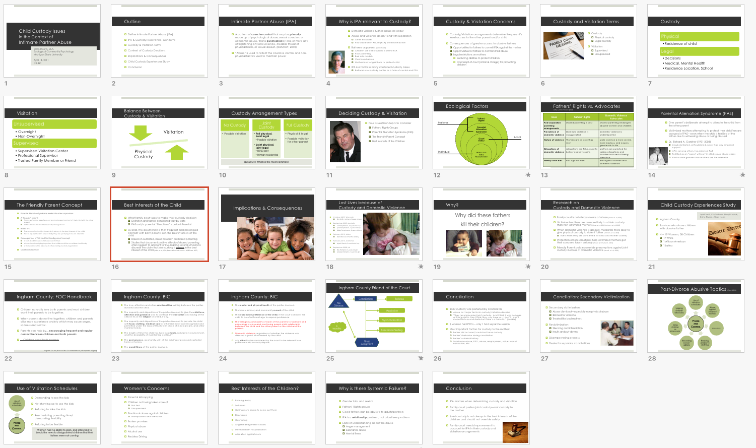
Ok, so here is my Masters Defense in 2010.

What I did right:
Decluttered slide design
Matching color scheme
Effective use of animations to walk my committee through each step
I made my own template, this isn't a default template
Problems:
TOO MUCH TEXT!
Smart Art!
I made a template, using the same visual on each slide (clutter)
Other clutter throughout the slide deck
[BFTP #2] Kill me, please & thank you.
In my first few years as a graduate student, I gave talks about how to get into graduate school, what it was like to be a graduate student, and how to decide whether or not to even apply for grad school.

Sadly, I took a step back in my presentation design with these slides. This is in 2011, a year later. See? I told you that my slides have not always been beautiful!
What I did right:
Um... I had a couple of visuals?
Good storyboard--the information was helpful.
Problems:
99% TEXT! DEATH BY POWERPOINT!
A slide template
Dark background with light text
Bullet points
Slide clutter
BORING. There's nothing on here besides text. How did anyone stay awake for this? I'm so sorry!
[BFTP #3] Cute dog, but now my eyes hurt
This is a presentation I gave as a guest lecture, discussing what it was like to study an emotionally difficult topic (intimate partner violence).

Wowwwww look at THAT. Again, I keep going backwards. Instead of a neutral background color, I'm using the really bright one and, well, let's analyze:
What I did right:
You can't see it, but I at least used animations to walk people through all this text
It was a pretty good storyboard. I told stories throughout and people seemed relatively engaged given it was hard to look
I used visuals. These are all my dog, Biscuit, and you can never go wrong with showing cute doggies :)
Problems:
A slide template
Dark background with light text
Bullet points
Pictures that feel like an afterthought instead of placed with purpose
TOO. MUCH. TEXT!
Mixed alignments
Slide clutter
Visuals aren't of the highest quality :)
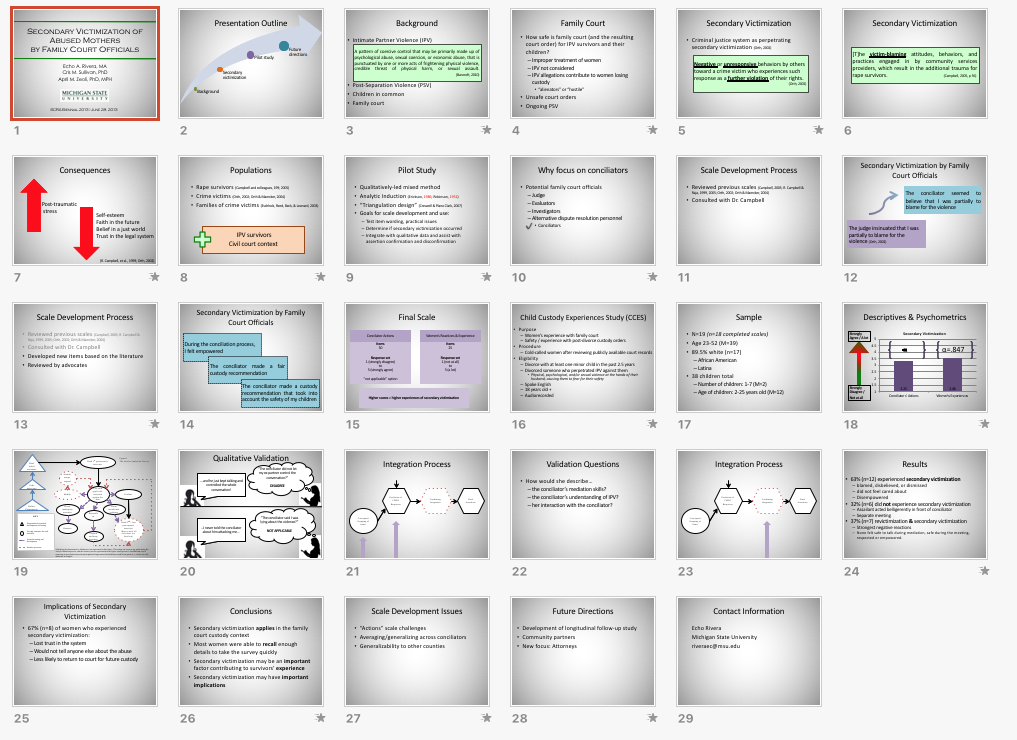
[BFTP #4] Thanks for the SmartArt and making me read your presentation, Echo
This is a presentation that I gave several times as a guest lecture about my research topic: the family court response to domestic violence when children were involved. A super depressing topic, by the way, because it was basically about how the family court system was (and still is) failing women and their children by giving abusive dads custody. Don't @ me.
Ok, I'm back to having less clutter on my slides and am getting better in some ways, but still lots of mistakes.
What I did right:
I sometimes used animations, but not enough.
This is a really depressing topic that can be so difficult to process, there was a huge risk that people would dismiss the info. So, I added in audience engagement and told stories to help people get through it.
I used visuals.
Problems:
TOO. MUCH. TEXT! OMG! DEATH BY POWERPOINT
Visuals that I found through Google Images
SmartArt
A slide template
Dark background with light text
Bullet points
Pictures that feel like an afterthought instead of placed with purpose
Mixed alignments
Slide clutter
[BFTP #5] At least you used cool animations?
Ok, fast forward to 2013. This is a conference presentation about the results from my Master’s Thesis research project. My slide design has ... improved slightly. Mostly in ways that you can't see.
What I did right:
The animations in this presentation were pretty badass. Nothing fancy or wild, just effective and well-timed so that the audience felt like I was telling them a story rather than reading them all my notes.
The template has been simplified, there is less clutter on the slides and the background is now lighter than the text.
I also designed my own models, rather than relying on Smart Art.
Problems:
I'm not even going to talk about that DataViz slide. Nope. Can't make me.
TOO. MUCH. TEXT! OMG! DEATH BY POWERPOINT
It's still a slide template that adds unnecessary clutter
Bullet points
Mixed alignment
Color scheme doesn't match or work together
[BFTP #6] OK, now we're talking!
Here is my dissertation proposal in 2013. This is still one of my favorite presentations I've given. I really let my creativity shine through on this one, and my committee loved it!

What I did right:
This presentation was a moving/animated masterpiece. No, not the obnoxious kind, but just really well timed so that it kept my committee engaged.
I made custom visuals using shapes and animations to tell the story of my proposed dissertation topic and analysis.
I created a theme to transition from one section to the next.
Problems:
Still using a color background
Mixed alignments
Typography and colors (slide style) could be improved
[BFTP #7] So many stops pulled, I lost count!
And then here's my dissertation defense presentation from 2014--a little over a year after the last one. Ohhh this thing is a beauty, truly. I'm still proud of this one.

What I did right:
Again, it was a moving/animated masterpiece. Each piece was well-timed and rehearsed so it didn't feel like a slide deck: it felt like a presentation performance
I made custom visuals using shapes and animations to tell the story of my topic, analysis, and results -- I explained longitudinal multi-level modeling using these icons, custom shapes, and animations. *pats back*
I color-coded the results and used that theme throughout.
I created a theme to transition from one section to the next.
I added personal stories about some parts of the dissertation process.
Finally got rid of the ugly background and used proper alignments.
Dataviz has headlines and is decluttered.
Problems:
I used the wrong chart for my data! LOL #facepalm
Made other mistakes in my DataViz
The colors did not look good on the projector I used :(
[BFTP #8] So pretty! Much visuals!
Later that year (2014) I made this slide deck.
I used to have a blog about bicycling, where I wrote about the intersections of social justice and equity with cycling. I also made comics in Keynote (the Mac version of PowerPoint) for my blog. It took off and was pretty popular (by my standards). I no longer run the blog because I don't cycle anymore, but during that time I was invited to speak about my blog and storytelling at Future Bike. I was on a panel and made a whole theme for our group. Here's my section.

What I did right:
Almost entirely visuals (all made by me)!
Very little text, which showed up pieces at a time using animations.
Told a story.
Problems:
tbh, nothing major, just little tweaks here and there. I'm really proud of this one :)
Key Takeaways
Hopefully you enjoyed this tour through my past, but I don't want to end there. I want to emphasize a few final points.
1. Designing effective and compelling presentations is not a natural talent: it's a skill that you can learn with the right tools and support.
This was a visual portfolio to show you the type of slides I used to make, which probably look like the slides you're making right now. If I can go from those slides to the ones I'm making today, then so can you.
2. Change can (and should) happen QUICKLY. Slow, baby steps don't work for this: you need to take BIG, QUICK steps.
OK, so you can clearly see that my presentations went from ineffective to effective. What you can't see is that I did it all on my own. I never had an opportunity to take formal training. And, because of that, I kept repeating the same mistakes and sometimes taking a step back.
I was not getting better just by using PowerPoint more. I was not getting better by becoming more comfortable with the software.
I got better because I FINALLY figured out how to apply a comprehensive framework to creating effective presentations. In other words: My slides improved (almost) overnight once I learned a new way to APPROACH presentation design.
Convinced? Then don't waste another second!
Take my FREE online training, right now >>
By the way …. this brings me to a confession.
I love-hate when people say, "You're so talented and creative, Echo, I could never do that!"
Like...first, AWWW! *blush* you're so sweet!

But also: ARGH. *rage throw*
*smash water glass against the wall*
*smash coffee mug--no wait, never mind. Save coffee.*
Do not sell yourself short like that!
You are creative.
You are smart.
You are hardworking, determined, and a total badass.
You could totally design & deliver awesome presentations, too. The only thing you don't have is training. I will say this until I'm out of coffee. Then I'll make more coffee, slurp it, and say it again.

That's the only thing separating you from the slides you create now and the slides you wish you could create: Training.
Well, ok maybe not the only thing. More time would be helpful, true...and support from others who also care about effective design...but we can work with that! Let's stay focused, shall we?
If you've been to one of my training webinars, you've probably heard me say something like "I've made every mistake I'm going to warn you about."
For some reason, I get the impression you don't believe me when I say that.
I swear, sometimes I get the impression some of y'all think I was born creating awesome slides, that it's an inborn talent I have or something.

As awesome-weird as that would be, lol it's definitely not true.
And my true motivation for writing this post was to dismantle this belief once and for all.
I’m not that special — you can have this transformation, too!
And an easy place to start is with my FREE online training👇