
How to design an award-winning scientific poster at your next conference

Are you working on a scientific poster for an upcoming conference?
If so, I have some tips to share with you in this blog post, and I’ll talk about a great resource that will help you design an award-winning poster!
Whoo hoo!
First, I need to add a little disclaimer to this blog post.
I’ve been training scientists how to create engaging slide presentations for almost a decade now, and it’s beyond rewarding to see an academic go from creating #DeathByPowerpoint to visually engaging presentations.
Over these years a common question has popped up that I’m finally answering in this blog post:
Echo! Your presentation tips are great! Do you help with posters, too?
I’ve traditionally steered clear of posters because I don’t have a lot of experience with them. I think I only did about 2 posters in my entire career. So, the reason I don’t have resources or training for posters is because it’s out of my lane
🛑 Wait! Don’t close out of the blog post just yet, I promise I can still help! 😭
Luckily, many presentation skills translate to poster design.
If you know how to design effective and engaging slide presentations, then you already have the foundations to create an effective poster.
In this blog post, I will:
Describe the presentation skills that overlap with poster design skills.
Share one key difference between presentations and posters (and how to leverage that effectively for posters).
Gush about a resource I found that will walk you through how to design award-winning posters, step-by-step
1. Presentation design skills that overlap with scientific poster design skills
(a) Storyboarding and storytelling skills will take your presentation or poster to the next level of awesome.
A mistake many people make when working on their presentation is they start with their slides. For example, many people start by searching which template to choose in PowerPoint or start typing on their slides.
Similarly, I think many people do the same with their posters. They change the dimensions in PowerPoint so a slide is the size of the poster and start there. Or, they look for a poster template.
That’s the wrong first step, though. Storyboarding should be your first step. When storyboarding is skipped, you run the risk of cramming too much information into your presentation and/or including information that is not essential to your presentation.
A good storyboard is like having a GPS when working on your presentation or poster. It helps you stay focused and keeps you from getting lost in your own data.
Have you ever struggled with:
Choosing what data to share (and what data to leave out)
Getting people excited about your data
Deciding on the order you’re going to share the information
I’m guessing you have struggled with that, because all of us do. These are all problems with storyboarding—a skill that is most often overlooked in this context.
Most people think their presentations and posters will get better if they learn some graphic design or data visualization skills. It’s not necessarily wrong, but those skills won’t help if the foundational storyboarding skills are lacking.
Storyboarding skills give you the ability and confidence to:
Decide on the appropriate number of key points
Choose the most interesting key point/s
Organize your content into a clear, concise, and captivating narrative
(b) Well-practiced scripts are your secret weapon for sounding “like a natural”, captivating your audience, and being memorable.
Let me guess.
You think having a script makes you sound like a robot?
Or, maybe you think there’s such a thing as “practicing too much”?
Neither are true!
In fact, having a presentation script (and practicing it in the right way) is your fast-track to sounding like a free-flowing, public speaking natural.
This shocks most scientists, but I get why: most people are scripting and practicing their presentation in the wrong ways—in ways that do add risk they’ll sound like a robot. They’re also scripting and practicing in ways that take extra time, so it’s not a sustainable or practical step for them.
But back to scientific posters.
Presentation scripting and practicing skills directly translate to posters.
As a poster presenter, you should be ready to explain your work and visually guide people through your poster content.
You should be prepared to walk them through your key points and how your data led you to come to those conclusions.
The best way to be prepared is to have a script and practice it, and to make sure your poster has built-in visual prompts to help you along the way.
(c) Be careful with templates. They don’t always help, and sometimes they make your presentation or poster worse.
How much time have you spent looking for the “best” slide template in PowerPoint or on the internet?
How much time have you spent testing out all the templates provided in PowerPoint, including the Design Ideas?
If your answer is any number higher than “I don’t know, like a 1 minute?” then you’ve spent too much time on this task.
PowerPoint slide templates (any off-the-shelf templates, really), SmartArt, and Design Ideas break several best practices for effective presentation design and lead you into the wrong direction.
The only time you should use a “template” in PowerPoint is if you’ve (a) taken training on how to design effective slides, and (b) created your own template to apply those strategies automatically and consistently. This is the approach I show people in my trainings.
At best, a template that you created and customized is a starting point for the most basic design in your presentations.
At worst, a template that you found online will encourage or force you to design ineffective slides.
It sucks, I know.
We’re all extremely busy and overwhelmed with gigantic to do lists.
But imagine if someone promised you that they had a data analysis template, where with one click of a button it would analyze all of your data for you.
You would instantly know that it wouldn’t work, because data analysis needs to be tailored to each individual project and database.
The same applies to poster design.
At best, poster templates work as a helpful starting point--especially if you don’t even know where to begin or are extremely short on time.
Luckily, I do have a poster template resource I can share with you!
Animate Your Science has the best poster templates I’ve seen, and I 100% approve them for helping you create better posters.
But at worst, a poster template will encourage you to create walls of text or posters that look like everyone else’s and fail to stand out among the crowd and draw people in. I wrote a blog post about this topic (templates and posters) if you’d like to read more about the risks involved with using templates.
(d) Walls of text and “data dump” graphs are unacceptable in all contexts: both presentations and posters must be visually engaging and well-designed.
I say #DeathByPowerpoint a lot, but it’s actually a misnomer.
First of all, it’s not PowerPoint’s fault that presentations are so bad. PowerPoint can be used to make highly visual and highly engaging presentations.
Really, it should be #DeathByWallofText. And that’s a problem with posters, too.
Walls of text are the kiss of death for both presentations and posters. Full stop.
Every single scientist I’ve worked with has too much text on their slides at first.
As a result, reducing the amount of text on each slide is typically our first step. None of the other strategies for effective presenting and slide design work well until this is addressed.
Similarly, effective posters are not walls of text—both need compelling, well-designed visuals and data visualizations as their centerpiece.
(e) Graphic design and data visualization skills are a requirement for creating a presentation or poster your audience will enjoy and remember.
If you don’t have walls of text, then what do you have on your poster?
That’s easy: visuals and graphs!
But you can’t just have any visuals or graphs, of course.
The visuals you use must be:
appropriate for the content
formatted or designed correctly
The data visualizations (quant or qual) must be:
custom designed (no defaults allowed)
coherent, concise, and easy to understand
The above requirements apply to the visuals and data visualizations shared in both presentations and posters.
2. One key difference between presentations and posters (and how to leverage that effectively for posters).
There is one advantage that posters have over slide presentations that you should use to your advantage because it provides a unique opportunity for creativity:
A large, blank canvas!
Now, if you don’t have the above skills mentioned in #1, then this can be a scary, dreadful thing. But, if you do have the skills then this is what can make designing a poster super fun!
Too many people, in my opinion, start filling up this canvas of possibilities with boring columns of bullet points.
Bleh 🤮 What a waste of an opportunity!
Even when well-designed, too many posters look like a well-designed report rather than something truly engaging and creative.
A poster is your chance to create something beautiful and memorable.
Something that makes you stand out among the sea of boring walls of text.
Something that makes it clear you’re a professional worth paying attention to and worth collaborating with.
Here are some of my favorite examples to inspire you:
A website about better posters (that blend data with design rather well)
Dr. Zen Faulkes’ blog — he also has a book about posters!
3. My FAVORITE resource for poster design skills development!
So, that’s awesome for getting you started. Yay!
But, what about all those other skills I just mentioned? How can you develop those?
Well, they have now launched an online course: How to Design an Award-Winning Scientific Poster.
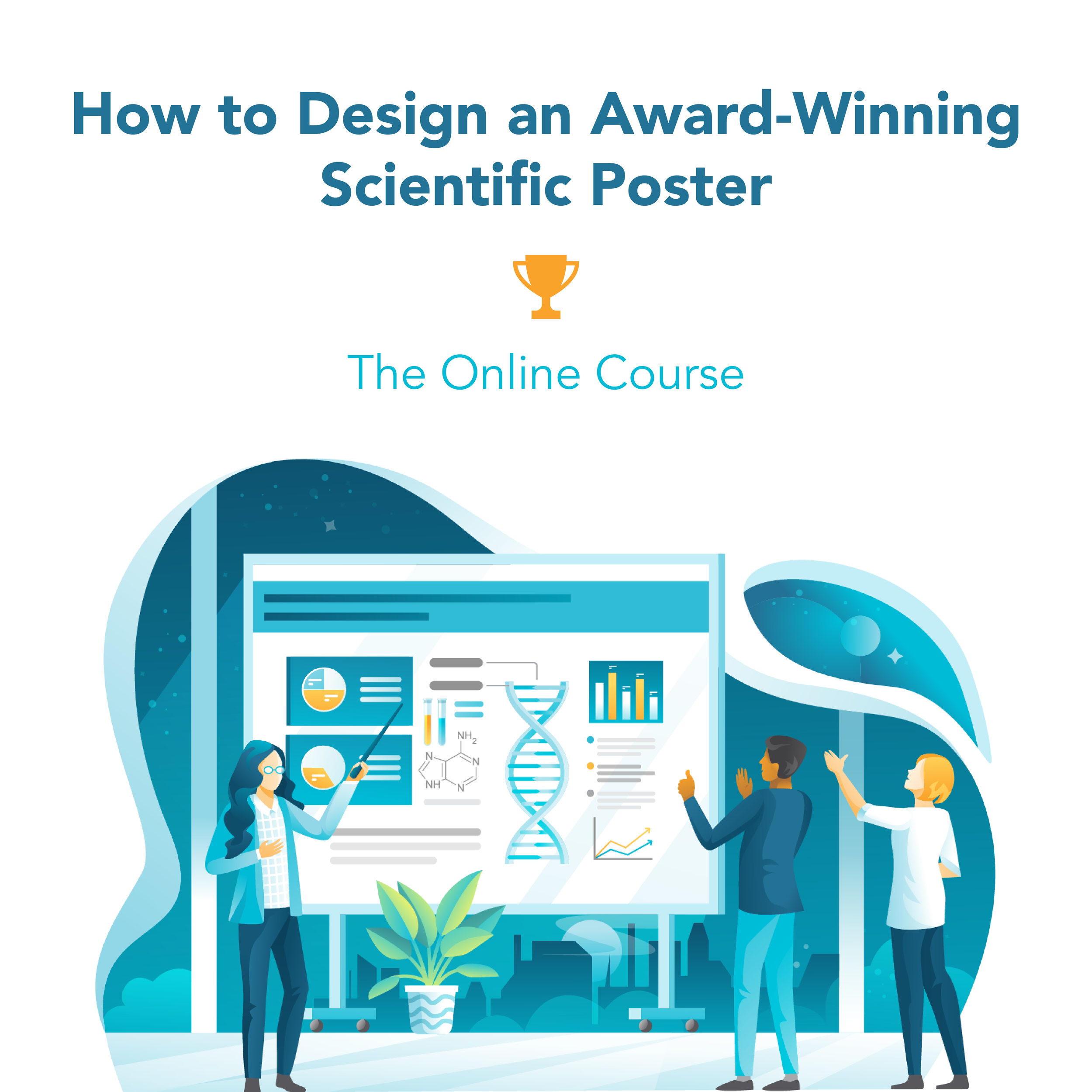
And let me tell you—this course is AWESOME.
I’d already been chatting and collaborating with Dr. Tullio Rossi and his team at Animate Your Science for a while now (they wrote a guest blog for me, and I wrote one for them). So, I already knew they were a company I could get behind.
I was also given access to the course so I could watch it and make sure the videos were high quality and shared great information. Even though I don’t do scientific posters or have training on them, because of the overlap with presentation design skills I still know what to look for.
And let me warn you, I’m really picky and don’t just love anything. If you haven’t seen my grumpy response to the whole “better posters templates”, read it now so you can get a sense that I don’t just endorse anything about posters.
But Animate Your Science’s (AYS) course?
Well, here. Let me show you my reaction:
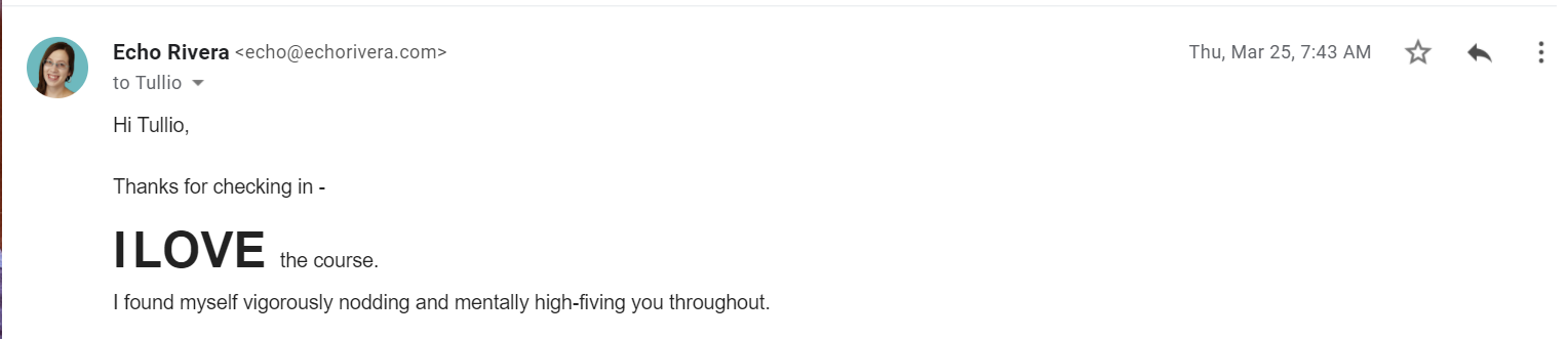
Here are my favorite things about the course:
You will get tips on all the skills mentioned above!
All of the information shared will help you create awesome conference posters. Every tip was helpful and (in my opinion) accurate.
It’s SHORT. I binge-watched it all in a day.
Because the AYS team knows how to design, the presentation slides are engaging too (see how that works? 😎)
Tullio is hilarious and the course is really fun to watch. With permission, I’m sharing my favorite slide that brought me to tears I laughed so hard:

I am thrilled this course exists, because now when people ask me:
“Hey Echo! Do you help with poster design, too?”
Instead of just saying, “no 😭”, I can say “I don’t, but I know who does and their course is awesome! 🙌”
That’s why, when Tullio first reached out to me about his course, I knew I wanted to help share the news right away.
Because it’s such a perfect mutual fit, we came up with a special win-win for both you (my reader) and me!
Through my fancy link, if you enroll in the Animate Your Science course “How to design an award-winning poster”, you will get 15% off 🙌🎁🎉!
Here’s how it works:
Learn about the program here, but DON’T use that checkout link!
When you’re ready to enroll, use this checkout.
Links Mentioned in this Post
How to write a presentation script and practice your presentation the right way
Do academic and scientific conference posters need a drastic change?
7 Things you didn't know PowerPoint could do that will make your next presentation POP!
7 Types of visuals you can use in your presentation slides right now
Guest post by Dr. Tullio Rossi & Dr. Flynn Slattery (Animate Your Science)
Learn about the Animate Your Science course “How to design an award-winning poster”
Use my fancy checkout link for a 15% discount on the course!
In full transparency, we will also receive a 15% commission if you purchase using our link. This is a great way to get the fabulous training you need right now while also supporting our blog and YouTube channel, which is packed with free help on how to create engaging presentations. Thank you so much in advance for your support! Oh, and it should go without saying, but we DO NOT join affiliate programs like this unless we 100% love the company and the product.