
Why being called unprofessional in academia is (probably) a sign you’re on the right track.
AKA how academia weaponizes “professionalism” to kill creativity.
An essay by Dr. Echo Rivera
”I want to create more visual presentations…but I’m worried I’ll be called unprofessional.”
I hear this a lot and boy does it make my blood boil.
It’s like there is a widespread, DEEP FEAR over being called “unprofessional” stopping people from creating more visually engaging, accessible presentations.
What’s going on here?
It’s such a widespread problem that I tore myself away from extra video game time and rage-typed this essay.
Because I swear, only in academia would someone be worried about this upside-down logic.

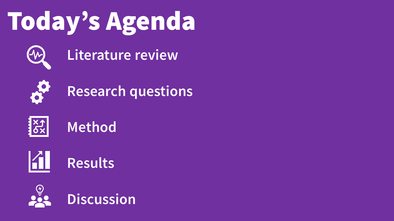
By the end of this essay, you will:
See how visually engaging presentations are way more professional than text-heavy, “data dump” style presentations.
Stop worrying about whether someone will call you unprofessional for giving a visually engaging presentation.
Have the confidence to laugh in someone’s face if they call you unprofessional for creating visually engaging presentations.
I hope you enjoy the ride 🎢. Let’s get started.

Heads up. This is about a 35 minute read.
PDF & ePub versions are available.
(podcast/audio video version coming next).
Get the other formats sent to your inbox >>
The 4 realities that turned “unprofessional” into a borderline meaningless word
Click the “reality” number to skip to that chapter >>
Chapters
Reality #1: Most academic & research presentations are inaccessible, text-heavy “data dumps”…and we all hate them.
Reality #2: We should all be creating accessible, visually engaging talks & lectures…because that’s what everyone wants to see.
Reality #3: It makes LITERALLY NO SENSE to call visual presentations “unprofessional” and SAD presentations “professional.”
Reality #4: Wait…it DOES make sense when you realize some people benefit from SAD presentations being the status quo

Reality #1 : Most academic & research presentations are inaccessible, text-heavy “data dumps”
…and we all hate them.
Let’s both grab a book and get on the same page. 📖
My clients only bring up their fear of being called unprofessional when talking about wanting to make their presentations better.
Ok, so better than what?
In this case, the “than what” is the status quo, or standard approach, for academic and research presentations.
This is pretty easy to describe and shouldn’t be controversial.
The standard academic delivery (SAD) is pretty much what academics and researchers are used to seeing when watching a presentation (or used to doing when giving a presentation).
And what have most of us come to expect when we’re at a conference or in a class/training environment?
We’re used to seeing slides like this:

Standard Academic Delivery (SAD)
AKA #DeathByPowerpoint
Some slides might be worse, some might be a little better…
…but on average, you probably wouldn’t be surprised if you saw slides like that ☝️
Hence, the “status quo.”
Alright. So, with that in mind, if we were to reverse engineer the status quo and create a checklist…what would it be?
It’d be this:
How to create a SAD Presentation
(Standard Academic Delivery)
AKA, a #DeathByPowerPoint Checklist
☑️ All or mostly text (which is also really small and hard to read)
☑️ As few slides as possible
☑️ Little-to-no pictures (visuals)
☑️ The few visuals are clipart, goofy, or things like “SmartArt” / AI designs
☑️ Uses a slide template that everyone has seen a million times already
☑️ TONNES OF DATA, ALL DATA, ONLY DATA
☑️ All the data “speaking for itself,” no compelling takeaways
☑️ One slide after another filled with dense information, data, definitions, policies, etc
☑️ Speaker goes on tangents, skips slides, doesn’t finish on time, causes mental whiplash
In just a few words?
Inaccessible, text-heavy “data dumps.”
👀 yeahhhhh.
We can sum up all these parts and just go ahead and call the SAD (Standard Academic Delivery) presentations: text-heavy “data dumps.”
And how do these text-heavy “data dumps” impact audiences?
Well… You’ve had to sit through text-heavy “data dumps” before. I’m guessing you experienced felt one or more of the following:
💀
BORED TO DEATH
😖
Overwhelmed
🥴
Confused
😫
Frustrated because you need to understand it, but you don’t
😏
Distracted because it’s hard to focus when it’s this chaotic or boring
😒
Annoyed that you wasted your time coming to this
I swear, only in academia would anyone try to gaslight you into thinking it’s professional to make your audience feel that way!
lol like what?!
You already know this. This isn’t new information.
But what is new information (maybe) is what I’m about to say right now:
SAD presentations have a deeply negative impact on the audiences who are forced to endure them AND the speakers who deliver them.
This might feel “new” because, by the time you’re reading this essay, you might have a sort of cultural-level learned helplessness (for lack of a better word).
By now, you might have convinced yourself that SAD presentations aren’t that bad, because that’s just how it goes when you create “professional” presentations.
Until this essay, maybe you’ve convinced yourself that SAD presentations are good enough if the audience “really wants to learn” and is willing to “meet you halfway”.
Maybe this sounds familiar to you:
When we first see SAD presentations, we think…
😩
Ugh! This is terrible. How boring and confusing. This teacher/speaker sucks.
But when we start to realize most are SAD, we start to think…
🤔
Another one?! Well…I guess all presentations are like this? Maybe I’m the only one who hates this?
By the time we’ve seen the 100th SAD talk, we convince ourselves…
🤓
This is the way.
This is a classic coping mechanism when we feel stuck and hopeless about changing the problematic thing in our lives.
Or, hey. Maybe you never believed this, and that’s why you’re here reading this essay.
The purpose of my essay is to help you remember how you initially felt when you first saw text-heavy “data dump” lectures (because most of us see them as students), and to remind you that your initial negative reaction was correct.
The culture of boring lectures was in the wrong—not you.
Because SAD presentations — that whole “checklist” I showed you above — isn’t okay.
It’s not “good enough”
It’s inaccessible.
Inaccessible for people with disabilities and neurodivergent folks, yes, but also inaccessible in the broad sense of the term.
Somewhere along the way, talks and lectures became tragically inaccessible, and then we were force-fed it so much that it became The Way.
But there is just no way that inaccessible data dumps with bad design are professional.
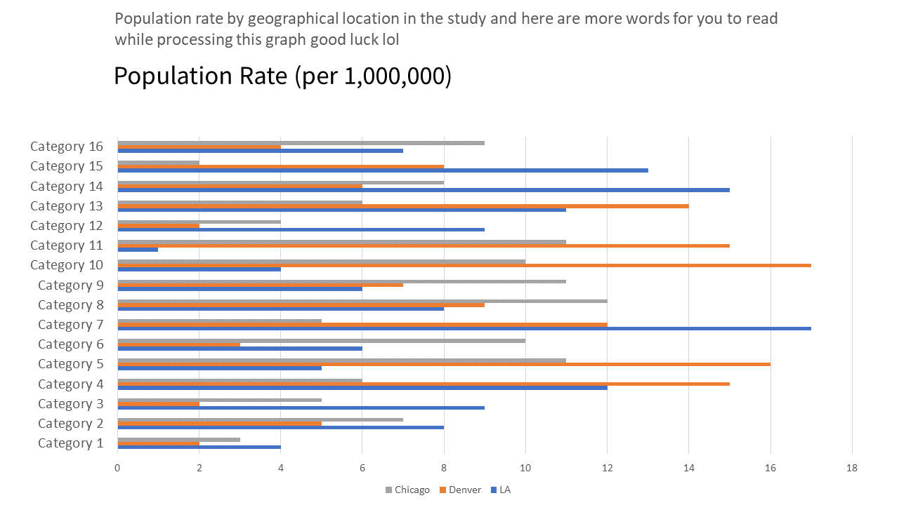
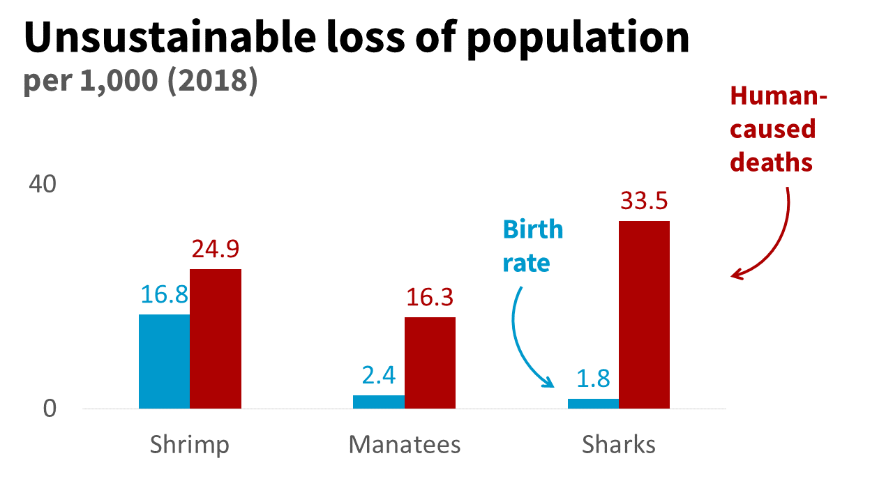
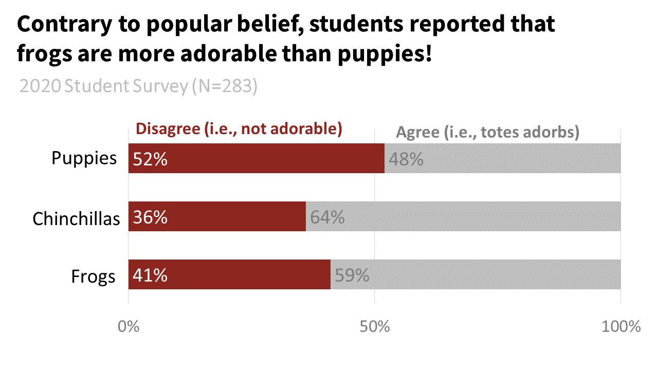
Do not let anyone try to convince you that this is somehow professional. There is nothing professional about this graph right here.
Now, most people agree that it’s unprofessional to be inaccessible.
So how did we get here? How did we not label these SAD presentations as inaccessible?
It’s a slow and sneaky process. So much so that we often don’t even realize it’s happening.
And the most insidious part of it all?
Deep down, most of us still know something is wrong.
We still know that we shouldn’t feel this bored, confused, underwhelmed, or overwhelmed when we watch a presentation.
But we’ve experienced so much gaslighting that we start to attribute the cause of these feelings to other (incorrect) things.
Because that’s how it works. When we know something is wrong, we have to blame something—even if it’s the wrong thing.
To avoid the reality that SAD presentations are inaccessible, we start to blame or believe some really weird things. We start to create SAD scapegoats.
SAD = Standard Academic Delivery
SAD scapegoat #1: Learning styles
AKA we blame ourselves, not the speaker.
I’m convinced this is one of the main reasons so many people continue to believe in learning styles despite the massive lack of evidence for it.
Just in case you didn’t know, learning styles are pretty much a myth.
The idea that some people are “visual learners” or “audio learners” (etc) and the way they learn should be tailored to their “learning style” is a bunch of nonsense.
But a mistake I see among people who are trying to combat the learning styles myth is they usually fail to address the big ol’ elephant in the room 🐘—that the SAD style of teaching is tragically and ubiquitously inaccessible.
Because of a whole bunch of compounding factors (individualism culture, inaccessible environments) and the fact that the status quo is inaccessible, by the time we’re in college, we blame ourselves when we struggle to pay attention or understand a presentation (talk, lecture, etc).
What happens, then, is many people think:
“Oh, that lecture was just a giant wall of text and incredibly boring…I guess I’M personally just a visual learner.”
… instead of:
“Oh, that lecture was just a giant wall of text and incredibly boring…the professor should have put more effort into making this engaging.”
Whenever I hear someone say “I guess I’m just a visual learner” I want to climb up Mount Midoriyama like I’m on Ninja Warrior and scream at the top of my lungs:
“NO, that lecture really just sucks and the professor failed at creating a minimally accessible lecture. You had no chance to even understand it! Stop blaming yourself so we can fix the actual problem!”
(Because it’s not just the hill I would die on, it’s the mountain I would die on).
If the status quo changed and became more visually engaging and accessible, I bet that we’d see the whole “learning styles” myth fade into the background.
SAD scapegoat #2: PowerPoint
AKA we blame the software, not the speaker.
An even bigger scapegoat than learning styles is PowerPoint.
We looooove to blame PowerPoint for bad presentations. It’s like a sport for some people.
We even created a name for the blame: #DeathByPowerpoint.
For example, people will think:
“That conference talk was crammed with data and I don’t even know what the key points were…Wow, PowerPoint really sucks, I guess!”
… instead of:
“That conference talk was crammed with data and I don’t even know what the key points were…Wow, that speaker really should have put more effort into making this easier to understand.”
So please hear me when I say:
#DeathByPowerpoint is not PowerPoint’s fault.
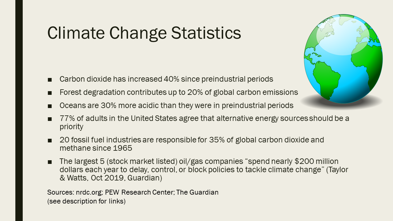
Here are slides made entirely in PPT
(scroll through)
👇


I made a short YouTube video about this with even more examples. Click the thumbnail to watch the video.
And those are just static images.
The real beauty of PowerPoint is how you can build an animated story.

You can easily create a “drawing” effect on your slides (an audience fav)
Or visualize and animate your analogies / metaphors to make your point memorable
Animations have a semi-bad reputation, but that’s only because they’ve been misused.
When used correctly—and strategically—animations can take your “pretty good” talk and turn it into something unforgettable.
Right now, no other slide app has the robust features that PowerPoint has. You have a surprising amount of control over how good you can make your slides look.
I’ve lost count over the number of times I’ve finished a webinar and people are like,
“OMG?!?!?! What software did you use to make this? Adobe Premier?”
And when I’m like,
…”no this is just PowerPoint, folks.”
I can feel the shock rippling through their brains.
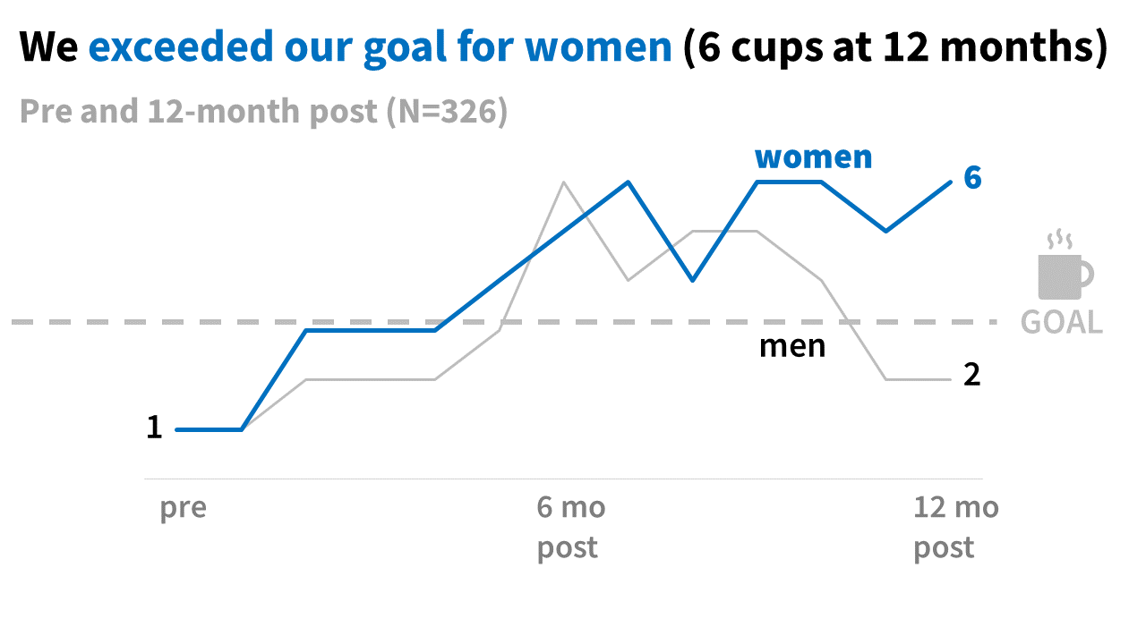
Both of these were made in PowerPoint.
It’s a choice to design a #DeathByPowerpoint.

This is why whenever I hear someone say “I want to create better presentations, what should I use other than PowerPoint?” I want to climb all the way back up Mount Midoriyama like I’m on Ninja Warrior Champions Edition and scream at the top of my lungs:
“OMG (gasps for breath) please just learn how to use PowerPoint correctly. (gulp of air) What are you doing?! Why are you like this?! (passes out)”
I understand the temptation to blame PowerPoint, though, I do.
In fact, I blamed PowerPoint in undergrad and thought using Apple Keynote (and, later, Prezi) was the reason people loved my presentations.
But I’ve since learned that the software had nothing to do with it.
Sure, some of the defaults helped me avoid some of the common SAD approaches, like tiny text. But the rest was all me and how I used the software.
And that’s the real truth: the software you use doesn’t matter.
You can design mind-blowing visually engaging talks and lectures using any software that exists.
Anyone who claims software X is the problem and software Y is the solution cannot be trusted for a single piece of presentation advice.
They are just trying to sell you on a gimmicky solution that won’t actually solve the core reasons presentations are boring.
You can make engaging, accessible slides in Keynote, Canva, PowerPoint, Google Slides, Prezi, etc.
Now, I do strongly recommend people use PowerPoint because (a) they usually already have a subscription and know how to use it, and (b) it has the most robust and powerful features, especially when sharing data.
PowerPoint also is in the lead when it comes to accessibility features.
But if you know what you’re doing and you know how to design slides properly, no one should be able to tell what software you’re even using.
SAD scapegoat #3: Laptops
AKA we blame the tech, not the speaker.
If we aren’t blaming ourselves or PowerPoint, then we might be tempted to blame technology.
Most notably, a few instructors post online about how they’re banning laptops because students aren’t paying any attention.
This scapegoat is a little more nuanced than the rest because I do think there are a lot of valid concerns people raise about laptops in the classroom.
I do think they can be distracting for other students (e.g. if a student is playing a game or something in front of them).
Or honestly, even if the student is just taking notes—hearing the sound of other people typing can be distracting (especially for neurodivergent students) and/or infuriating (especially for people with misophonia).
Plus we know a lot now about how social media is intentionally designed to be addictive, so having easy access to check social media can definitely be a problem.
BUT
I get the strong impression that many instructors who consider a laptop ban haven’t even tried to address the low-hanging fruit first…
…the elephant in the room known as SAD lectures.
💀
💀
💀
💀
💀
If your lecture slides look like this, then yeah. Literally anything else is going to be more enticing.
But guess what?
If all you do is ban laptops without also creating more visually engaging, accessible lectures…then your students are still going to choose literally else than paying attention to your lectures.
For example:
zoning out,
arguing with people in your head,
daydreaming, or
napping…
…are all totally analog ways to disengage.
They may be less noticeable to you, which might make you feel better.
But if you aren’t careful, then this is only going to make you feel better without actually helping your students pay attention to your lectures.
SAD scapegoat #4:
“If they wanted to learn, they’d meet me halfway”
OR…
“My professional audience expects slides like this.”
AKA we blame the audience, not the speaker.
Fun fact! The fastest way someone can send me into a rage is to say to me:
“Well I don’t have to make better slides—if my students really wanted to learn, they’d just meet me halfway.”
There are few ways to so clearly say they don’t give a sh*t about their audience than that.
First of all
You are not entitled to your audience’s attention.
Your audience — even your students who are paying tuition — does not actually owe you their attention.
You have to earn their attention.
You are the one who has to do your job properly.
If your job is to teach, then you need to teach in effective, engaging, and accessible ways.
Inaccessible data dumps (i.e., the #DeathByPowerpoint checklist from above) are not teaching.
That’s literally what you’re being paid for (?!). If you hate teaching, then stop torturing your students and find another job.
Second
I betcha a year’s worth of coffee that you aren’t even meeting them halfway.
I bet that the people who say this are actually creating presentations that require the audience to do all the heavy lifting, and then have the audacity to complain when their audience refuses.
Finally
If you really don’t think it’s your responsibility to create visually engaging presentations for your audience, then my website (and the rest of this essay) isn’t a good fit for you. I work with people who deeply care about their audience’s experiences and want their talks to be enjoyable.
If you are saying this in good faith because you have already tried to make your presentations, talks, and lectures more engaging…
(and they are, in fact, engaging and accessible)…
Then it’s fair to be frustrated if your audience doesn’t meet you halfway. This section here isn’t about you (because you did try to make your slides better).
SAD scapegoat: Summary
AKA what is their purpose?
Notice a pattern with the SAD scapegoats?
They all serve the exact same purpose:
They shift responsibility for creating visually engaging, accessible presentations away from the ONE person who can actually do that — the speaker.
Scapegoats serve a purpose. We use scapegoats when we aren’t ready to:
address the root cause of a problem.
take real steps toward the solution.
You’re in a weird spot though, because you’re actively seeking solutions (and probably have been for a while).
Am I right that you have been ready to address the root cause, and you have been taking real steps toward making your presentations better?
That’s exactly why it’s so important for you to be able to label all of these myths perpetuated by other people (i.e., their scapegoats) accurately.
Because it’s really hard to see them for what they are when they’re coming from people you trust and respect.
That’s probably how you ended up here, and why you’re so frustrated. You’ve been listening to what your mentors, supervisors, and peers told you to do.
(And comprehensive training on presentation skills is still nonexistent in graduate school, leaving you completely abandoned on your path to do better).
That’s how people like us — who are dying inside every time we see (or present) a #DeathByPowerpoint and are driven to do better because we just can’t take it anymore — end up trying a million things that never seem to work, and feeling frustrated that we’re wasting our time.
Unfortunately, it’s also how our presentations really never become fully accessible or engaging… because we’re focusing on something that isn’t even a real cause of inaccessible slides.
That’s how we repeat this cycle, whether we want to or not.
So now let’s look at the alternative cycle-breaker.
What is better than SAD presentations? How do you actually fix this?
Reality #2: We should all be creating accessible, visually engaging talks & lectures
…because that’s what everyone wants to see.

Ok, so we’ve established that text-heavy “data dump” talks and lectures become the status quo despite the fact that they’re inaccessible and everyone hates them.
The status quo is not legitimately a good way to present.
We all know this.
That’s how cultural norms work—they can persist across generations even when they are harmful.
When we know something is wrong, we find scapegoats to shift blame rather than identify or tackle the root cause.
(This explains how a lot of things work in the world, unfortunately. If we do this for Big Things like systemic oppression then of course we would do it for Little Things too, like communication strategies).
But sometimes we can shift cultural norms when the alternative becomes too popular to ignore.
And it can sometimes help when the alternative is legitimately better.
So let’s make visually-engaging presentations more popular than SAD presentations.
Legitimately better presentations look like this…

Visually-engaging, accessible slides
AKA Powerful presentations
How to create a visually-engaging, accessible presentation
AKA, a Powerful Presentation Checklist
☑️ Slides are used (verbal-only presentations are inaccessible)
☑️ Text is used with visuals (visual-only presentations are inaccessible)
☑️ “Curse of knowledge” gaps are non-existent or minimal
☑️ Content/script is not based on information deficit model of communication
☑️ At literally no point in the talk will anyone have to read the slides on their own
☑️ Appropriate amount of text per slide (large fonts); No “wall of text” feeling
☑️ The appropriate amount of slides (i.e., not too few slides)
☑️ Highly visual; 80% of slides or more have a good visual
☑️ The visuals are powerful, diverse, and inclusive (no SmartArt, ClipArt, etc)
☑️ Uses a custom, tailored design (no SmartArt, design templates)
☑️ Data is condensed, summarized, concise (not a data dump of ALL DATA
☑️ Audience is walked through the content, takeaways are extremely clear
☑️ Speaker engages participants in some way (even for videos)
Pause for a second and go back through that list one more time.
You’re used to scrolling and skimming. You probably just glanced through that.
No. nuh-uh. Not this time.
I really want you to read every single one of those checklist items.
And for each one, think about whether that conflicts with what you’ve been told by your mentors, peers, or maybe even other trainers.
(Also look for new terms you’ve not heard of before)
☝️
What I want you to notice about this powerful presentation checklist is…
Many of those items are entirely new terms and/or have probably never been addressed at all by your mentors, peers, or trainers.
Which is why DIY training or just getting tips from social media threads will never fully help you, because you don’t even know everything you should be looking up!
Many of those items go beyond slide design (and dataviz!) and are about the content, script, and organization (what I call the storyboard).
Which is why “quick tips and tricks” focused on slide design will literally never solve your problem or fundamentally make your presentations more engaging.
You’ve likely been told to do the opposite of many of those things (e.g., almost everyone hears they should use as few slides as possible).
Which literally explains why you still aren’t happy with your presentations. It’s more than quick tips—it’s a fundamental shift in how you think about and approach creating presentations.
And if you really think about that checklist…
My next question for you is…
Have you ever seen a presentation that meets even 50% of those items (let alone all of them) ?
👀
Because… if you are worried that you’ll be called “unprofessional” for creating a presentation that follows the above checklist… then um, this is kind of awkward, but…
…that’s, like, a sign you’ve never actually seen a visually engaging, accessible presentation before.

In my opinion, if you are worried about being called unprofessional for creating a visually-engaging, accessible presentation…
that’s a sign you’re the first person in your team, dept, or org who is trying to push back against #DeathByPowerpoint.
Are you aware that makes you a communication leader ?
You’ve probably always hated these dreadful things. 💀
The only thing you haven’t had is the right support or guidance to make presentations you’ve really wanted to make 🤩

Am I on the right track here?
While I know with 100% certainty you’ve seen status quo style presentations, what I’m not sure about is whether you’ve seen a visually engaging presentation before.
I think if you’re worried about being called unprofessional for creating “better presentations” it means you’ve never actually seen a visually-engaging, accessible one as an audience member.
Maybe that isn’t true. Maybe you did see one and it was the catalyst that “woke you up” to how there actually is another (better) way to present.
But only one example might not be enough to shake the years of training you’ve had for creating inaccessible presentations.
I truly believe that once you experience a visually-engaging, accessible presentation for yourself, it’s hard not to laugh when someone tries to tell you it’s unprofessional to present in that way.
Unless, of course, they weaponize imposter syndrome against you, which we talk about later.
Because honestly, you can tell you’ve seen a visually-engaging, accessible presentation when you feel one or more of the following:
😃
ENGAGED AND INTERESTED
😊
Following along
👍
Totally getting it
🤓
Feeling super smart & relieved you understand
🙂
As focused as you can be
😁
Empowered and excited you watched the presentation
So what could possibly be unprofessional about making your audience feel this way?
And with that, let’s talk about Reality #3.
Reality #3: It makes LITERALLY NO SENSE to call visual presentations “unprofessional” and SAD presentations “professional.”

If we consider Reality #1 and #2 together, we can easily see that the pieces don’t add up.
It’s EXCRUTIATINGLY OBVIOUS that SAD presentations are unprofessional, and visually-engaging, accessible presentations are professional.

SAD presentations make audiences feel:

Visually-engaging presentations make audiences feel:

I feel like the only instance where someone could try to make this make sense is if they have vastly different definitions of “professional” and “unprofessional?”
So, I guess, let’s make sure we’re on the same page about how these terms are defined.
How do you define “professional” and “unprofessional”?
I always thought (and still think) those terms were supposed to describe someone’s behavior toward others.
To me, “professional” is defined by behaviors like:
Treating others with respect
Being considerate of others
Displaying compassionate leadership qualities
Effectively accomplishing the tasks related to your career
Whereas “unprofessional” is defined by behaviors like:
Being rude, abusive, or harmful to others
Being selfish and inconsiderate of others
Bullying others into submission
Doing sloppy work, being unprepared
What do you think about my definition, and how much does it align with the way you define these?
Does that really seem unreasonable? Or radical in any way?
If you’re anything like me, then you’d be quick to identify the principal investigator who exploits their grad students or sexually harasses people as unprofessional.
You’d also laugh (or roll your eyes) at people who say dyed hair, tattoos, or piercings are unprofessional. 🙄
So, if we’re similar in how we define this, then how could you not define SAD presentations as completely unprofessional?
A SAD presentation (inaccessible, text-heavy “data dump”) is:
✖️ Treating others with respect
✖️ Being considerate of others
✖️ Displaying compassionate leadership qualities
✖️ Effectively accomplishing the tasks related to your career
which means it checks almost ALL of the “unprofessional” checkboxes.
And I believe it truly is:
✖️ Being rude, abusive, or harmful to others (more on this later, though)
✅Being selfish and inconsiderate of others
✅Bullying others into submission
✅Doing sloppy work, being unprepared
which means it checks NONE of the “professional” checkboxes.
I guess maybe one could argue that #DeathByPowerpoint is professional if it did, at least, check off a few of the “professional” boxes. But it doesn’t check a single one.
And I guess maybe one could argue that #DeathByPowerpoint is professional if it didn’t check off the “unprofessional” boxes…but it checks almost every single one.
Make it make sense!! OMG!
(I do, in reality #4)
But still. It’s truly maddening how anyone can actually say this type of thing with a straight face.
Is that not a glaring example of being inconsiderate and treating others (the audience) with major disrespect?
Your audience is there to learn something new, and when a presentation is that inaccessible, it ends up being a frustrating, waste of time (or worse, people feel disempowered and defeated).
Please, can someone justify how wasting another person’s time and forcing them to slog through a dreadfully dull, inaccessible talk is professional?
Is my definition of “professional” really so far off that I’m the only one who considers that an example of being unprofessional?
I don’t think so.
The professors who brag about putting little effort into their presentations aren’t “efficient with their time”: they’re admitting they’re bad at their job.
I’ve actually had people on social media say things like this to me: “It’s not my responsibility to make my talks or lectures more engaging.”
I find this both appalling and shocking. That’s literally your responsibility — to teach effectively.
Those types of statements are giant red flags that the person creates inaccessible, ineffective presentations…and they’re proud of it.
In what other career would we call those people “professional”?


Like, imagine going to a bakery and biting into a cupcake only to be horrified it tastes like sawdust.


And now imagine the baker scoffing at you, saying “lolz well it’s not my responsibility to make a cupcake you’d actually find tasty.”


You would think…the audacity.
You would think….how unprofessional.
You would want a refund and would refuse to ever go back.


Why don’t we apply this professionalism in the context of presentations? Why are we so okay with people being bad at their jobs and bragging about it?
Meanwhile, we see the opposite pattern with visually-engaging, accessible presentations.
If we refer to the features of a visually-engaging presentation established in reality #2, we can see that a visually-engaging presentation is:
✅ Treating others with respect
✅ Being considerate of others
✅ Displaying compassionate leadership qualities
✅ Effectively accomplishing the tasks related to your career
which means it checks ALL of the “professional” checkboxes.
And I believe it truly isn’t any of the items on the unprofessional list:
✖️Being rude, abusive, or harmful to others
✖️Being selfish and inconsiderate of others
✖️Bullying others into submission
✖️Doing sloppy work, being unprepared
which means it checks NONE of the “unprofessional” checkboxes.

I believe taking the time to think through how you communicate so that your audience understands and enjoys it is the epitome of being considerate of others.
Creating something that others can understand, in the time I’m presenting, is the best way to treat their time with respect.
And quite frankly, it’s our job. If we teach, then we are expected to teach effectively. If we do research, then we are expected to communicate those results effectively.
It’s literally just doing our job well.
Even if you don’t agree with that — even if you don’t agree that visually engaging presentations are better and more accessible — there is absolutely no legitimate way for you to claim that it’s unprofessional.
There is no world where the visually-engaging, accessible presentations I’ve defined in this essay could ever be considered sloppy, unprepared, rude, or harmful.
It’s completely disingenuous to try to argue that the text-heavy “data dumps” are more professional than visually engaging presentations. It is such a ridiculous statement that it safe to assume anyone who says this is saying it in bad faith.
That’s what frustrates me the most about all of this.
Like, I would be fine if people were just honest about why they make inaccessible #DeathBypowerpoints.
If people just admitted they:
don’t have the energy to make them better
don’t care about their audience, or
don’t know how to make them better
…then great. We could all just move on and leave them behind.
But instead, people come up with all sorts of scapegoats (see reality #1) to make them feel better, while also dragging everyone else down with them and lowering the bar for all professional presentations.
I will admit that it does take some courage to push against that. So, just to emphasize my earlier point even further, that’s why I stand by my assertion that…
Creating visually-engaging accessible presentations is leadership.
…And you know what? Some people are threatened by leaders.
Let’s talk more about that.
Reality #4: Wait…it DOES make sense when you realize some people benefit from SAD presentations being the status quo

I keep saying it makes no sense to call visually-engaging, accessible presentations (as defined in this essay) unprofessional.
But that’s not true.
It actually makes perfect sense when you think about who benefits from text-heavy, inaccessible presentations.
The EXTREMELY RARE occurrence of a naysayer calling an accessible presentation “unprofessional” is so predictable that it’s laughable.
(we laugh to not throw chairs at them)
Because this comment will, without exception, come from one of two types of people:
(1) someone who obviously benefits from being able to create SAD presentations when they have to present.
(2) someone who not-so-obviously just doesn’t like what you said (or you), but can’t actually say that part out loud.
Before we break this down…pause and think about those two types of people. Before I say anything else, really stop and think:
Are those your people? (no).
Are those the people who should be dictating how YOU communicate your work? (hell no)
Ok. Let’s break this down by naysayer group.
Naysayer Group 1:
The people who want to continue delivering SAD presentations when they give talks or lectures
Some people, whether they realize it or not, are just trying to protect their own personal status quo.
For the most part, I think naysayers from this group are people who never hated #DeathByPowerpoint as much as we do.
I think they’re mostly people who:
don’t have a disability, especially a learning disability
are neurotypical
were able to participate in classes with relatively higher resources and support (e.g., higher income, access to health care, traditional student, functional/healthy family systems and supports)
These are people who likely never really suffered when watching an inaccessible presentation, the way people with disabilities and neurodivergents really do.
And/or, they’re people who didn’t really have chronic stress, trauma, or other factors that ruined their ability to sleep and eat well, or depleted their working memory.
They might not have liked inaccessible presentations, but it probably didn’t deeply harm them.
At best, it means they never developed the empathy and compassion that often drives people who are motivated to create better presentations.
AKA “I was fine, why can’t others just deal with it like I did?”
It’s not active hostility or apathy for the audience experience, it truly comes from a place of not realizing how bad it is for others.
So, to them, it’s actually not a big deal to make inaccessible presentations.
They’re the ones who usually view design as a preference. They say things like:
“Well sure, adding design to slides is nice…when I have the time to do it”
“Oh, yeah, those slides did look nice, but it probably took a lot of time (was it really worth all that effort when text-heavy slides are fine???)”
They aren’t against well-designed presentations, they just view it more as a bonus.
They don’t hate their audience, and might truly care for them and want them to learn something new when they present.
Sure, no one seems all that engaged when they present, but they have all those scapegoats to rely on to explain it away and to not worry all that much about it.
…until they see your visually engaging, accessible presentation.
That’s when they might feel some anxiety that the rules are changing and they will be left behind or forced to change.
AKA “I just don’t have the energy to change what I’m doing, and you’re making me anxious about that.”
Because it’s easier to make bad presentations, isn’t it?
If all of a sudden presentations everywhere, all at once became accessible then they would stand out too much (in a bad way) and feel pressure to change.
Tbh, no one likes to feel that way about anything they’re currently happy with right?
This is a perfectly normal human reaction and no one is evil for feeling that way or having those thoughts.
I imagine if someone absolutely loves, loves, loves their Standard American Diet (which is … lolz … also SAD) then they’re gonna be pretty upset when their body starts reacting poorly and giving clear signs they have to change their eating habits before they’re ready.
Because that’s what SAD presentations are—bad habits.
AKA “omg, seriously, please don’t make me change my bad habit.”
Unfortunately, humans are weird. We don’t like to admit this type of thing to ourselves. A lot of people feel an internal conflict when we know something is bad and do it anyway. It ruins our self-image a little bit.
And I think academics are more likely to struggle with this internal conflict than everyone else.
Because we see ourselves as evidence-based people who use logic to make decisions.
(lololololololollllllllllllllllllllllll which is hilarious).
So, academics tend to feel this internal conflict more intensely. They really truly believe they make decisions based on logic and data, and not emotions.
(lollllllllll as if having a piece of paper that says PhD on it disabled the fundamental way humans operate hahaha).
So for example, if someone has a self-image of themselves as being a decent instructor…even when they make terribly inaccessible presentations…they are allowed to hold both of those realities in their head while the status quo is SAD presentations.
But the second anyone around them (i.e., you) delivers a visually-engaging, accessible presentation…
…that internal conflict can no longer be ignored, and they can no longer live in their fantasy world that creating inaccessible #DeathByPowerpoints is somehow professional and effective.
AKA “please stop destroying this fantasy world I’ve built that lets me believe inaccessible, #DeathByPPT is professional and effective!”
People are going to fight to maintain their fantasy for as long as possible.
The easiest way to do this is to attack the evidence, and/or attack the person delivering the evidence (i.e., downgrade their credibility).
It will be significantly easier for them to dismiss your presentation (or you) as unprofessional than it is to dismantle their fantasy and build a new realty (i.e., new habit) for themselves.
I want to emphasize that we all do this for one thing or another. This is something good, well-intentioned people do all the time.
This is more likely to come from your mentor, friend, or a colleague/peer you respect.
AKA “OK FINE! I’m convinced. jeez!”
That’s going to make it more painful and harder to dismiss than the other naysayers we talk about. But you also have the advantage here, because chances are high you can see how they present too.
If you can see that they give #DeathBypowerpoint, inaccessible presentations then you can feel pretty confident that their “it’s unprofessional” comment is coming from a place of needing to preserve their fantasy.
And just like their fantasy world, it’s not real. It’s not true.
But there is a ray of hope here.
I think people in this group are the most open to coming around eventually.
A lot of people who take my training ask me for help with convincing their supervisors, mentors, and colleagues when they get pushback about the slides being “too visual” or “too different.”
These are the type of people who tend to change their mind (and become advocates for visually engaging, accessible presentations) once they actually experience one for themselves.
The foundation of their fantasy world starts to crack once they experience an engaging presentation for themselves.
Their fantasy world starts to fade when they see someone else’s audience stay completely captivated during a visually-engaging presentation.
And their fantasy world turns to dust once they hear people from the audience say things like:
“omg that was a great talk, wasn’t it?”
“wow, that was actually really easy to understand!”
“I really liked that talk, and those slides were so visual!”
That’s why my advice is always the same: push through and do it anyway. Once they experience it (and see an engaged audience), that usually wins them over.
That’s what makes them different from this next subgroup...
Some naysayers from this group are apathetic to their own audiences.
There are a lot of people out there who have been doing well with minimal effort, and just from being mediocre.
These are the type of people who tend to be a little more apathetic to their audience and the idea of presenting in general.
They honestly just do not care about their audience. They aren’t hostile, but they are very much not interested in delivering an effective or positive experience.
Their vibe is milquetoast and they’ve never had a problem with that before.
AKA “please do not disrupt my milquetoast vibe. I’m getting praise just by being mediocre and you’re threatening that.”
…until they see your visually-engaging, accessible presentation.
Visually-engaging presentations require the use of information design, graphic design, and a variety of other skills (like empathy for the audience, storytelling skills, etc).
NONE of those are taught to us.
We are taught the OPPOSITE of this (as established in Reality #1).
That means it takes extra motivation to seek outside sources of professional development, and the commitment to invest in our own skill development.
It takes the perseverance to try, practice, fail, and make a real effort to get better at something.
Guess who has no interest in doing ANY of that?
People who don’t care about being good at their job, and have been doing well already even though they’re not very good at their job.
i.e., the bakers who scoff at people who get upset their cupcakes taste like sawdust.
AKA “Just eat my sawdust cupcake and continuing praising me for doing a bad job like I’m used to. k thx.”
Which brings me to something I’ve noticed about who is actually worried about being called unprofessional for creating better presentations.
This concern over being called “unprofessional” is a burden not shared equally.
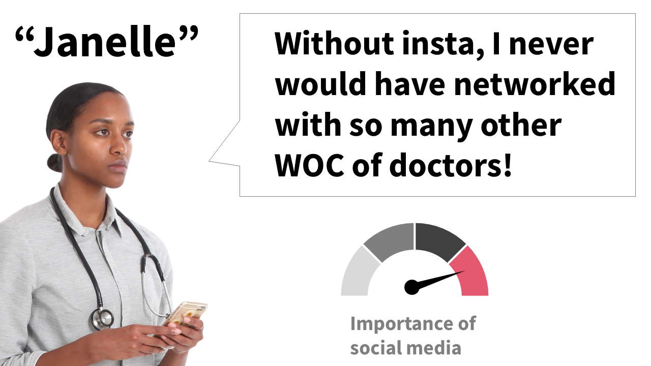
In my experience, the people who have a deep fear of being called unprofessional tend to be or have:
women
people of color
neurodivergent
a disability
part of the LGBTQ community
gender non-conforming
first gen
low income
an immigrant
White men are noticeably more aggressive about justifying SAD presentations to me on social media.
H o w i n t e r e s t i ng
So when I look at who is actually worried about being called unprofessional, it becomes a lot easier to see what’s really going on here.
Because I’ve attended some talks where the white male speaker said some really terrible, unprofessional garbage…and with such confidence that it was clear he had never worried about being called unprofessional in his life.

Meanwhile, I’ll be training someone from a historically marginalized group and they’ll be having an existential crisis because they’re worried using a high-quality photo will make them look unprofessional.

But these people who have done well with their milquetoast vibe are more aware now, I think.
I think they know it might not last forever.
I suspect they have a tab open in their brains where they’re “waiting for the other shoe to drop.”
And that’s what your visually engaging presentation is—the “other shoe.”
So it creates the same internal conflict that we talked about earlier and they need to do something that quickly and easily gets them back to their personal status quo.
Calling you “unprofessional” is a lazy, easy way for them to do that.
Unlike the above subgroup, these are people who truly do benefit from SAD presentations, because their entire vibe is about being mediocre.
It’s nearly impossible to get them to change their mind or become open to visually engaging, accessible presentations.
So just leave them in the dust, where they belong.
Naysayer Group 2:
The people who not-so-obviously don’t like what you said (or you), but can’t actually say that part out loud
There is, sadly, a chunk of hostile people who are coming from a bad place.
AKA let’s talk about the elephant in the room
If you are from a historically marginalized group and/or you’re talking about anything that remotely challenges a status quo, then this section is for you.
Because this is the one situation where I do think you may have someone tell you that your visually engaging, accessible presentation is unprofessional.
But that’s honestly not a surprise.
It is well documented that Academia has a brutal history (and current problem) of racism, hatred towards the LGBTQ+ community, xenophobia, sexism, classism, and ableism.
And people from historically excluded groups have had to endure generations and lifetimes of being told – in a million different ways, through a million different microaggressions — that they do not belong in academia.
Very broadly speaking, these messages start as overt direct statements. As in, literally telling people “you do not belong here.”
But, over time, as laws are passed and society progresses that becomes less acceptable.
And for the people who are desperately clinging onto their power and refuse to change with the times need more covert ways to send that message.
The modern way of telling people they “don’t belong” in this career, is by telling them, “you’re unprofessional.”
“Unprofessional” has become weaponized.
“Professional” = code for “you belong” = we value you
“Unprofessional” = code for “you don’t belong” = we don’t value you
So for some people, that’s actually what they’re worried about when they say, “I want to create better presentations, but I’m worried I’ll be called unprofessional.”
Maybe you’ve been reading this and wondering when I’m going to address this. Or maybe, you just realized that this was the case and maybe I just helped articulate what’s really been bothering you.
Either way, time and time again, we’ve seen that white men’s value is so inherent that they can walk up to the podium, flip through 50 slides, say nothing of importance, and get accolades.
I’m not trying to make white guys the enemy here, I swear, but we need to acknowledge that we’re working in an industry where there are set, unspoken words about who has value and who doesn’t.
If society has categorized someone in the “has value” group, then the default label assigned to everything they do is “professional.”
Anything people labeled by society as those who inherently “have value” do is labeled as “professional.” It doesn’t matter what they actually do. It will be labeled as professional. As correct. People will accept it as The Way.
👏 It doesn’t matter what they actually do 👏. It will be automatically labeled as professional. As correct. People will accept it as The Way.
And it takes a lot, and I mean a lot, for people to change their label to “unprofessional.”
In contrast, if society has categorized someone as part of the “does not have value” group — AKA people who were only just allowed to be here like 5 days ago (AKA historically excluded groups) — then they do not have this benefit.
Best case, their label is unassigned at first. Even still, I swear some people will give themselves whiplash with how fast (and for so little) they’re willing to change that to “unprofessional.”
Worse case, the default label assigned to everything they do is “unprofessional.”
So it’s logical to worry that when we go against the status quo, even if it’s just a little bit, that hammer will come down to nail us back into place.
No, that’s not quite right.
I think it’s more like we’re worried the hammer will swivel around, pull us out of the wall, and toss us aside.
And if you have the audacity to actually be noticeably better than the people who are historically valued no matter what they do…
phewww that pisses them off, doesn’t it?
It’s a precarious place, so it makes sense to worry that sticking your neck out can backfire.
But here’s my stance on this. And I don’t think this is new information, I think you know this already.
Literally just existing in this space will sometimes get you labeled as unprofessional by default. As “incorrect.”
Some people are literally just mad you’re there.
That you are existing as a leader and being powerful.
That you have the courage and ability to say something that actually matters.
But when those people who supposedly “don’t have value” come along and start making accessible, visually-engaging presentations that everyone loves there isn’t a legitimate way to reject it without placing a bad quality on it.
They know they can’t say the truth out loud, which I imagine would be something like:
“I’m upset your audiences love your talks and lectures more than mine. I probably couldn’t learn how to do that or pull that off because I’m not that smart/talented/motivated. So I’m gonna attack you with a word I use as a weapon and people before me have used as a weapon.”
If anyone actually says that an accessible, visually-engaging presentation is “unprofessional” then they might as well be saying the quiet part out loud:
…that they want to keep being bad at their job, but you’re making that hard for them (or making them feel bad about it), and they need you to stop.
AKA how dare you not stay hidden in the metaphorical (and sometimes literal) special little back office (in the basement) we assigned to you
And if your content is related to social justice at all, then you’re a triple threat—existing in this space, trying to make the world a better place, AND doing it well.
When you’re challenging multiple status quos at once, chances are higher that someone will use “professionalism” against you.
But you’re not being unprofessional.
I think being called unprofessional in this context means you’re probably doing something right.
You’re actively trying to make the world a better place and being effective at it, which is why some people who feel threatened need to lash out in a way that doesn’t immediately embarrass them.
I don’t want to deny that there might be someone out there who, one day, will say your visually-engaging, accessible talk or lecture is unprofessional.
And if/when it happens, if we dig even deeper, what they’re really threatened by is your leadership.
They are threatened that you are strong enough, smart enough, and skilled enough to challenge the status quo, and still succeed (maybe even succeed in ways they only dreamed of).
It’s such a joke, honestly (see reality #3).
Which is why we need to start laughing in their face.
Status quo, text-heavy, “data dump” presentations are inaccessible and inconsiderate—the opposite of professional.
Don’t let anyone try to convince you otherwise, and do not let these people stop you.
Status quo, text-heavy, “data dump” presentations are inaccessible—the opposite of professional.
Visually-engaging presentations are accessible and the literal definition of professional.
Don’t let anyone try to convince you otherwise, and do not let these fools stop you.

You have a higher chance of winning the lottery* than being called unprofessional for creating better presentations.
*not a real statistic, obvi, but it’s effectively true in practice
99.99% of the time, when my clients present visually-engaging presentations, they get applause.
They hear from their students or junior colleagues:
“FINALLY, an accessible presentation! OMG!”
They hear from their supervisors or senior colleagues:
“WHOA. That was impressive! Where did you learn those skills?”
They hear from peers or professionals in other settings:
“That was a great talk, can you come give this talk to my department?”
Presenting visual presentations is an empowering, confidence-boosting experience for my clients because they can finally — and visibly — see the lightbulb moments from their audience, in real-time.

If you enjoyed this essay, then that’s a sign we should work together
My menu of services is below, but if you aren’t sure where to start, then I recommend you book a 1-and-1 session with me and we’ll go from there.

PDF & ePub versions of this essay are available.
(podcast/audio video version coming next)
Get the other formats sent to your inbox >>