
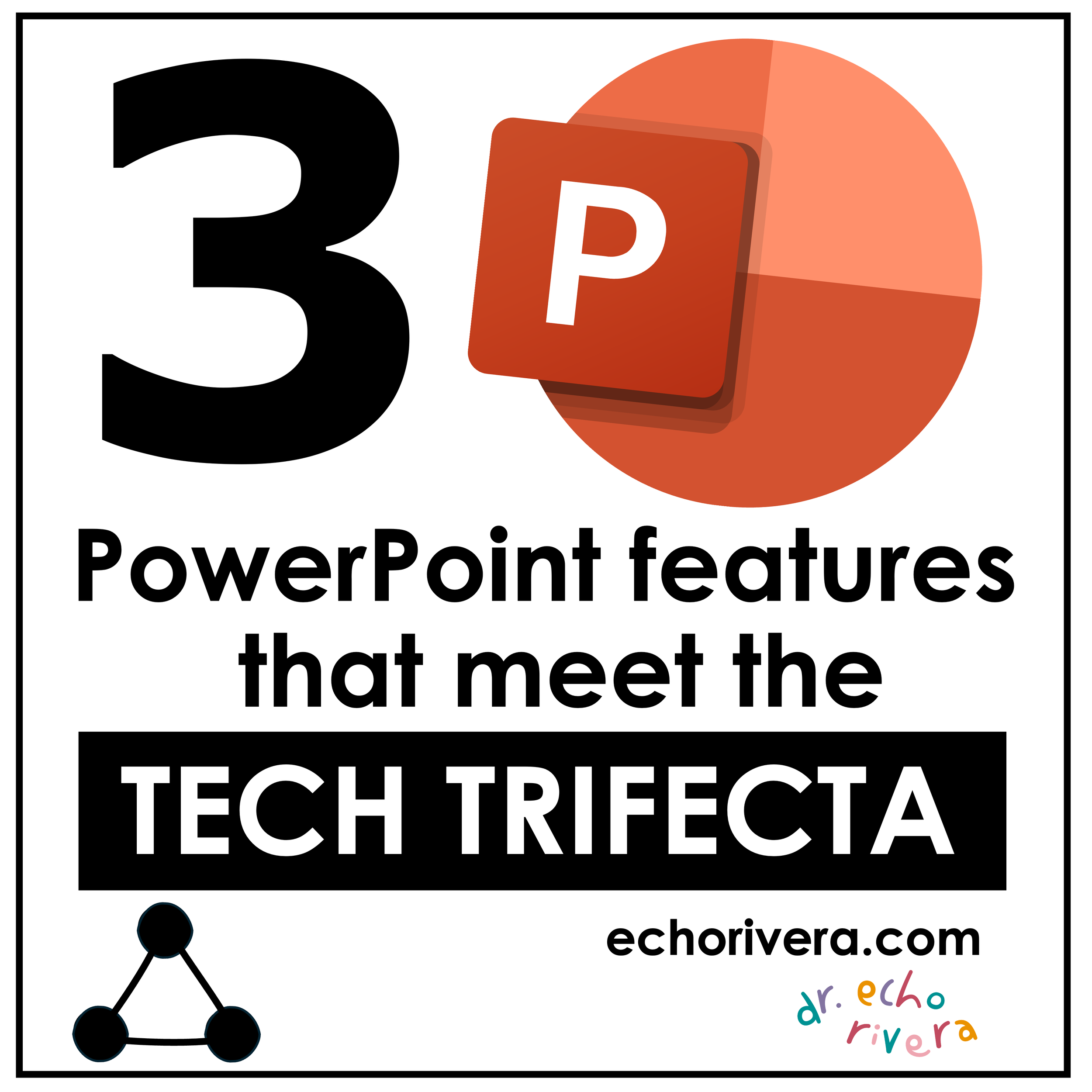
3 PowerPoint features that meet the Tech Trifecta (and blow my clients' minds every time)
Echo Rivera, PhD shares 3 PowerPoint features that are quick & easy to use, AND make your slides look better. Professionals who give presentations, use these!
Blog version updated: November 17, 2025
I almost didn’t write this blog post because I think I’m about to spoil one of my favorite moments in 1:1 sessions or during the Q&A sessions for my program.
I look forward to this moment, because after the Big Reveal I’m guaranteed to see their faces light up with pure delight and excitement.
“How did I not know this existed?” They say.
“That was so easy!” Says their wide eyes.
“It’s going to save me so much time!!!” Their face betrays.

Then we cheer together in the pure delight that only a Tech Trifecta can bring.
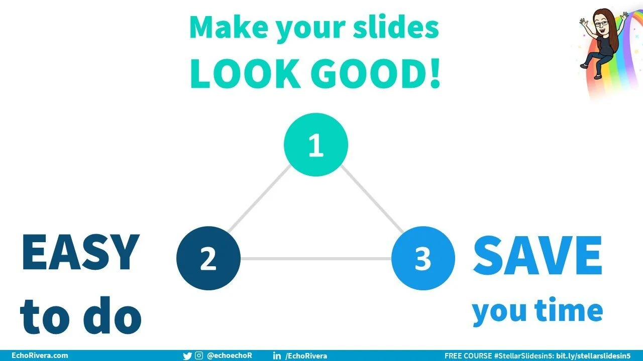
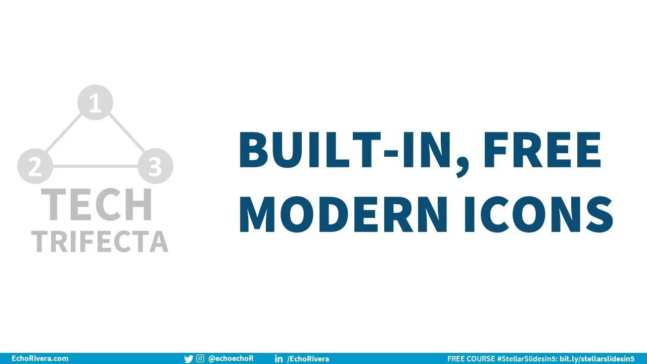
What is a Tech Trifecta, you ask? It’s when a tech feature meets all three of the following criteria:
It’s EASY to use
It makes your slides (or whatever) LOOK GOOD
It SAVES YOU TIME
omgggggg, right?!
Making people feel joy when using something like PowerPoint is my not-so-secret mission, so I never get tired of this moment. Not ever.
But I’m going to put my selfishness aside and spill the beans. And here’s why: A lot of people get hung up on the technical part of using PowerPoint.
That’s why I love showing people how easy PPT is.
So let’s get to it. What are the 3 PowerPoint features that meet the Tech Trifecta (and blow my clients’ minds every time)?
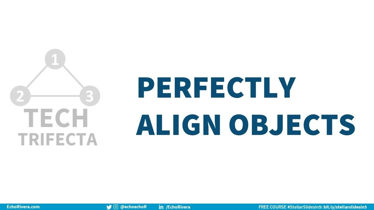
1. Perfectly align objects in PowerPoint with a few clicks
Ever have objects or text on your slide and you know they aren’t perfectly aligned, and you’ve tried your hardest to align them manually but it’s never perfect?
Or have you ever thought yourself to be extremely clever because you inserted a line and used that as your guide for aligning objects (hi, it’s me)?
Well, GET THIS. You can stop messing around with all that because PowerPoint has this wonderful feature called Align.
How to use the PowerPoint align feature:
Select all your objects and/or text boxes you want to be aligned.
Look over on the top right for the “Arrange” icon. Click it enthusiastically.
Hover your arrow over “Align” and click the correct one (this depends on where/how you want them aligned).
Wait with bated breath and watch as your objects magically align themselves perfectly.
Wahooo! Let’s move onto #2.
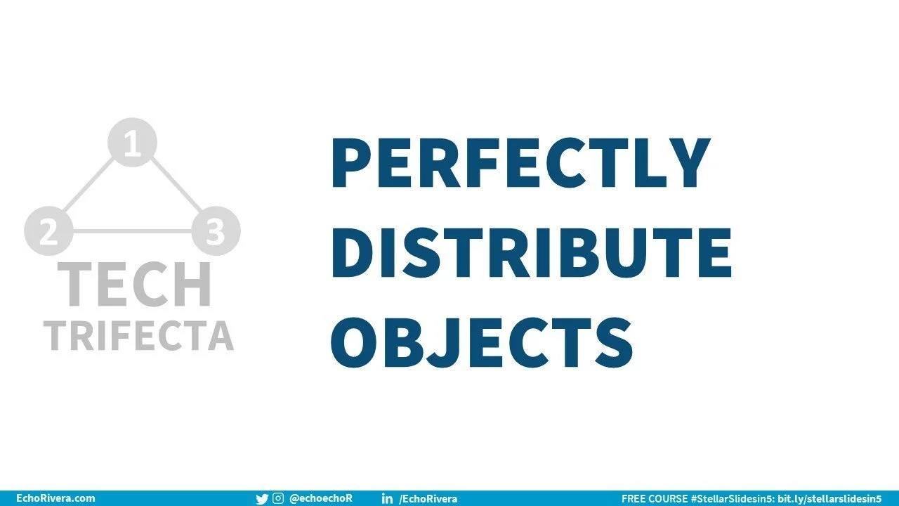
2. Perfectly distribute objects in PowerPoint with a few clicks
Okay, so maybe all your circles are perfectly aligned to the top…but then you might notice that there isn’t an equal amount of space in between them.
Sure, you could try to move them manually and hope that those auto-guides in PowerPoint will help you.
Or, you could feel all clever about yourself by creating a rectangle, and then duplicating it a bunch of times to use it as the measurement between each object (hi, it’s me again).
Oooooooooor, you could be smart and efficient and have PowerPoint do this for you automatically again.
How to use PowerPoint to perfectly distribute objects:
Move one object to the “starting point” you need, and then one to the “ending point.” In other words, choose the position for the first and last object.
Select all your objects and/or text boxes you want to be aligned.
Look over on the top right for the “Arrange” icon. Click it emphatically.
Hover your arrow over “Align” and click either “distribute horizontally” or “distribute vertically” (this depends on where/how you want them distributed).
Wait with bated breath and watch as your objects magically distribute themselves perfectly.
Amazing! Let’s move onto #3.
3. Use the icons in PowerPoint
I just about fall out of my chair when people tell me they haven’t seen these yet. They’ve been in PowerPoint for years!
This feature is one of the key reasons I’ve ditched Apple Keynote after 15 years and am now using PowerPoint exclusively.
You. Have. Free. Icons. Waiting. For. You. OMG. USE. THEM!
How to use icons in PowerPoint:
Go to the Insert tab.
Click “icons.”
Fall out of your chair for not realizing they were there before, get back on, then swirl around in your chair from excitement about all the time you’re going to save when looking for icons.
Choose the icon/s you want to use.
Click “insert.”
Amaze your audience with your professional use of icons.
Tips for using PowerPoint icons:
Each icon has 2 versions, one that’s a light outline and one that’s more filled in.
You can even change the color of the icons by going to Graphics format, and changing the “fill” color.
There are more types of visuals in this section, such as: cutout people, stickers, videos, illustrations, and cartoon people. I cover this in more detail and include recommendations about which ones to use (and which ones to avoid) in the visual database minicourse part of my program).
Bad news notes about the PowerPoint icons feature:
Internet connection is required.
This is more annoying on the Mac version of PowerPoint because it opens up in the side panel instead of as a pop up.
If you don’t see “icons” there, then check to see if your version of PowerPoint has them.
If your version of PowerPoint is supposed to, then it’s likely blocked by your IT department. Contact them about getting icons unblocked. It’s worth the effort!
You may be wondering what’s so fabulous about these icons, given there are free icon websites.
Yes, websites like flaticon.com and nounproject exist…and I used to use flaticon.com.
…but…as I cover in my online professional development program, you have to be careful about avoiding icons that look like ClipArt or don’t follow some other important design rules.
Most of time, when clients have icons from flaticon or nounproject in their slides and we work together on a makeover, I replace them with PPT icons.
You also typically need to give credit to the creators, which means you have to keep track of more things and adjust the slide design to include the attribution. It’s totatlly possible to do it, but it does take more time.
And I have people telling me every day that they don’t want to make better slides because they don’t have the time.
So, here I am, offering up a TIME SAVING way to use quality visuals.
In full disclosure, I personally use PPT icons or icons from streamline.hq. I don’t use flaticon or nounproject, etc anymore.
But these icons in PowerPoint follow all the criteria I provide in my program when choosing visuals. That’s less thinking involved.
So, not having to provide image attributions saves time and is a highly welcomed strategy among my clients.
So what do you think? Are you excited? Did you already know about these? And more important: do you know any other features that meet the Tech Trifecta? Let me know!
Want to get better at PowerPoint?
I have a whole bunch of videos about PowerPoint over on my YouTube channel. If you liked this post, then take a look at this video about the 11ish MUST KNOW PowerPoint tools.
I’ve organized the topics into different playlists, so it’s easy to get started with your topic of choice. View my playlists here:
FREE training 👇
with joy,
Echo Rivera, PhD (she/her) See my portfolio
Hi 👋 I’m Dr. Echo Rivera and I want to help you give presentations that educate, inspire, and have an impact on your audience. I run the YouTube channel, More Than PowerPoint! that helps thousands of people end #DeathByPowerpoint. I work with people in STEM and entrepreneurs who run professional development programs. We can work together in whichever way works best for you.
Book a private session | Hire me as your design consultant | Take my professional development training