
[VIDEO + BLOG] How to use simplicity to design stellar slides - GESTALT SERIES #2

Before you read this post >>
This is actually the written version of my YouTube video. Watch it instead here >>
Update: The download mentioned in this video is no longer available, but I teach this in my masterclass program, and you can kickstart your training for FREE.
This is the 2nd video/post in my series about how to use fields of Gestalt psychology and visual perception to create effective slides (read/watch the first one here).
Also, you should know I have free training available!
Today we’re going to talk about the principle of simplicity. Also known as Good Form or Pragnanz. This is probably my favorite Gestalt principle to use because it’s so foundational. This principle informs everything I do, every design decision I make.
Here’s what it is:
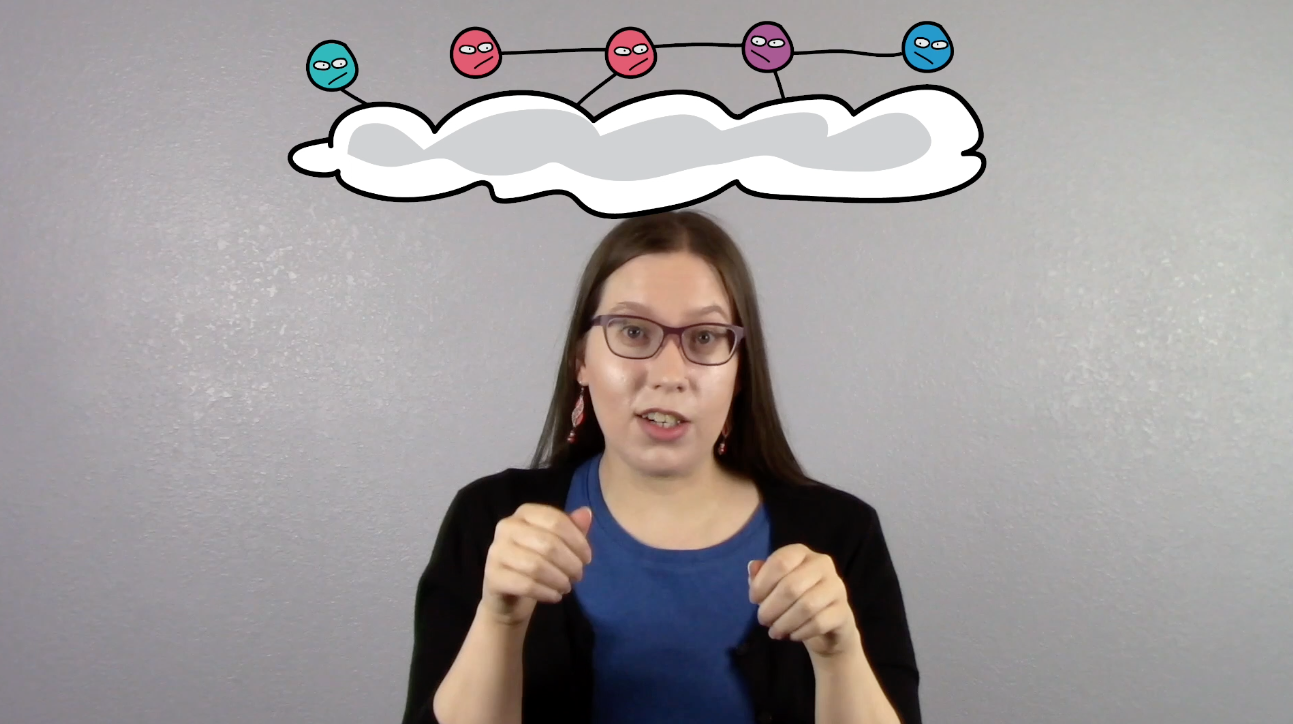
Our brains look for the simplest, easiest way to organize information.

Mind blowing, right?
In other words, our brains prefer the simple over the complex. It’s basically the Ockham's Razor of design. Not sure what I mean yet? I have an analogy that I think you might be able to relate to.

Storytime!
Not so long ago, someone told me about this driving app that was supposed to show you the fastest way to get to your destination. It was supposed to use some fancy algorithm to help you beat traffic. Sounds good. I tried it on my way to/from work, which was a really simple route that had horrible traffic.
So, I trusted that the algorithm gods would know a better way...


Except, it was a super annoying app to use. There'd be video game noises for picking up candy on the road (WTF, why?!), and bleeps and notifications due to an accident or traffic or a squirrel up ahead!


All while it would suddenly tell me to TURN LEFT, and then TURN RIGHT, and then CROSS THIS DANGEROUS INTERSECTION BECAUSE YOU'RE ON A SIDE STREET!
UGH. It was obnoxious. I had to make 30 turns just to get to work maybe a couple minutes faster. I preferred the simple route over the complex one because, ultimately, it was easier.
And guess what. According to the principle of simplicity, our brains will also prefer the simple over the complex route in our slide design.

So let's talk about how to apply this principle to your slides.
Ask yourself: What "route" do people have to take to get to all the information on your slides?


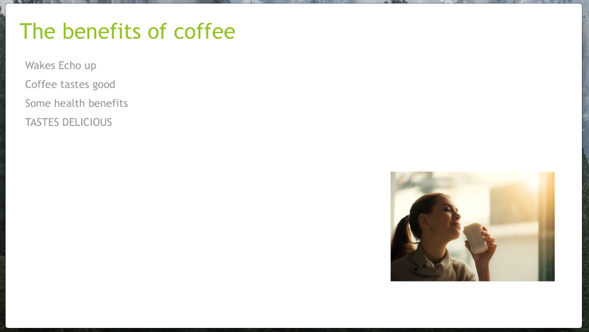
Do you use a bright, highly visible, high contrast template that your audience has to look at first and then decide they can ignore it because it’s meaningless clutter?
Then they have to backtrack to look at your heading (which is in a low point on your slide and centered)...and then have to backtrack again to the left to look at your body text…
...and then jump to a random spot on the slide to try to look at your (really tiny picture) which is awkwardly placed…
...all while you’re talking and distracting them (because we read faster than you can talk), so then they're lost and just stop listening to you altogether.
If your audience has to do all that mental gymnastics to get the information from your slide...then yeah. Your slides are basically that driving app.

And that's not a good thing. That complex route, is stressing people out. It’s bogging down their working memory and pretty soon, they’ll be too tired to care anymore and probably won’t remember much.
Good thing there’s a better way!

The Gestalt principle of simplicity tells us to, KEEP IT SIMPLE, SLIDE MAKER!
But how?
Get rid of all the distractions. If it doesn't have a specific meaning, then delete it! And yes, that includes your template.
Move that heading up so it isn’t in a far away place, it’s where they’re going to look first
Left align it
Arrange the rest of the information in a place that makes sense, right underneath it
Delete the template
Remove the bullet points
Cut down the amount of text on the slide
Now, people will find the information using the fastest and easiest route possible.

Again, this is actually really simple. Just delete all the clutter from your slides...


Stay tuned for my next video, where I show you what to do next.
If you want to get a head start on creating better slides, then dont leave without signing up for my free training!
with joy,
Dr. Echo Rivera