
How to create effective presentation handouts for class lectures, conference presentations, and training workshops
Note: Are you a course member? If you’re enrolled in Visual Slide Design, there’s related bonus materials & handouts waiting for you inside the training, check it out! 😉
Okay, so you are here reading this post because you need to create presentation handouts at some point. 📝
Whether it is for class lectures, training workshops, conference presentations, you are generally expected and should provide some type of written material or handout for our audience.
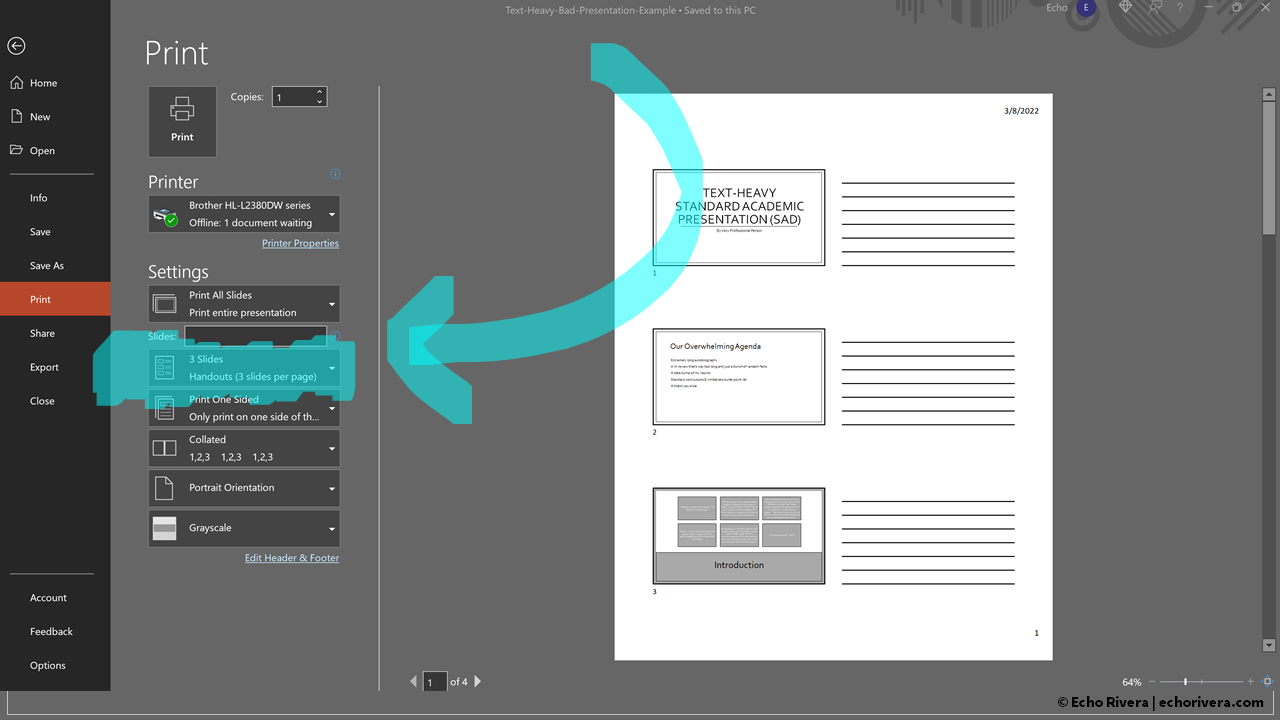
Does this screen look familiar? 😅
I know it does, because it's the place you go to when you’re done with creating a presentation in PowerPoint, and you want to make a handout.
It's those “Print” options in PowerPoint, the three slides per page with lines.
Yeah, you know the one. 😉
Well, it's time to stop using that option forever. After reading this post, I want you to never again choose that option for your handout.
But before we get started…
Hello! 👋 I’m Dr. Echo Rivera and I specialize in presentation skills professional development for people who present data.
Topics in this post
Why the default PowerPoint handout template is so terrible
Three alternatives to this presentation handout design
2 PowerPoint features to avoid when creating a presentation handout

1. Why the default PowerPoint handout template is so terrible
Let's get started by talking about why this default template design is so terrible and why it should not be the standard go-to handout that we are all using. 👎
To understand why this design is so bad, we need to first take a quick moment to get on the same page about the purpose of a handout.
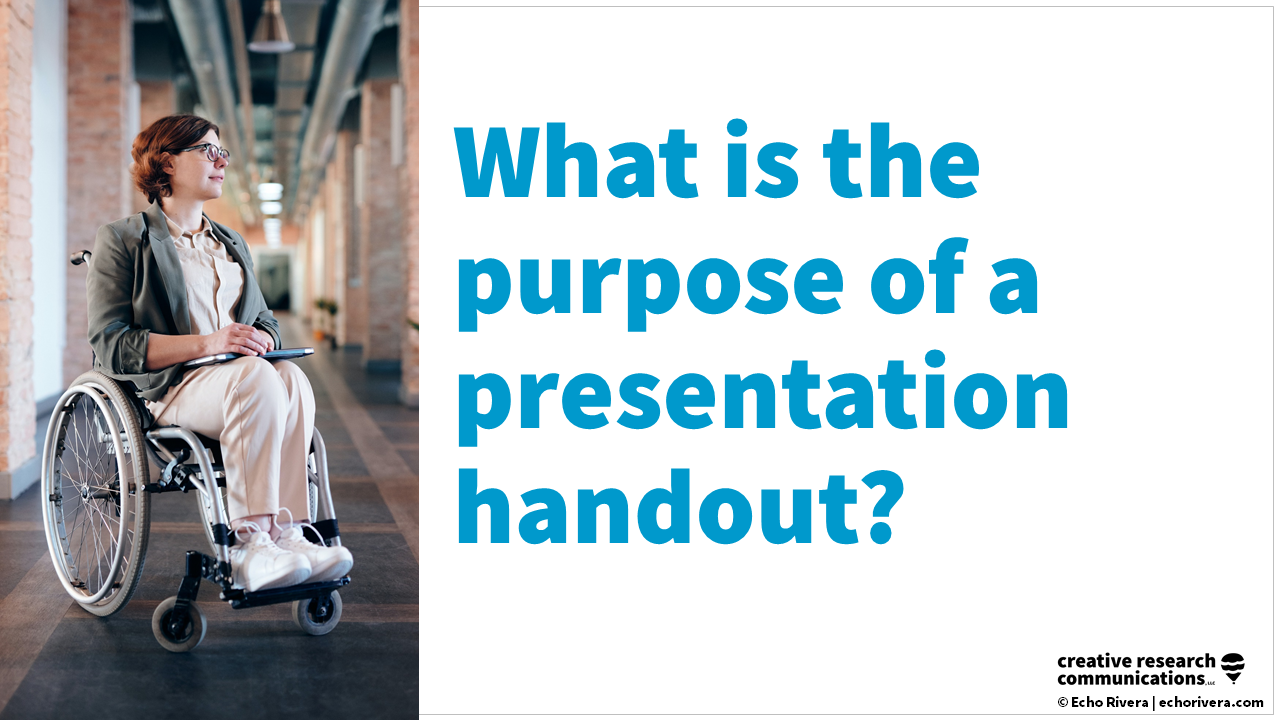
An effective handout is one that works as a reference for later on.
I mean, that's probably the main purpose of a handout, right?
But a good handout also does things like providing the audience with structure and space to take notes that are helpful for their learning. 💡
It helps them stay engaged and if done really well, it can actually become a written guide or a visual structure for how all that information, all those slides in your presentation, fit together.
And finally, maybe with a little extra effort, a handout can be a great tool to keep your audience engaged from start to finish through your entire presentation.

And yes!
It is possible for a handout to meet all of these goals.
Basically, we've just created a helpful checklist that we can use to evaluate different handout designs. ☑️

So, let's get started with the standard three slides per page with lines handout.
That was kind of a tongue twister. 🤪
Okay, so do these work as a reference for later on?
Well, your immediate thought was probably, "Um, yes Echo, that's why we use them," but let's take a trip down memory lane together, okay?
Has this ever happened to you? 💭
It's some period of time after a lecture or a conference presentation and you dig out your handout, because you're thinking:
“Oh good! I'll be able to use it as a reference”
“I need something that was mentioned in that lecture (or that conference presentation)”
“I need to review for my exam”
“I need to get a citation”
Whatever it is, you finally dig it out of your bag and then you go, “oh wait, it's so pixelated and so small that I would need a microscope to read this, ah!”🔬

Has this ever happened to you? 😬
I know it has happened to me all the time.
So in that case, does that actually work as a reference later on?
No, it does not. 🙅♀️
And here's the twist.
I know this post is about presentation handouts, but we can't talk about presentation handouts if we don't talk about slide design, because that problem is not actually PowerPoint's fault. 💡
It's actually a problem with the slides themselves.
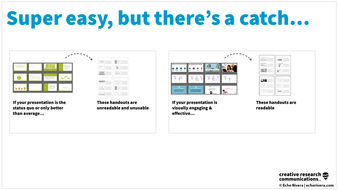
If the presentation is this status quo (text heavy presentation that is everywhere in our field), or even if it's just slightly better than average (it has things like Smart Art and design templates)…
If the presentation has stuff like that, there is no way that those thumbnails are going to work in a handout.
They're just always going to be unreadable and unusable.

On the other hand, if your presentation is significantly better than average, meaning it is actually visually engaging and effective, then these handouts could actually become readable. 🤩

These are all tiny thumbnails of a thumbnail, so let's take a closer look at what I'm talking about here, okay?

So this might depend on if you're reading this on your phone 🤳 or a small screen versus a computer 🖥, but you should be able to read the words in those thumbnails now.
What you’re seeing is a sample of slides from my presentation skills training where I am practicing what I teach: visually engaging and effective slides!
At least I'm, you know, trying to get there. 😅

Now, this is what most people are doing. ☝️
Lots of text crammed on a slide, tiny font sizes, not visually engaging.
There is no chance anybody could ever read that without a microscope and let's be honest, even then that wouldn't work, because it's just the quality of the thumbnail itself.
It's too blurry, it's too pixelated. 👾
So it really could never work with the standard presentations that we are used to seeing, also known as #DeathbyPowerPoint.
So does this handout format work as a reference for later? 🤔

For now, I'm just going to put a question mark to symbolize that it depends, because it depends on the quality of the slides themselves.
So what about the next piece here? The structure and the space to take notes.
Let's do a deep dive on that together.
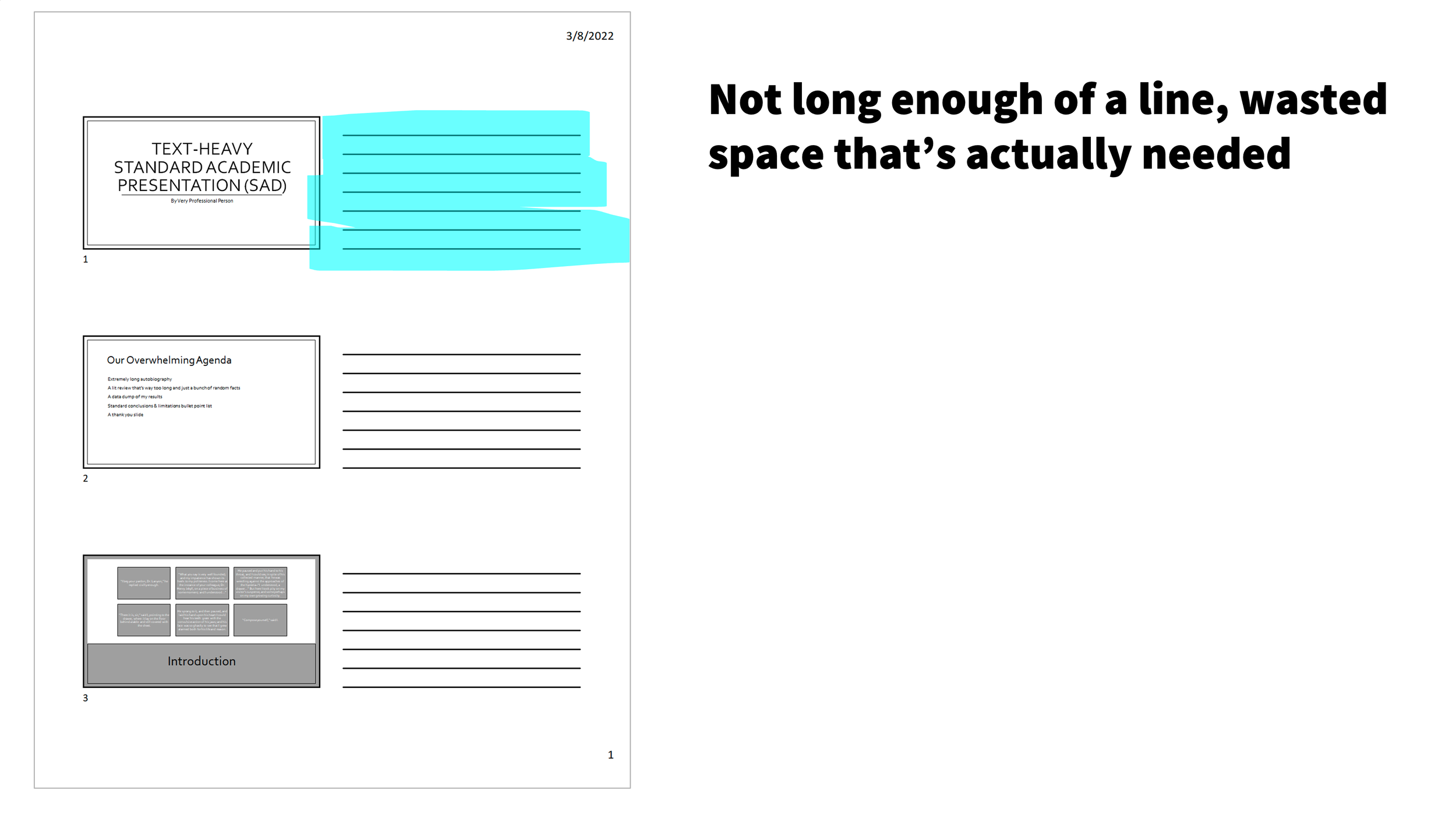
Do you see some lines here next to the thumbnail? 👆
I bet you are tempted to once again say, "Um, yes, like what more structure do you need, Echo, literal lines for notes?"
I hear you and I'm going to burst that little bubble and challenge that.💥
First of all, the design of the line itself fails to allow for meaningful note taking for most people because:
The line isn't long enough
There's wasted space on each side of the line that’s actually needed
Line spacing may not be wide enough depending on your handwriting
So, there's some problems with the actual design of those lines.
I geek out over design stuff, so that's why I pick up on these things. 🤷♀️
What about you?
Have you ever struggled to actually fit all the notes you wanted to take for that slide in those lines?
From what I've heard from other people, it's a pretty common struggle.
The other problem is, you actually have two zones for note taking: with lines and without. 📝

You have the lines, and then you have this loooong blank space.
And there are two shapes, one's a square, one's a long rectangle.
It just makes it awkward in terms of having that space and structure to take notes. 🥴
You don't really know what to put where, it just becomes kind of a mess.
And, you're going to think I'm totally weird for this, and that is totally fair, but I swear, this is a thing.
There also becomes a problem with bad contrast. 😨
So most of us, we're writing with something like a black pen, for example, and when we write our notes and then go back to it later, there's no contrast between our notes and those lines! 🖊

Those lines make it harder to actually use your notes as a reference, because of that contrast problem.
So, one of these things isn't necessarily a deal breaker, but when we look at the impact of all three of them together, our notes kind of turn into a hot mess!
What do your notes look like when you use this?
I know that if I pulled this out six months later, I would look at this and be like, you know what, I don't need this information that badly anymore, and there it goes in the recycling bin. 🗑
That’s the impact of all of these problems put together and I know it's really easy to blame the note taker and to say, "Well, if you would just write neater or smaller or just learn how to take notes, you wouldn't have a problem."
Long sigh. 😮💨
That's not really the attitude that's going to help you connect with your audience and make an impact with your presentation.
Making an impact is that connection and it's setting your audience up to succeed and making it easy for them. 🙌
Whereas something like this kind of sets them up to fail and if their notes work, it's in spite of the structure, not because of the structure.
You're here reading this post, because you want to create better presentations.
I encourage more of a thought process of you wanting to make it easy for your audience and to make them enjoy the experience of note taking. 📝✨

So no, this layout does not help provide a structure and space for people to take notes.
And finally, in no world is a handout like this going to keep people engaged.
We all know this, we've never found this handout to be interesting or engaging, so I don't think that's a surprise.
So here's the final breakdown:👇

Basically, that first item about whether it works as a reference will entirely depend on whether your presentation itself is effective or not.
An effective presentation has things like:
correct font sizes ✅
correct amount of information per slide ✅
correct number of slides ✅
But even if that is the case, it is not checking all of the boxes.
It does not check the other two boxes, which are important.
That is why there are some major flaws with this design and why I am hoping you will use some of the alternatives instead of this design because it:
sets your audience up to fail 😩
does not support your audience in following along with your presentation 💭
doesn't help them use the information later on 📝
is not engaging 🙅♀️
So what should you do instead?
Let's talk about the three alternatives to this handout.
2. Three alternatives to this presentation handout design
Option 1: Use a different handout layout (no lines)

This first option is so easy. You are going to love it! 🥰
All you have to do, is choose a different option when printing or saving your handout as a PDF.

All you have to do is go here 👆, same place, but instead of three slides per page with notes, click that little down arrow and choose something else.
What do you choose? 👀
You choose either four slides per page or six slides per page.

Four slides per page is probably the safest option, but it will depend on how visual your slides are.
If they are highly visual, highly effective, you can probably do six slides per page.
And then in the settings, before you print or save it, you need to change one setting. ⚙️
Remove the slide numbers underneath each thumbnail.

When you start having more effective slides, the whole page number thing becomes unnecessary, irrelevant and unhelpful. 🚫
You will probably be able to stop using them.
That is kind of the goal, but it could be a whole other video one day. 😁
So that's my recommendation. 💡
If you really want those slide numbers on there, you can leave 'em, that's okay.
But that's it, that's option 1!
Now, you probably already caught this, but there is a catch…
If your presentation is that standard status quo, then it's not going to work as an option for your handout.
This option will only help if your presentations are effective and engaging and meet those minimum slide design basics I keep hinting at. 👀✨
(Uses the right font size, correct number of slides, things like that.)
So far, our checklist looks very similar to what we've talked about. 👇

For effective presentations, it will work as a reference later, but it won't if the presentation itself has not been improved (aka standard presentations).
Then why is it better than the three slides per page with lines you ask? 🧐
Well, it's better because the note taking will be a little bit better. 📝
Let's take a look together:

As shown in the handout above, each slide has its own space and there's no lines to get in the way. 👏
There's none of that awkward design where the line is a little too short and the line spacing isn't correct for everybody's size handwriting.
Having blank space actually gives us more flexibility when taking notes.
We don't have lines getting in the way. ⛔️
We are not fighting with any lines. 🤺
Also, there is only one zone to take notes. 😍
We don't have a combination of part of it is lines, part of it is blank space, it's just all blank space and that really is giving us that flexibility we need to take notes in the way that works for your audience.
And of course, that contrast issue I was talking about, we're not going run into that because when people come and look at their notes later on, they're just going to see their handwritten notes. 📝
They're not going to have to look at other ink that is basically the same level of contrast with their handwritten notes.
So this option is an improvement for note taking ✅ and it is an improvement regardless of the slide design itself.
So that's nice. 😄💯
Now, it's not going to be an engaging handout, but again, especially if you've improved your slide design, you've now checked off two of the three boxes and even if you haven't, we've at least checked one box where it will be a little bit easier for people to take notes.
So, you know, a step in the right direction. 🐾

If you have been improving your slide design already, hopefully you are like, sweet, okay, I could totally use this as an option. Yay!

And I do think this is a great handout for:
When you’re in a pinch and have no time at all ⏳
When it's a low stakes presentation (like a lab meeting) 🥼
When you're only giving this presentation once in your life (like a special guest lecture) 👩🏫
When you’re presenting new materials for the first time and you're still working out the content. You don't want to spend a lot of time on a handout if the content itself isn't pretty solid or mostly finished. 👷♀️
So this is a great option for these situations, BUT there are some downsides to this handout…

The downsides to option #1
If you're going to use these, I feel it's my responsibility to make you aware of the downsides.
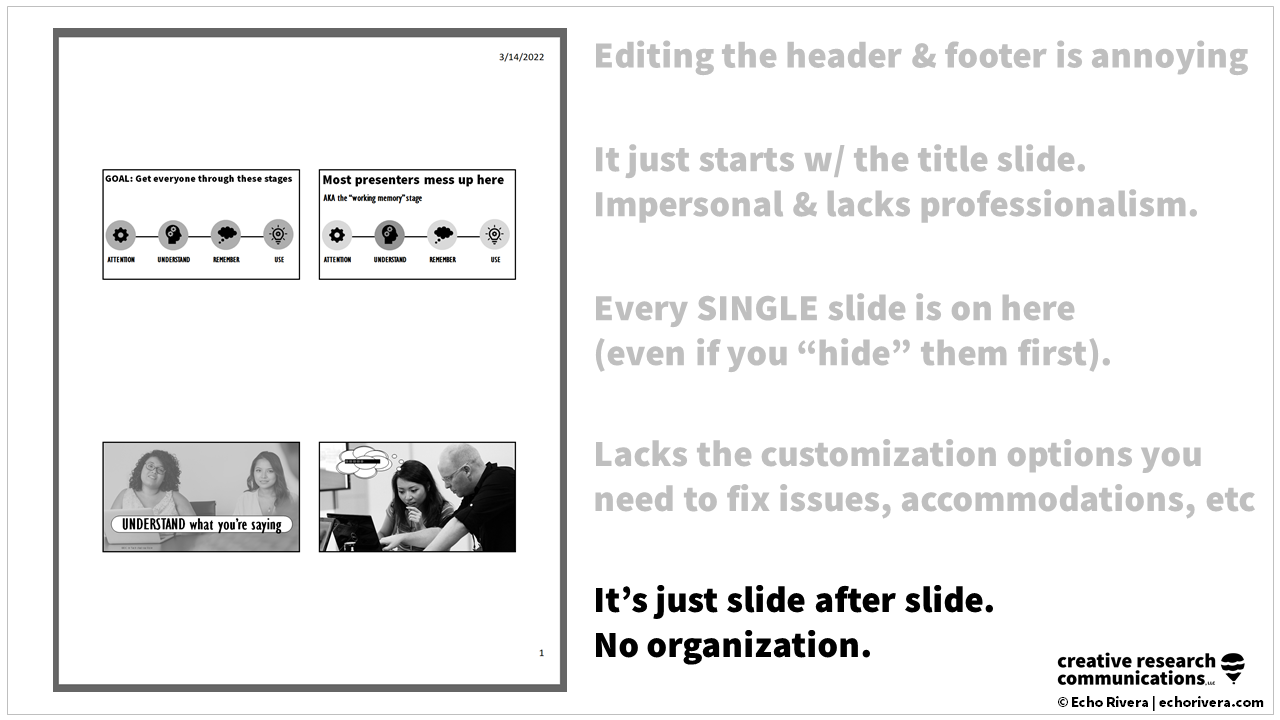
1. Editing the header and the footer is super annoying. 😤
You actually have to use an option, I'm going tell you later to avoid.
You have to go into that option to edit the header and footer, so you're probably not going to do it, which means the header is just going to be this, super generic date (the default).
Very run of the mill, this isn't something that is professional or nice, and the header and the footer are not great.
2. The handout starts with the title slide AND it’s impersonal & lacks professionalism. 😩
The handout, as all of these options do, start with the first slide (the title slide).
We also have so much blank space above the first slide.
There's just nothing special about it.
This makes the handout so impersonal and it lacks professionalism that some of our presentations need to have, something important, like a conference presentation or a keynote.
This isn't setting the impression of ourselves that I think we want to.
Maybe your undergrad students won't care (that's debatable 🤷♀️), but again, if you're doing like a conference presentation or a keynote and you want to set yourself apart and set yourself up for networking and making a good impression, this is not going to do that.
3. Every SINGLE slide is on the handout (even if you “hide” them first). 🙈
The other problem is every single slide gets put on the handout, even if you hide them first.
Okay, so I'm curious if anybody has done this before, but before making this blog, I could've sworn if you hid the slides, they wouldn't show up when you go to print using this feature.
I could've sworn that happened in the past, but I tested it before making this post and it didn't work. The slides that I hid were still showing up in the handouts. 😱
I don't know what's going on, but that told me that this is very inconsistent and that it inconsistently works.
All I could do was go in and specify the slides I wanted to show up in the handout.
I'd have to type 1-15, 17-35, 40-31, and memorize all that…
No, okay, no. 🤦♀️

Now, if you get what I'm saying, you're like, "Oh yeah, that's annoying." 😅
But I know some of you reading this post are thinking, "What are you even talking about? Why would you not want every single slide in your handout?" 🤔
That question is a sign that you have too few slides in your presentation and a presentation that's probably difficult to follow.
Take my free training below, so you can start to see a different way of presenting. 💪✨
That's all I'm going to say, but if you're already in my training and if you've already started to improve your slides, you will totally get why you don't need every single slide in your handout. 💯
All right, let's move on.
4. Lacks customization options you need to fix issues, accommodations, etc 👩🔧
The other downside is that you can't do anything about any of this, because there's effectively no customization options.
You cannot fix these issues.
Plus you won't be able to use handouts to address concerns or provide accommodations like you can if you use options two and three.
5. It’s just slide after slide. No organization. 😵💫
So what you end up with, is ultimately every single slide and just slide after slide.
There's no organization to it, there's no customization, there's no polished look to your handout, it's just a data dump of all of your slides.
And as you start creating better presentations that are more visual and are more effective, you are going to hit a wall with this really fast.
Here's an example of what I mean.
What you're going to end up with is this really, really, really, really long handout with a lot of wasted space, because it's showing every single slide.
Your presentation is going to have an ebb and flow to it where people will only need to take notes on certain slides.
So your participants are going to end up with a situation where their handouts might look something like this 🥴:

Again, all this wasted space. 😩
It feels very unbalanced and doesn't contribute to a positive experience in terms of note taking, following along, or using it as a reference later on for your participants.

So yes, option 1 definitely has some pros and cons.
It is a great option to have in your back pocket for those situations that I talked about, but we need to talk about options two and three, because those are going to literally solve all of those downsides. ✅
Option 2: Copy, paste, edit in Word or Google Docs

Option two is where you're going to use Google Docs or Microsoft Word to create your handout.
When you use Google Docs or Word, you will unlock a whole new level of customization and professionalism for your handout that you probably never even thought was possible. 🤯
This is what will help you create really nice, professional, sleek handouts that your audience will never want to throw away, because they just love having them and using them as a reference. 😍
It's so, so easy to do this too!
You can literally copy a slide from PowerPoint and paste it into Word as a picture and then you basically just build your own handout.
You can utilize all the features in Word you are familiar with like: text styling, headings, font colors, font sizes, bolding, and shapes. ✨
You can also use that wrapping text around images feature, and also do things like add borders to images, change the color of a border, resize images without distorting them…
And this mostly works in Google Docs too, so that's perfect if you want to share your handout with a link. 🔗
Here is an example of a handout that I created in Word:

1. Add structure & organization to the notes! 🤩
I was able to add structure and organization to the handout.
I did things like add in my own section headers, which is just text with a background color, nothing fancy (Photoshop was not needed).
This way I can add organization to my notes to help the audience know which slides belong in which category and I get to be selective. ✨
It is not every single slide.
I get to choose the best slides, the ones that will actually work as a reference for later on and that the audience actually needs in their handouts. 💯
2. Copy & paste selected slides from PowerPoint to Word or Google Docs. 🖱
Next, all I do is copy and paste the slides I need, super easy, and there's no wasted space when I do that.
And they aren't all the exact same size with the exact same layout either.
3. Adjust size, add borders if needed. 📏
In this example, they are all the exact same size, but you are going to see later on that I did change it up a little bit.
But still, I was able to choose the size I wanted and they are a little bit bigger than the ones in the standard PowerPoint print options.
4. Copy & paste your notes (or add new notes, tips, etc). 🗒
Hopefully, you've checked out my other post where I talked about scripting and practicing your presentations.
Because one of the advantages when you do that, is then you can do things like add your notes in the slides. 😱
You can copy and paste those, maybe format them a little bit, and add even more information for the audience and have that waiting for them.
That means less notes that they're maybe scrambling to take.
It's less stressful for them. 😮💨
You already have some key information in there and it's a much more enjoyable experience for them as well.
But you have control over that, whether you're going to apply it or not, it's in Word, so it's just a matter of copy, paste, and reformat.
Plus, like I said earlier, there's something so generic and bland about the standard print options in terms of the header, the footer, and that wasted space on the first page before the first slide.
So if you hop into Word and do this, you get to customize it and make it a little bit more professional and special.
You can tailor it to that situation. 💯

This creates a custom experience that your audience will really appreciate. 🙌
For example, what I do for my training workshops is:
Have a photo, welcome message and a little note before we begin the workshop.
Used this space to put things like contact information.
Place a URL that you want your audience to know about.
For example, if you're doing a paper presentation or a conference presentation about an article or a report, you’ll put that URL or information about how they can find the full report or the publication. 📰
You could make this feel like a very custom experience that you are prepared for and it wasn't done at the last second.
That's how those print options from PowerPoint can make things feel, like it was rushed and finished at the last second. 😥
Whereas option 2 feels like you've put time and effort into your presentation and you want it to be a positive experience for your audience, which is a win-win for everybody.
And because you’re choosing what slides go into the handout, you could do things like resize and reformat them.
Each page can be customized to fit how much space the participants will need to take notes. 👇

So this is what I was talking about earlier, where you can do things like resize the images.
It's nothing super complicated and it's actually very easy to do. 🤩
You're simply choosing your best slides (the ones that have information that will be helpful as a reference for later on) and then you re-size them and place them appropriately.
If you have a standard presentation with lots of text on a slide, well, then this is actually a helpful option because you can put it into Word and make the text large.
This way, people can actually still read it on a handout, and they will really appreciate that you took the time to do that because you can use the information later. 🙏
This is also helpful if you want to do things like keep certain segments together and group your slides.
Again, it helps with organization, so when someone is looking at your handout later on, they will see how the slides fit together. 💡
That's another problem with the standard four slides per page layout.
Every single slide looks the same, so there is no organization. 🥴
So let's sum it up!

1. Reference for later. 📎
This option works perfectly as a reference for later and because you can make those slide images really big, it works even if you do have a lot of text on a single slide.
Your audience will extra appreciate that at least the handout is something they can read.
2. Structure & space to take notes. 🪶
Because you can customize the handout, you can make sure that it has a good structure and space for someone to take notes and you could do it in a way where it's not going to be a lot of wasted space in the handout.
And if you've also grouped items together, it's really going to be appreciated by your audience!
3. Keep audience engaged. 💡
This handout is so much more customized and it doesn't look like that generic PowerPoint print option, which means it's going to be engaging and your audience will enjoy it.
So win, win all around! 👏👏👏
And here's the best part.
Once you've done option two, then you just need to make a few adjustments to get to option three, because option three is literally the same thing, but you just spend more time to make them interactive and useful, aka fancy. ✨
Option 3: Copy, paste, edit in Word or Google Docs + make them fancy!

Fancy's my favorite word, if you don't know. 🤣
All right, let's take a look at this example here made in Word.
This is from my online course and it's an activity from the course. 👇

The idea for this handout is that, in the course lesson video, they're going to see this handout and look how big I made it. 😱
It's not a tiny little thumbnail in the corner, right?
It's a full page, nice and big, and easy to see. 🤩
And then of course, this corresponds to the video, but there's instructions I mention and I've also put them there with a nice little icon to indicate, yes, you need to write something down now. ✍️
I used a gray shape so that there is enough space to write down their answer and the answer is shown on the next page, because I don't want to give any spoilers. 😉
I used a little hand icon 🖐 (PowerPoint and Word have nice icons!) and a little text box, that stays, hold on, don't turn the page until you're done, because the answer is on the next page!
This is all done in Word and it's so fun!
I've received a lot of positive feedback from people who take my course about these handouts and yes, that means even professionals enjoy interactive, fun handouts like this in the right context. 🤸♂️✨
For example, don't do this for a job talk or a conference presentation even, but for a class lecture, this would be very fun!
You can also do things like create fill in the blanks.
I did a video collaboration with Dr. Barbi Honeycutt, we've done quite a few things together, one was even an interview on her podcast, and we were talking about these kind of handouts and notes and she calls them guided notes.
Basically, you have most of the sentence there and then a blank line where they have to sort of fill in the answer. 👀
It's a great way to keep your audience engaged, because they know they need to fill in the answer or fill in the blank.
So this is something you can do at this stage for option three. 💡
Go through some of the notes that you have, delete some words here and there, and replace it with an underscore, a long underscore.
That's it! That's all you have to do to create guided notes.
All in Word, super easy. 🙌

You can do so many cool things to make your handouts significantly more engaging, interactive, memorable, and effective.
Here's another example. 👆
This is an activity in my course where people learn a scale called the Ban-All-That-Text-Scale (I have a blog post about it too).
BATTS is a rating system to help you know whether you have too much text on your slides, which literally everybody does. 😮💨
That's the biggest problem with standard presentations.
So, I wanted to make it fun to learn how to get some of that text off the slides.
It’s a rating system and we do an activity where they see a slide and have to guess the BATTS score. 🦇
The first page on the handout is where they can write their guess down.
I have instructions on the handout and a video to guide them through it and then, for each slide, I've put the scale options there so they can circle what their guess is. ⭕️
On the next page, I have the exact same handout, but this is where while we're going through the answers together, they can mark what the correct answer is. ✅
So that's just one more example.
The sky is the limit in terms of how you can use option three. 🚀
These are just some examples and I wanted to show you that you can create handouts like this in Word.
If you're really good at using Google Docs though, I'm sure a lot of this is possible in Google Docs as well.
I don't talk about it as much just because I'm more familiar with Word and not as familiar with Google Docs, but if you’re loving Google Docs and you can already see how you can do it in there, go for it. 👍
This is why option three checks all of these boxes too, because it's basically option one, but with more effort and with a higher level of impact. 🔥

Almost everybody at this point has kind of the exact same reaction, which is like, "Echo, you're ridiculous. I do not have time for this, okay?" 😬

I hear you and I have four responses for you. 🎙
Let’s break this down together below:

1. That's why I shared Option 1. ⏰
Like I showed you an option 1, it takes literally no extra time to complete.
So, if you don't have time, do option 1, that is why I shared it with you.
Yes, there are some downsides, of course there are, but I wouldn't tell you to use option 1 if it was total garbage, okay? I wouldn't do that to you.
It’s at least a little better than the three slides per page with lines.
So there you go, option 1!
2. Option 2 takes less time than you think. 😱
I can't actually read your mind.
I don't know how long you're thinking it could take, but when I talk to people about this and they experience it the first time, quite a few of them will say things like, "Oh, that actually wasn't too bad!"
And again, you have control over what you're doing.
I mean, the first time you do option 2, you could just be copying and pasting the best slides, resizing them a little bit, and then that's it.
And then maybe the next time you do option 2, you do things like add a few more notes, add some text to it, things like that.
So, you do actually have more control than you might think!
3. Yes, it takes time (but it’s worth it!) 💪✨
I want to validate that, yes, it is going to take some extra time to do option 2 and it's gonna take a lot of time to do option 3.
Absolutely.
So maybe the question is more, is it worth it to take that extra time?
Let’s talk about the benefits of taking the time to do options 2 and 3.

(a) First of all, it’s going to be a way you can make a better first impression 👌
If you are at a conference and you really want to be there to show up as a professional, to use it as a networking opportunity, really get your name and research out there, options 2 and 3 are definitely going to do that more than option 1 and definitely more than the three page per slide with lines.
So, it's a really good way to set that good impression. ✨
(b) Options 2 and 3 are also more accessible + customizing allows for certain accommodations 💖
We don’t talk about that in this post, because I'm planning on a whole new post/video just about accessibility and accommodations.
But just as a heads up, I'm going to say, "watch my handout video," because options 2 and 3 are how you're going to do this type of accommodation and why this is going to be accessible.
So you kind of already have a head start with that. 🏁
(c) The other benefit is that your audience is going to appreciate it and they're going to be more likely to use it as a reference later on 👀
And just in general, this is something that's going to be good for your reputation, and it's going to be something that is good for your audience.
It's a win-win! 👏👏👏
(d) Positive feedback loop with your presentation quality ✨
One thing that I've really seen, not only in myself, but in clients that I work with, is that creating better handouts creates a positive feedback loop with your presentation quality.
Because in a way, the only reason I'm able to make my handouts so interactive or fancy, is because the presentation itself has met a certain level of interactivity and are high quality. 💡
They just feed into each other and you'll start to notice that even while you're creating your presentation, you might be thinking about your handout and how you can make your handout engaging, and that will actually make your slide more engaging.
Then as you work on your handout, you might think, oh, I wish I did this in my presentation. So this part would be easier to take notes and then you improve your overall presentation.
It actually has these really wonderful ripple effects. 🌊
And I want to mention that just so you knew that that was in your future. 🔮
(e) It addresses a lot of different concerns people have about creating more visual presentations 🖼
Having the power to customize your handout addresses a lot of different concerns that people have about creating more visual presentations.
I hear all sorts of concerns like:
What if my students are used to text heavy slides?
What if my audience is multilingual?
What if my professional audience expects to see all the data, all the text, all the things, all at once?
Well, having a good custom handout can actually let you address some of those, but that's something I talk about more in my training.
And finally, my most important point of all, which I kind of hinted to already, but let's just bring it out here. 👇
4. It’s not necessarily “or" – it could be the order.
It's not really a matter of which one you choose (option 1, 2 or 3), instead of thinking this as an “or” situation, think of it as the order. 💡
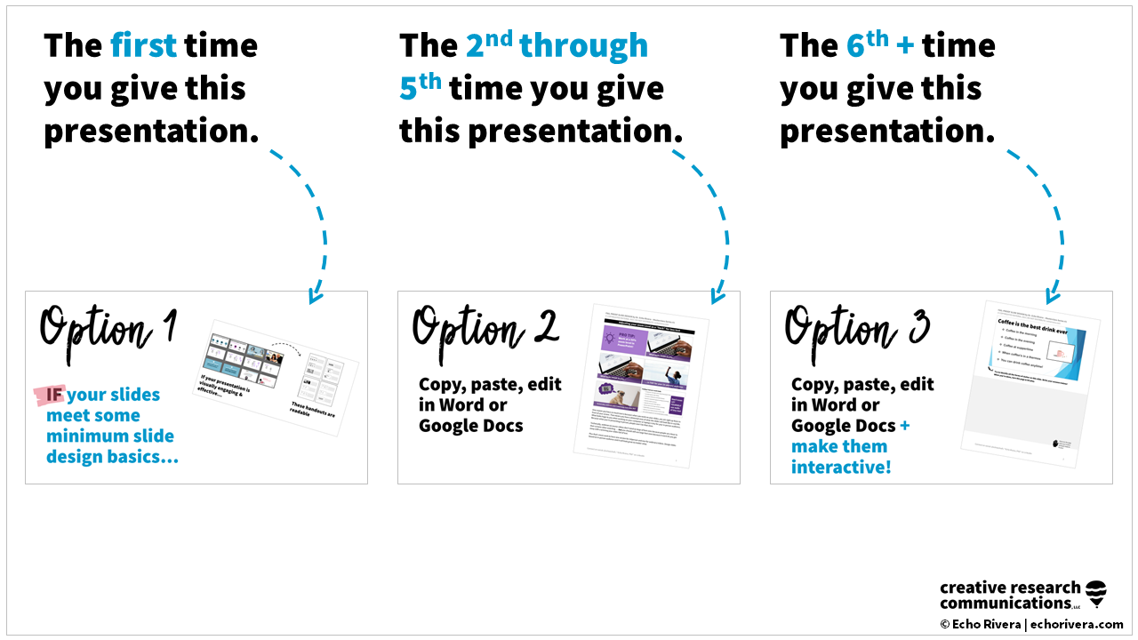
(a) The first time you give this presentation
What I mean by that is, the first time you are giving your presentation, you spent so much time creating it from scratch.
Do yourself a favor and use option 1, okay? 😮💨
(b) The 2nd through 5th time you give this presentation
Then maybe the 2nd through 5th time you give that presentation, that's where you stay in option 2.
Even the first time you do option 2, just get your best slides on there, resize them, leave some space for notes, and move on with your life. 🙌
But then maybe you add a little bit more to that.
Maybe some shapes to take notes. 👀
You can even stay there and just do little improvements over time. 👌
(c) The 6th+ time you give this presentation
And then if you find yourself giving this presentation a lot, and it's something like a training, then that's when you can think about doing option 3.
Because the content is solid, you’re not going to change it much, so you can turn it into an amazing option 3, a super interactive handout! 🤩
This is particularly useful if you are teaching an online course.
For example, if a lot of your undergrad classes or grad classes have moved online, you might spend a lot of time creating your video, so use option 1 the first time you create your class lecture.
Then if over time, you know that video itself is solid, and you're not going to have to change it for a while, then you can focus on improving the handout. 💯
Basically, so many people are worried that when they come to me for training, that I'm going to tell them they must have the most beautiful slides for every single slide in every single presentation, and they must do option three for every single presentation ever.
Absolutely not. 🙅♀️
I'm always recommending that you implement strategies in waves or phases. 🌊
I've sometimes called it a “phased praxis” approach when I want to sound fancy.
So you can do it in stages. 🙌
The idea that you're always setting yourself up for success so that you can just take things one step further each time you give a presentation.
You don't go from 0 to 10 right away and you don't go from 0 to 10 for every single presentation. It's not realistic and it's not sustainable. 💯
This is a concept I talk about my free training below!
Now that you know the three best alternatives to that standard handout option, I want to take some time to talk about two options that I recommend you don't use. 🚫
3. Two PowerPoint features to avoid when creating a presentation handout
These are both features in PowerPoint that you will probably come across, so I knew I had to talk about them. 😬
1. I don’t recommend the “handout master” feature in PowerPoint
The first is called the handout master in PowerPoint.

This is where you are supposed to be able to go in and:
edit the basics of a handout template
delete the date at the top
remove the page number on the bottom right (which you wouldn't do)
edit the header (I was talking about that earlier and how it's annoying because this is where you have to go to do it, which is why most people aren't 😩)
edit the footer
But beyond that, there's not much you could do to make these handouts better. 🤷♀️
For example, here is the master template for the three slides per page with lines:

How awesome would it be if I could just fix those lines and then we could use that template? 😱
If we could, I would make them like a super light gray.
Maybe I would also do something like add shapes to give people the space that they need to write the notes, right?
So I was like, hmm, okay, I'll be clever. 💡
I'll be clever and just put shapes over the lines and hide them and then we can use this!
Oh, oh, Echo, you're so smart, you hacked PowerPoint, yay! 👏👏
No, no, I did not hack PowerPoint, because this is what it looks like when you go to print, it looks even more ridiculous than it did before. 😅

I've spent quite a bit of time trying to sort of hack this and make this work. 🛠
Let me just tell you, it doesn't, it doesn't even come close to what we can do in option 2, definitely not option 3.
So honestly, I recommend you just avoid the handout master altogether (unless you're doing option 1 and you want to edit the header and the footer). 🙈
2. I don’t recommend the “export” feature in PowerPoint
This is the other feature that you are probably going to come across in PowerPoint (and get excited about only to be disappointed, which is literally what happened to me). 😑
I even used to recommend this as a good option, but I don't anymore, here's why.
Basically, this is an export not print.

You go to “Export”, and you'll see this seemingly perfect option called "Create Handouts” and then what it does is, it's going to send your slides to Word so you can create the custom handout.
Huh, sounds a little bit like options 2 and 3, doesn't it? 😲
Well, look at that.
So at first you might think, perfect, now I don't have to copy and paste my slides, because I can basically just click, create handouts. 😀
There's a popup with a few different options but let me go ahead and show you the lines next to slides options.
So here's what it looks like:
Looks familiar, doesn't it? 🤨
It's basically three slides per page with lines, but we can customize it now, at least that's the idea.
When it goes into Word, it's three columns and so much space is dedicated to the slide number.
I do not get this, we don't want that. 😤
So we can delete that column and that makes our life easier, so great.
And then we want to maybe keep the column for the lines, but delete them so we can replace them with our own formatting.
So I was like, okay, okay, off to a good start. 😀
I'm liking what I'm seeing, here we go, all right!
So I cleaned it up, got rid of those line numbers, deleted the lines, and so now we have a table of two columns basically, and we have a cleaner look already.

All right, so off to a good start.
And then here is where everything just goes downhill. 😰
We pretty much can't effectively do anything else.
The best I could do was create one long shape for taking notes, and I actually think, okay, this looks kind of nice.

I feel like we could work with this!
But then I started doing things like, okay, let me try to increase the size of those images and adjust the spacing and then it just kind of like broke on me. 😰
It was so glitchy (and I have a pretty fast computer).
For example, I would increase the size of the column and it would freeze. 🥶
It was honestly awful to work with and it's so much easier and faster to use Word the way I was talking about, where you copy and past slides into Word.
And the other thing is that when it's exporting from PowerPoint to Word, it takes forever and you cannot do anything. 🥲
Like you don't even look at your computer, just hit the button to create handouts and walk away, and come back like 10 minutes later.
Because if you so much as breathe on your computer or click anything while it's exporting, you get an error message and it cancels the whole thing and you have to start over. 😡

It is a really frustrating experience and if you do this, you won't want to create custom handouts, whereas option 2 is so much easier and so much faster.
So that is why I recommend you avoid this option.
Okay, there you go.
I bet you didn't think someone could talk so long about presentation handouts, but here we are. 🤣

I truly hope that you found this post to be helpful and that it will help you not only create better handouts, but also better presentations! 💯
If you've been wanting to make better presentations but:
you feel stuck,
you're not really sure why things aren't getting better,
or you're not even sure how to move forward,
I am here to get those gears moving! ⚙️
If you are an academic, researcher, evaluator, TTA provider, federal or state staff, I am here to help you share your data in effective and engaging ways. 🙌
Check out my free training below where you will learn about the six gears of creating engaging presentations!
At the very end of that video, you will learn a little bit about my presentation skills masterclass training program. ✨
All right, if you enjoyed this post, please share it with someone you think might find this helpful.
And again, if you want to improve your presentation skills, I am here for you.
Sign up for that free training workshop to get started!
Thank you so much for reading and I will see you next time. 👋
with joy,
Echo Rivera, PhD
Links shared in this post >>